Sankey Diagram

If the analysis was calculated properly and accepted on the user's end, opening it from your My reports list will load a results page.

O/D Analysis results page showing left sidebar with analysis information
Analysis results page

TomTom O/D Analysis offers 5 different methods you can use to review the results. In this chapter we will focus on the third one - Sankey Diagram.

Sankey Diagram

This option shows you the number of connections between different regions in the form of colored lines.
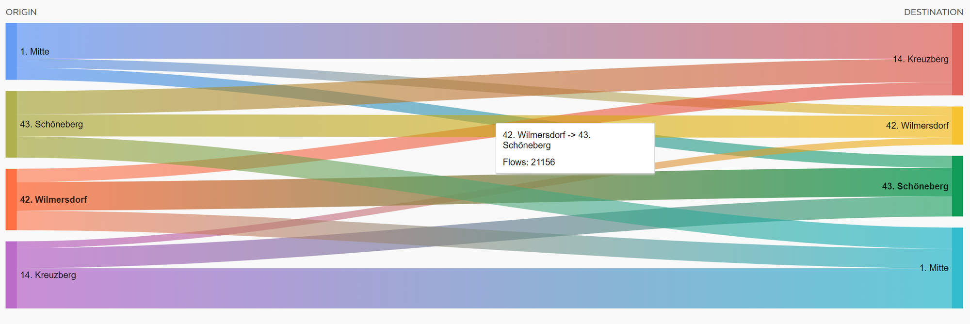
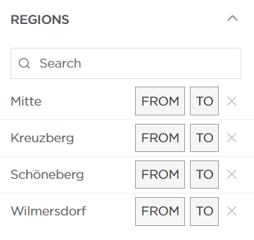
Sankey diagram showing four regions on left connected to four regions on right with flowing colored bands of varying widths representing trip volumes between origin and destination pairs
Sankey Diagram* representation of the analysis results

By default, the results show you only 4 regions with the highest number of trips measured. In order to add additional regions, you can use the Search window on the left side.
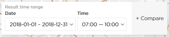
Left sidebar showing search field with region name input and list of selectable regions with checkboxes for adding to Sankey diagram
The possibility of adding more regions into Sankey Diagram results page

The time and the date ranges can be changed on the left side:
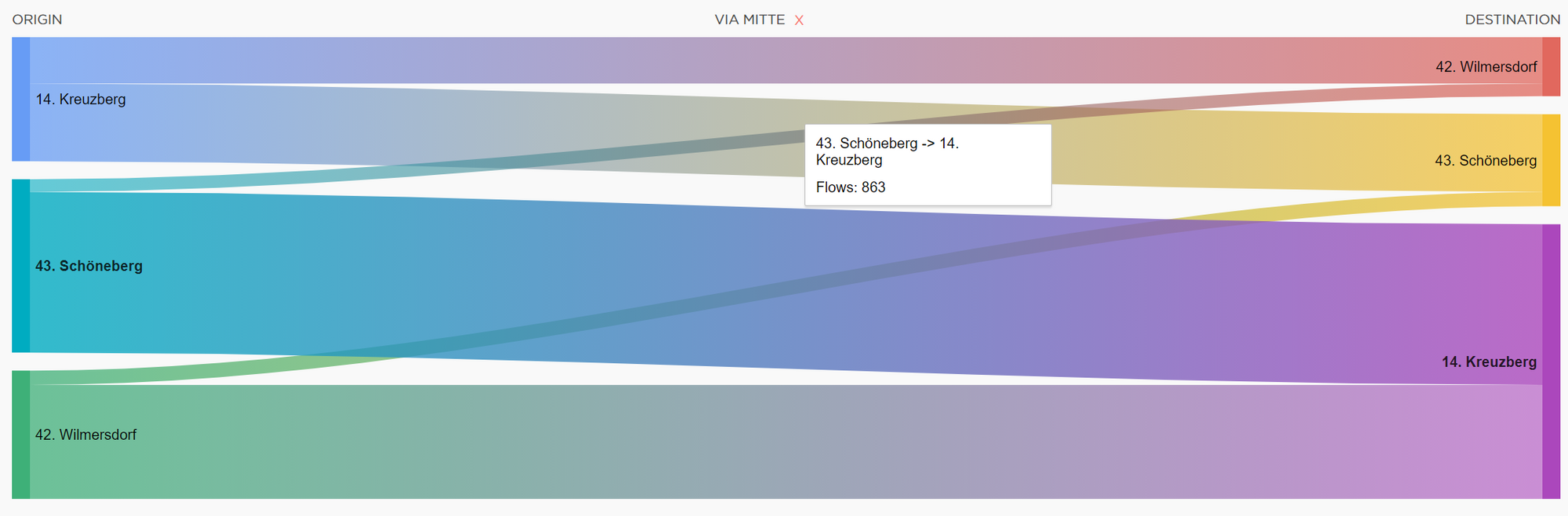
Left sidebar control panel displaying calendar date picker and time range slider with timezone selector dropdown
Date range & time range selector menu

There is also a possibility to select VIA regions, so you will see the number of connections between different regions that travelled through the region selected as VIA.

Left sidebar showing Via Region dropdown selector with list of available regions that can be selected as intermediate transit points
Sankey Diagram Via Region selector

The example is shown on the screenshot below:

Sankey diagram showing trip flows between multiple origin regions through a single via region to multiple destination regions with color-coded flow bands and numeric labels
Sankey Diagram results visualization with a Via Region selected