Flows explorer

If the analysis was calculated properly and accepted, opening it from your My reports list will load a results page.

O/D Analysis results page showing left sidebar with analysis information
Analysis results page

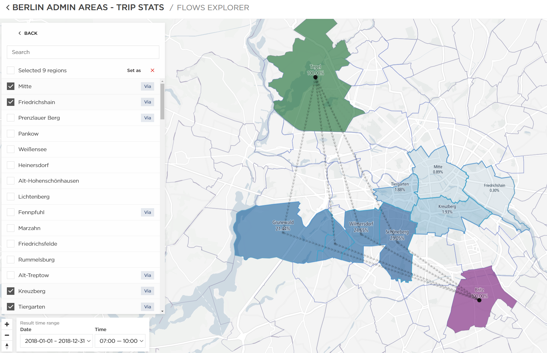
TomTom O/D Analysis offers five different methods you can use to review the results. In this chapter, we will focus on the last one - Flows Explorer.

Flows Explorer

Flows Explorer interface showing map with multiple colored regions, left sidebar with region selection panel showing Origin, Via, and Destination categories with multiple regions listed under each
Analysis results displayed on an interactive map of Flows Explorer

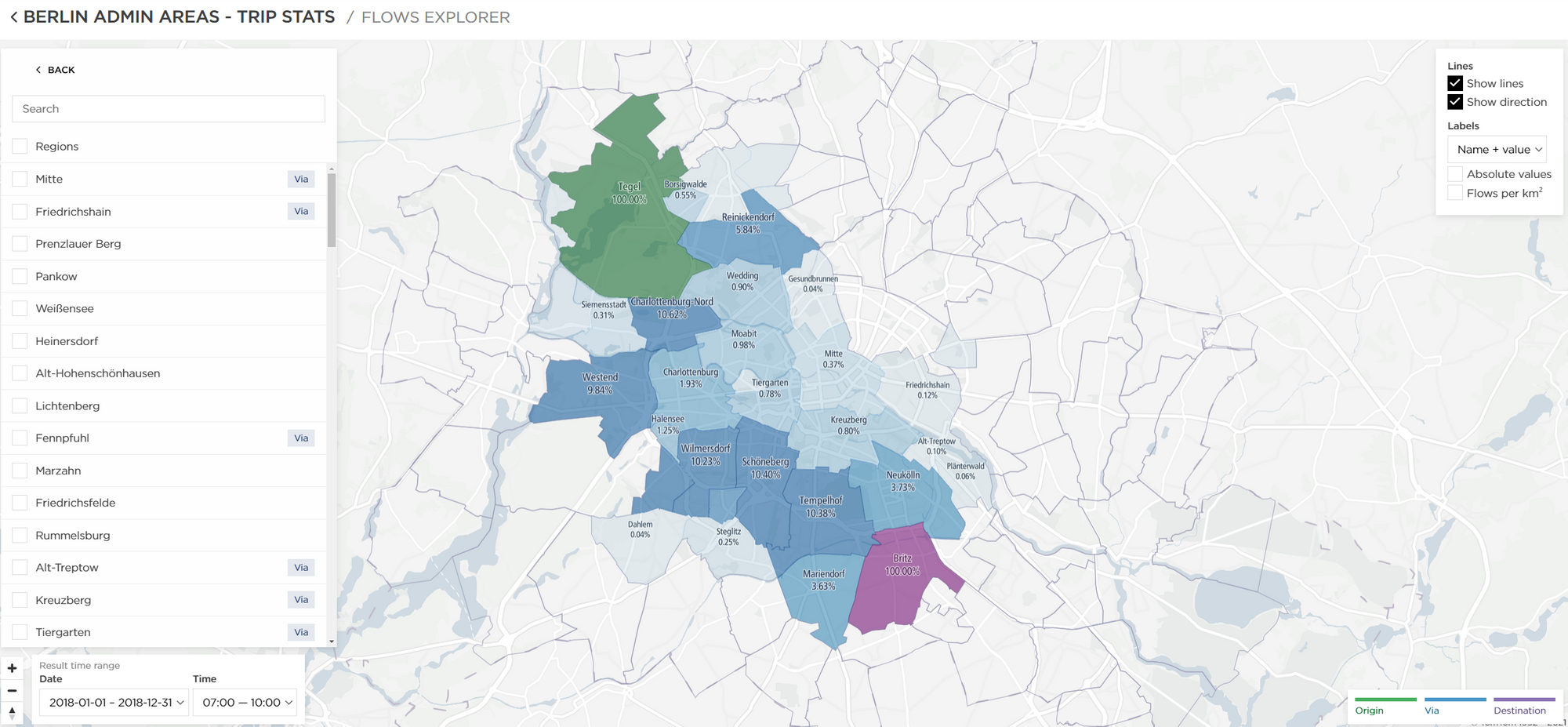
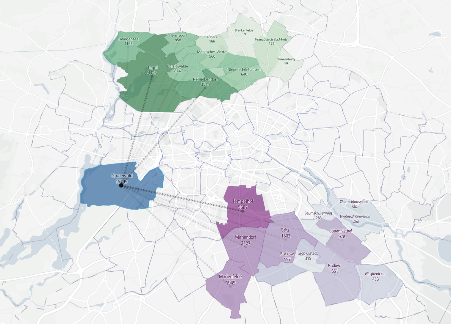
This is an interactive report view that allows you to select more than one Origin, Via and Destination, unlike Map Flows.

Once you set your regions as origins, destinations and vias, you can view the relations between them in all possible ways.

To select multiple regions, you can use the region list on the left or hold the CTRL key and click on the regions on the map. This allows you to see the start and end regions, multiple via regions that the trips travelled through and their trip percentage value.

Map displaying multiple origin regions, destination regions, and via regions highlighted in different colors with percentage values shown on regions representing trip distribution
An example combination of multiple region types in the Flows Explorer

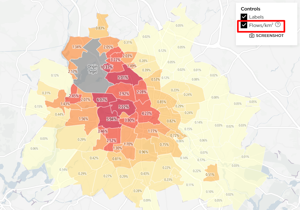
If you want to see the number of trips instead of percentages, you can check Absolute values in the upper-right corner.

Upper right control panel showing checkbox toggles for Flows per km², Region names, and a slider for the lower limit in percent
Additional controls for the Flows Explorer result
Map showing regions with numeric trip counts displayed instead of percentages, with larger numbers indicating higher trip volumes
Results displayed in the form of Absolute values instead of percentages

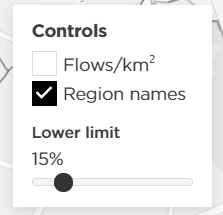
Just like Map Flows, this view also allows you to check the Flows per km2 values in the upper-right corner:

Map displaying regions colored by gradient showing Flows per km² normalized values with legend indicating value ranges from low to high density
Distribution of trips shown in the form of flows per squared kilometers

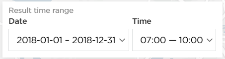
The date and time ranges can be changed in the bottom-left corner of the map.

Bottom left control panel showing calendar date picker widget and horizontal time range slider with adjustable start and end time markers