Map flows
If the analysis was calculated properly and accepted, opening it from your My reports list will load a results page.

TomTom O/D Analysis offers five different methods you can use to review the results. In this chapter, we will focus on the first one - Map Flows.
Map Flows
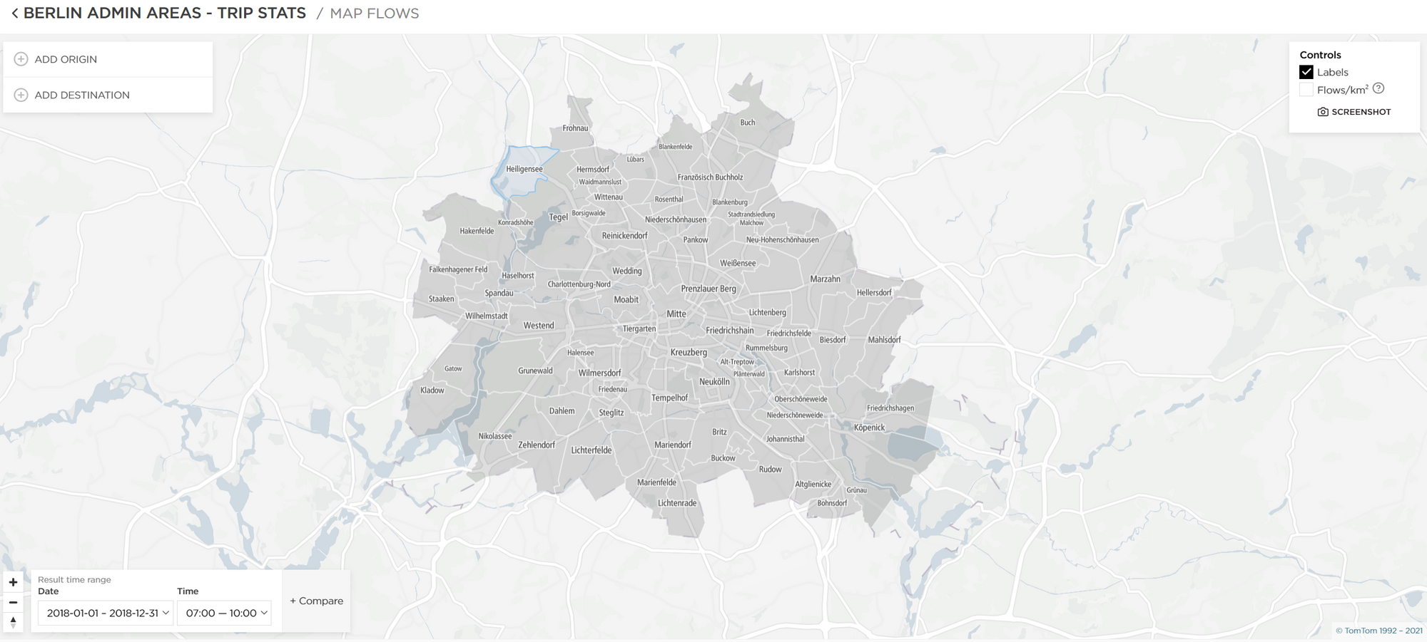
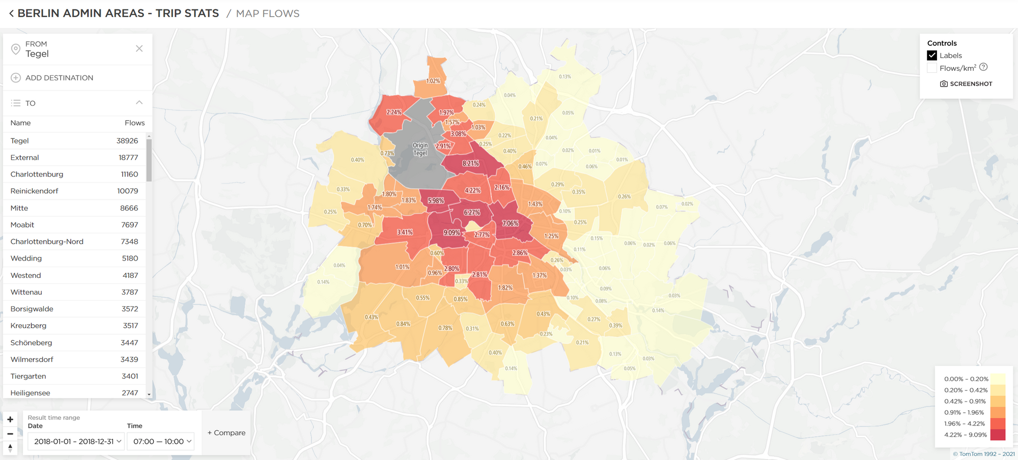
This is an interactive report view that allows you to preview many different scenarios.
There are two ways you can mark a given region as either an origin or a destination:
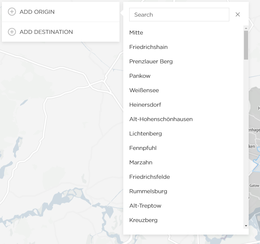
- Using the menu on the left side (Add Origin/Add Destination);
- By clicking on a given region and then selecting an option;
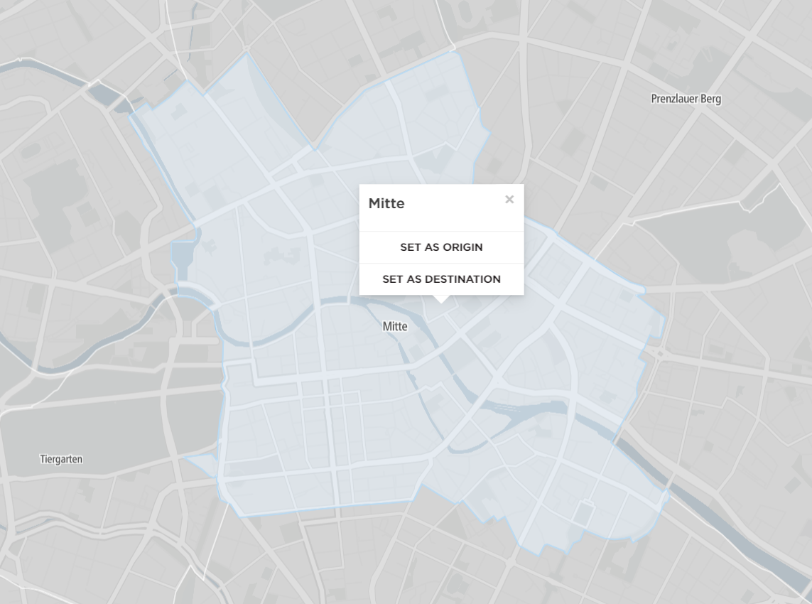
The example in the screenshot below shows the result for one region selected as an Origin (highlighted in gray). All other regions, in this case, become Destinations, and the outcome shows the distribution of trips in:
- Percentage ratio - shown on the map.
- Flows ratio - shown on the left side.
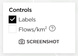
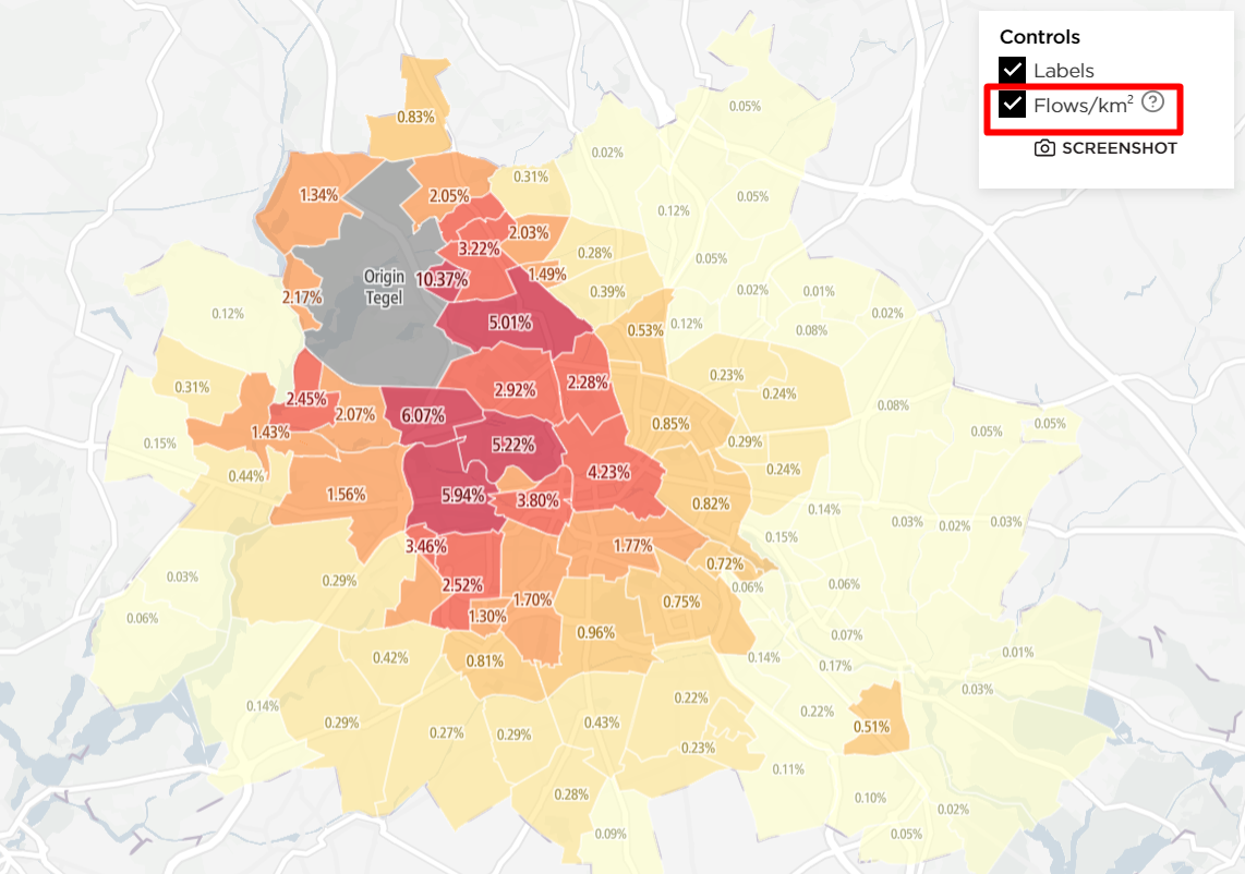
These results contain additional information when you check the Flows/km2 option in the upper-right corner. This option considers the size of the regions and compares it to the total number of trips.
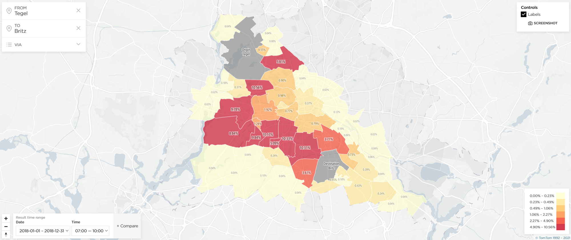
Another way of viewing the Map Flow results is to:
- Select one region as an Origin (highlighted in gray).
- Select another as a Destination (highlighted in gray).
All other regions with available data will automatically be treated as Via regions, showing how many vehicles traveled through them on their journey from the Origin to the Destination.
Note: You can take a screenshot of the analysis in the upper-right corner.