Viewing report results
If you have already requested a report or if you simply want to review the results of the predefined demo reports available on your account, this section of the guide will help you understand how to do so.
Once you open the Area Analytics app, the default view displays the map and a list of reports on the left. You can open any report you wish to analyze from this list and the app will redirect you to its results.

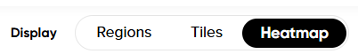
There are several different ways to analyze the data in Area Analytics.
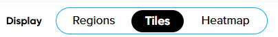
A) Data in Map Tiles
In this case, the results are provided by equally sized individual tiles (squares) on the map that are selectable. The size of these tiles can vary from approximately 38 meters to 400 kilometers, as the tile size is automatically adjusted depending on the size of your region(s) in the analysis.
Zooming in and selecting a specific tile provides you with information about the congestion level of that square (in percentage), the average speed (per hour), the average free-flow speed per hour (where free flow refers to conditions when there is no traffic, usually during nighttime), travel time per 10 km, road network length (in kilometers) and the coordinates (latitude and longitude) of this tile on the map.
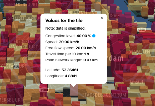
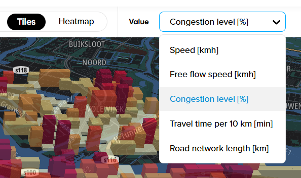
Note: Please keep in mind that the tile height and color you see on the map are based on the value selected in the top-right corner. By default, this value is Congestion level [%], but you can change it to any other value and the map will reflect your choice in a different visualization.
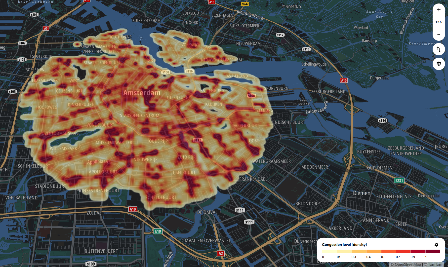
B) Heatmap
Instead of reading the data in Map Tiles, you can also focus on the Heatmap view, which allows you to quickly identify anomalies, such as the largest congestion spots in your region(s) or areas where the speeds were highest.
This option is primarily tied to the color scale in the bottom-right corner and only allows you to analyze the data visually, as the heatmap is not selectable.
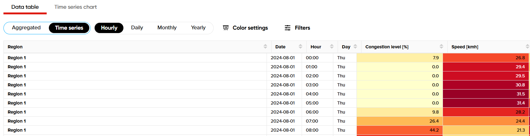
C) Data table, time series chart, and average week tabs
This part of the results provides raw data about all the values of the analysis in the form of a table. The advantage of using this feature is that it not only shows you aggregated data for the entire region(s) but also for individual time frames based on hourly, daily, monthly or yearly categories.
Thanks to this feature, you can see how conditions like congestion levels change in your zone every hour of the day, which can help identify how rush-hours affect driving conditions in your area of analysis.
All the data points are conveniently displayed on one page, so there's no need to switch between different values:
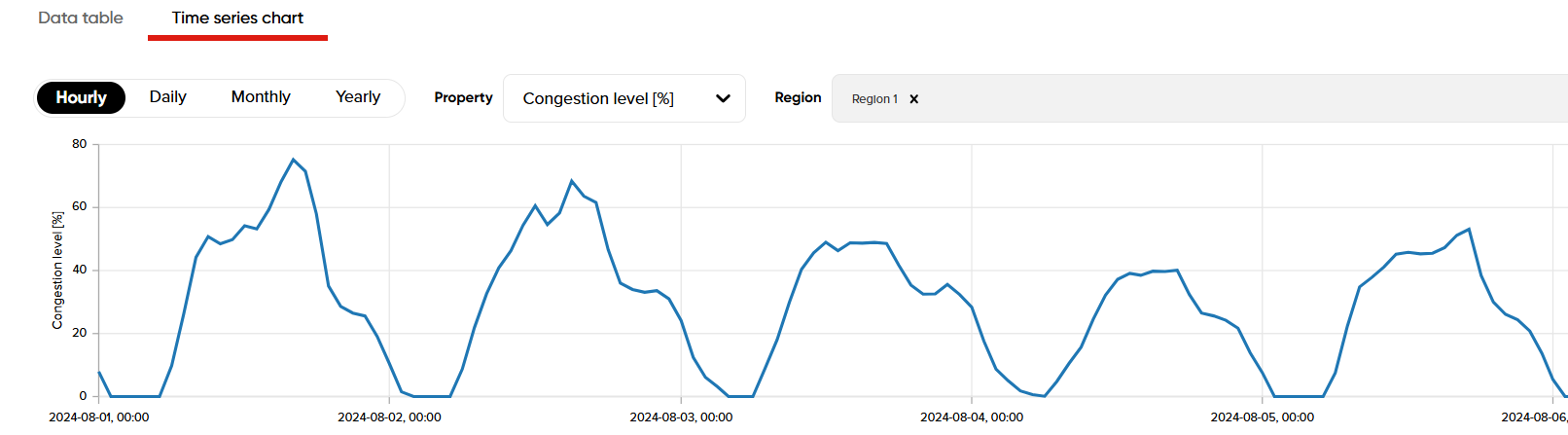
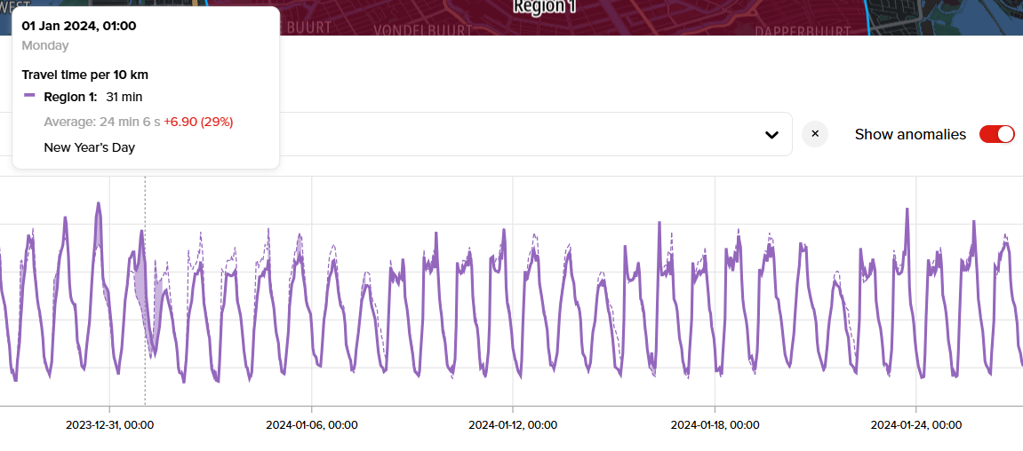
Similarly, you can also review this data in the form of a time series chart, which shows fluctuations of different values on the line graph based on hourly, daily, monthly or yearly intervals:
Experimental
This section also provides a useful feature that detects anomalies in the data. To use it, enable the Show Anomalies toggle and then scan the line graph to identify them. This option also displays public holidays:
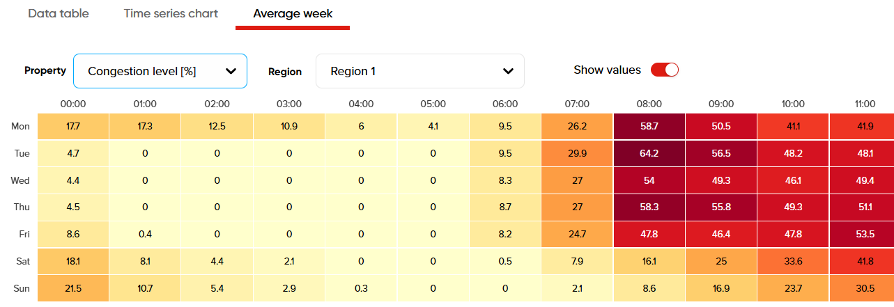
The Area Analytics application also offers a table view displaying the average weekly values for the entire region and the full date range of the analysis. This view provides insights into how the data appears for individual hours of each day over a complete week.
For example, if the analysis covers an entire year, you can see how congested the morning hours were on average for all Mondays within that date range.