Modal Panels
Important note:The TomTom Digital Cockpit SDK is not available for general use. Please contact us for more information.
A modal panel is a floating panel that blocks all other user interaction until it has been dismissed. They are used to display information that:
- Needs attention from the user, because it presents instructions or critical information.
- Requires information in order to continue with a service or workflow.
Modal panels interrupt a user's workflow by design. When active, a user is blocked from the task panel or home panel content. They cannot return to their previous workflow until the modal task is completed or the modal panel has been dismissed.
Modal panels are used for short and non-frequent tasks, such as logging into an account, Bluetooth device pairing, making small changes, or management tasks. If a user needs to repeatedly perform a task, consider letting the user perform it in the original panel.
Modal panels can be stacked to create a user flow through various screens. The top-most modal panel will be shown to the user. When that panel is dismissed, the next modal panel on the stack will be shown.
They may be dismissed by the user through system UI functionality, like tapping a Close button.
Such an action may trigger the system UI to dismiss the whole modal panels stack, rather than just a
single one.
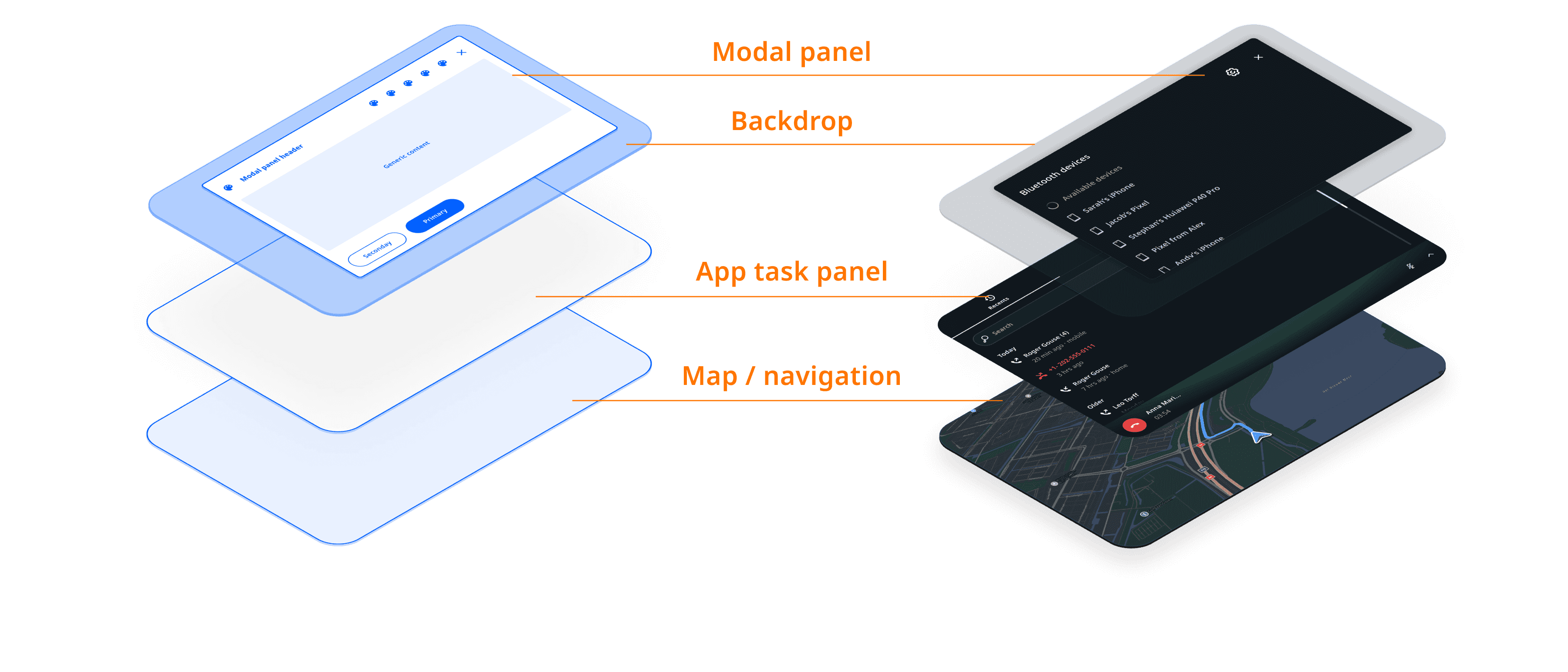
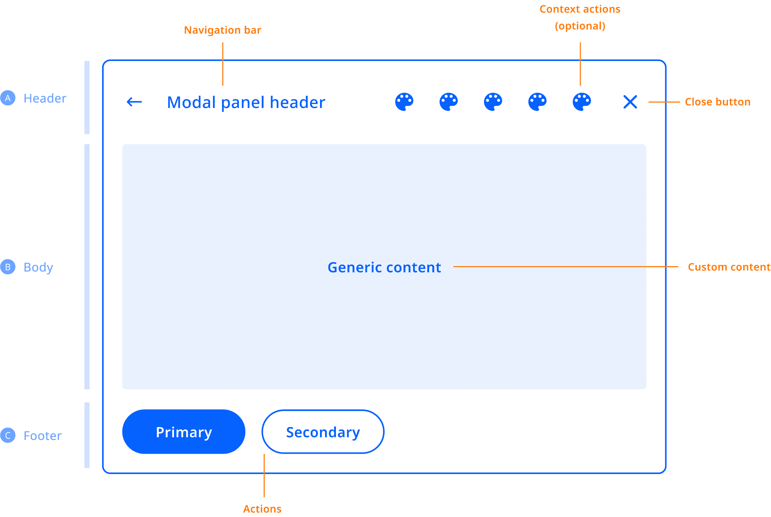
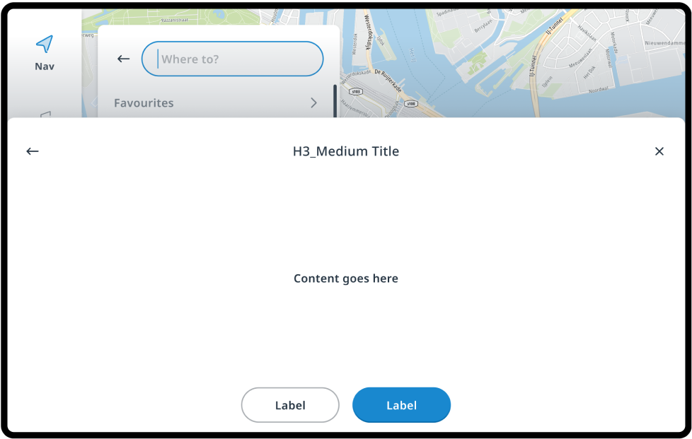
Anatomy
The modal panel can be used as a standalone container (the backdrop + the panel), but the use of the following default modal panel template is recommended. It comprises an optional header section, a body section, and an optional footer section.
Customization
| Component | Customizable |
|---|---|
| Theme | The style (color, shape, size, etc.) of the modal panel and backdrop follows attributes defined in the system theme. |
| Content | Modals can be created with any content within the modal panel. The content of modals created by existing applications can typically not be modified without replacing the entire application frontend. |
| Replacing | The modal backdrop can be replaced by modifying the system UI. (Note: Currently it is not possible to replace the panel template. It is on the roadmap to be supported.) |
| Position | The position of modals and the modal backdrop can be modified in the system UI. |
| Animation | The enter and exit animations of the modal panel and modal backdrop can individually be changed. |
| Dismissal behaviour | It is also possible to change the dismissal behaviour in a custom system UI. For example, to replace current dismiss actions (Close button, tapping on the backdrop or the menu) with another mechanism. |
Levels of customization
The positioning, styling, and other aspects of the modal layer can be customized. However, since the content of modals from existing applications already exists, it cannot be customized. The content of modals created by new applications is fully customizable though, as any UI can be created within its boundaries.
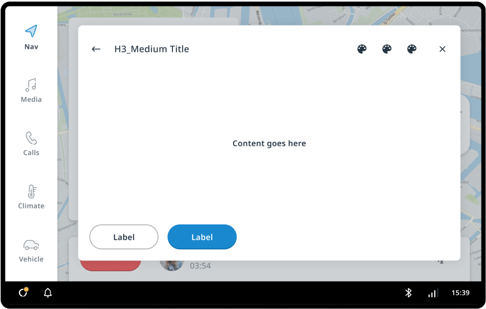
Out of the box
How modals look in the stock system UI.
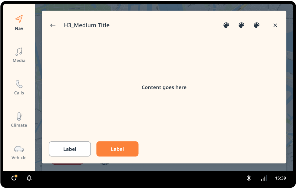
Themed
Global and modal-specific theme attributes can be used to change the styling.
Custom panel
The system UI is tweaked to reposition the modal panel, and the modal template and backdrop are replaced.