Scroll View
Important note:The TomTom Digital Cockpit SDK is not available for general use. Please contact us for more information.
Scroll View is the area in which the content can be scrolled.
The control is shown when the content does not entirely fit the page or the viewport.
Anatomy
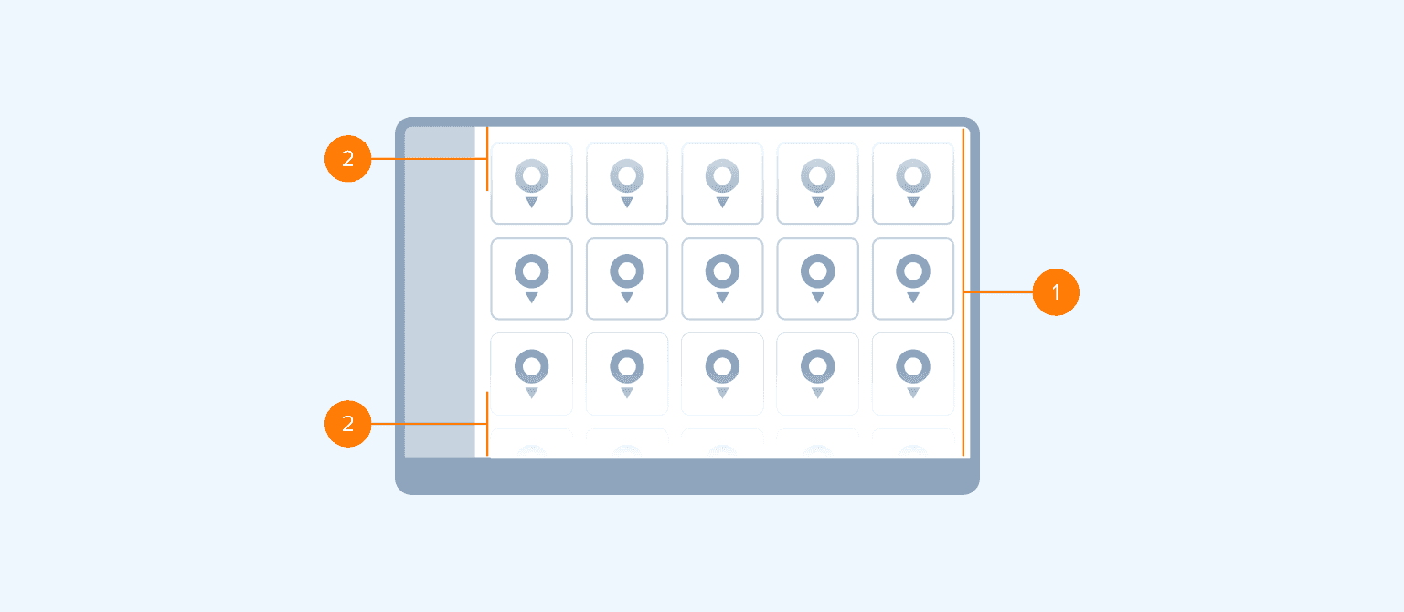
- Scroll view: The viewport within which the content can be scrolled (for example, app, panel).
- Fadeout effect: A visual cue that indicates that the content is scrollable. By default, it is displayed at the end of the scrolling direction of the Scroll View (for example, in vertical scrolling, fadeout is visible at the bottom of the Scroll View). When reaching the end, the fade-out effect is no longer shown. Optionally, this effect can be set from both sides of the Scroll View.
Style
The fade-out effect is created with a gradient that interpolates from 0% to 100% with the color that matches the color of the background it is displayed on. The following size templates are used:
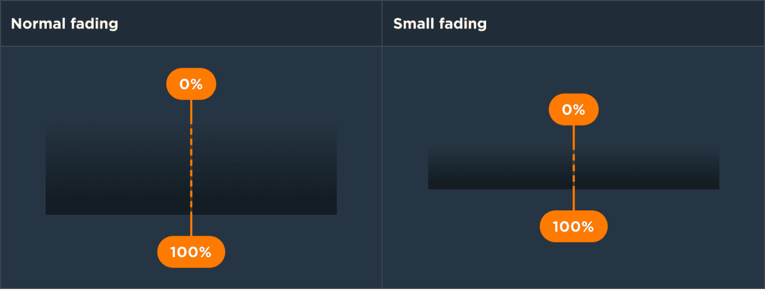
| Size template | Use |
|---|---|
| Normal | Used to indicate scrolling in bigger scrollable views (for example, task panels, modal windows, etc.) |
| Small | Used to indicate scrolling in smaller scrollable views (for example, home screen panels, pop-overs, etc.) |
Usage
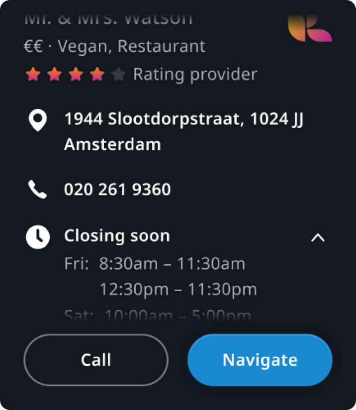
Point of interest preview panel
Panel content is scrollable while buttons are docked to the bottom.
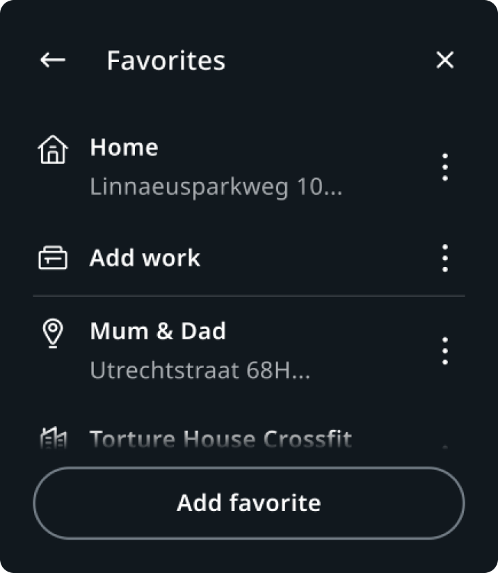
Favourite locations panel
The list of locations is scrollable while the "Add favorite" button is docked to the bottom.
Customization
| Type | Customizable |
|---|---|
| Theming | The sizing of the fading effect can be adjusted. |
| Configurations | Two size templates are supported. |
| Content | - |