Entertainment
Important note:The TomTom Digital Cockpit SDK is not available for general use. Please contact us for more information.
TomTom Digital Cockpit comes with a universal media player for audio entertainment. This application provides access to in-vehicle media sources like radio and Bluetooth audio, and sources from third-party providers such as Spotify, iHeartRadio, and many more. This documentation will cover how the media player works, its functionality, and how the media player can be customized and configured.
Media player panels
The media player is made up of different panels that let the user select media sources, browse media content, control media playback and login.
- Dashboard: selecting media sources. For example radio, Spotify, or Bluetooth.
- Media browser: browsing content from the selected media source.
- Playlist view: browsing playlists of songs or podcasts inside a media source.
- Task process panel: controls and displays media playback while the user has the media application open.
- Expanded process panel: an expanded, more detailed view of the media that is currently playing.
- Main process panel: controls and displays media playback when the user is outside of the media player application. For example, using the map.
- Source login: a login screen for third-party media sources that require account login.
- Source settings: a settings modal where the user can change the settings of a media source.
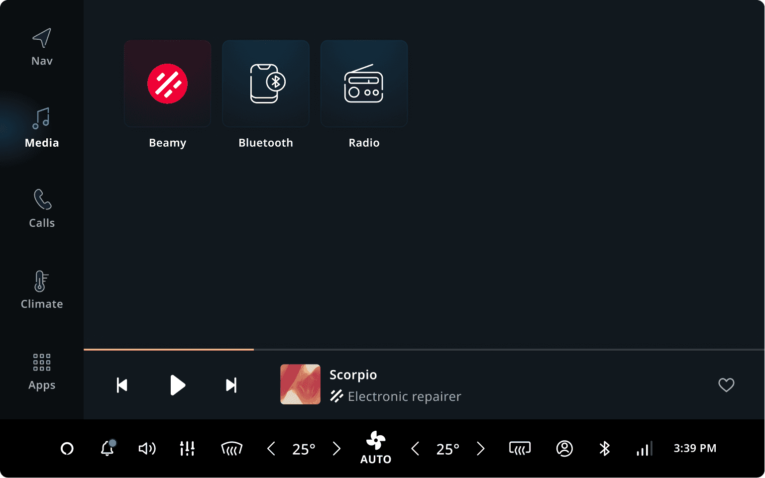
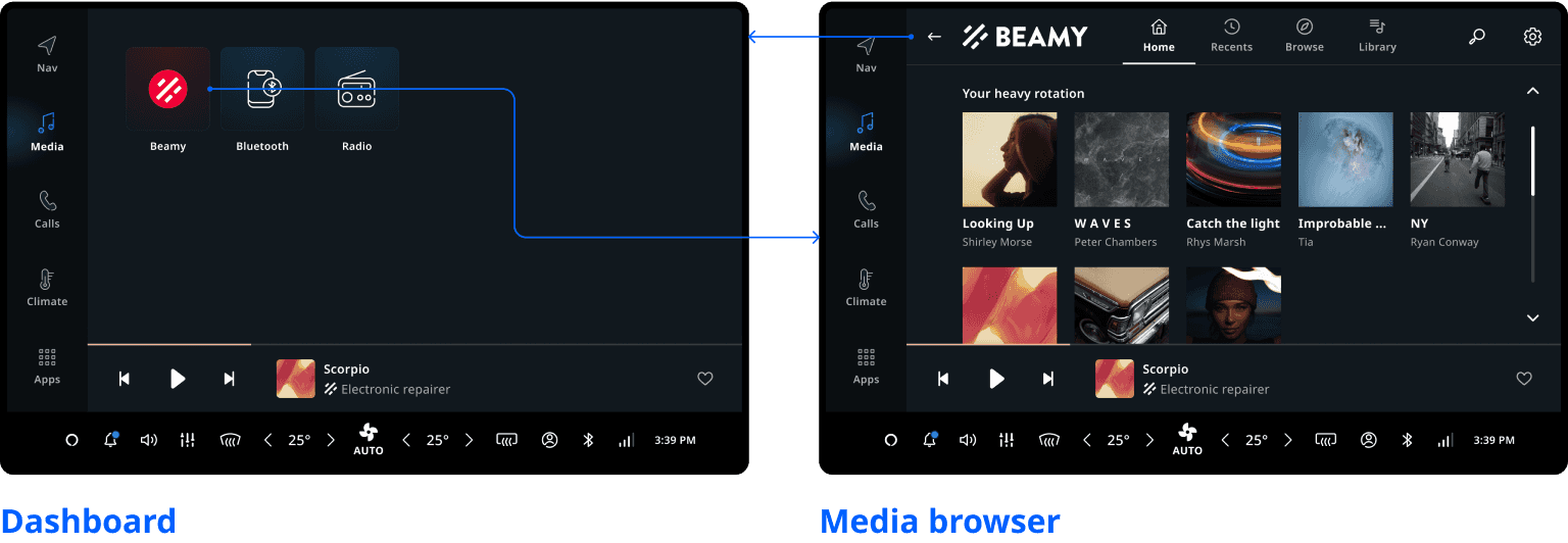
Dashboard
When opening the media app, the user is presented with the dashboard, which lets them select a media source. All available media sources are shown in a grid view. Unavailable sources are shown in a disabled state, such as Bluetooth audio when no device is connected. Tapping a media source opens it, and shows a login screen if required.
All media sources can be customized. However, any customization to media sources provided by external companies (not TomTom) will require certification. The default configurations available for Spotify and iHeartRadio are already certified for use, provided these are not customized.
| Source name | Customization |
|---|---|
| Radio | No certification required. |
| Bluetooth audio | No certification required. |
| Spotify | Requires certification by Spotify. |
| iHeartRadio | Requires certification by iHeartRadio. |
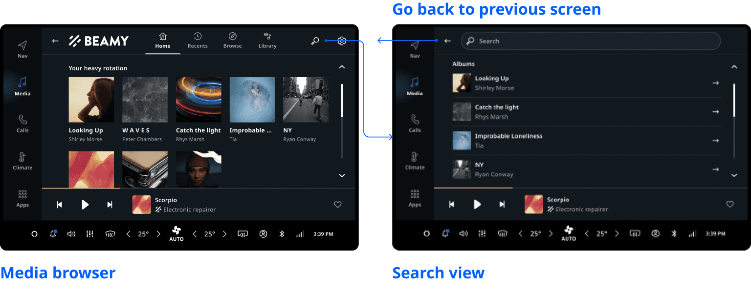
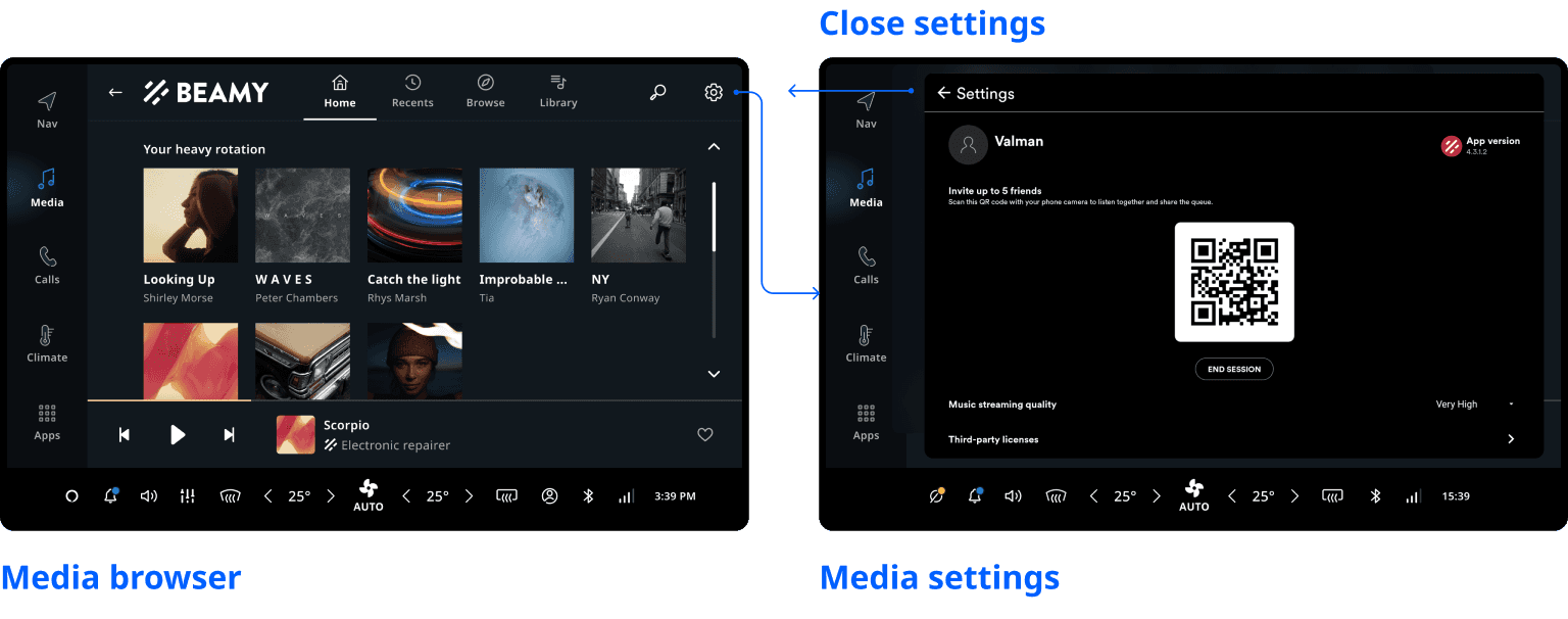
Media browser
When the user opens a source they are shown the media browser. Content supplied by the media source is shown in tabs, each containing sections of browsable media (for example, albums/playlists) and/or playable media (for example, radio channels, songs). Media within a section can be shown as either a grid or list layout. Tapping browsable media opens the playlist view and tapping playable media starts media playback.
In the top right, a Search button can be tapped to search the media source. A Settings button is
next to it, which can show the available settings for the source in a modal. Pressing the Back
button returns the user to the dashboard.
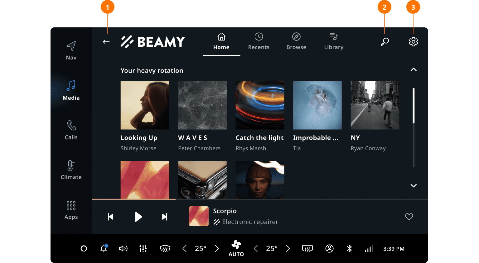
| Section | Use |
|---|---|
| 1. Back button | Return to the previous screen (back to the dashboard in this case). |
| 2. Search | Open the search view of the current source. |
| 3. Settings | Open the setting model of the source. |
Playlist view
The playlist view contains a list of playable items such as songs or podcast episodes. Next to the list content is the metadata (cover artwork, title, subtitle, number of the items, and duration). In nested pages, like the playlist view, a breadcrumb bar is used to take the user to any level in one tap.
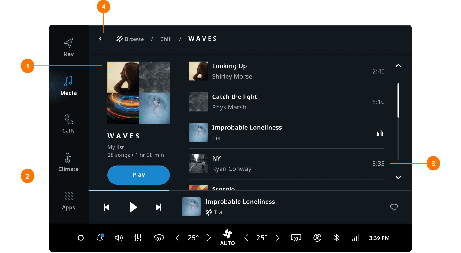
| Section | Use |
|---|---|
| 1. Metadata | Cover artwork, title, subtitle, number of items, and duration. |
| 2. Play/pause button | Play/pause the playback of the playlist. |
| 3. List content | Open the setting model of the source. |
| 4. Breadcumb | Tapping the item leads back through the level of screens. |
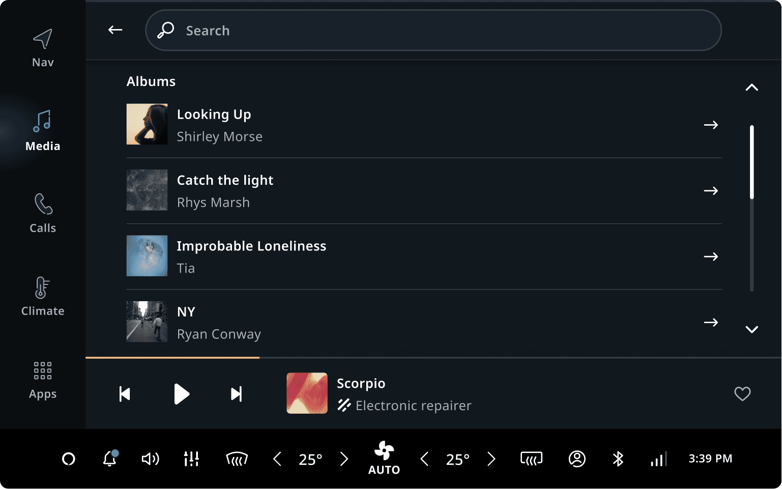
Search view
A source can be searched by using the search view (accessed from the source browser). Search starts automatically as the user types into the search field. Search results are presented as determined by the source, which may contain multiple sections. The search results are presented in a list layout, as this makes it easier to see which items match what the user is looking for.
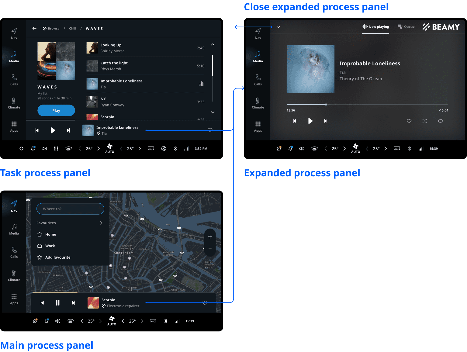
Media playback - Task Process Panel
In the media application, media playback controls are always available in a
Task Process Panel.
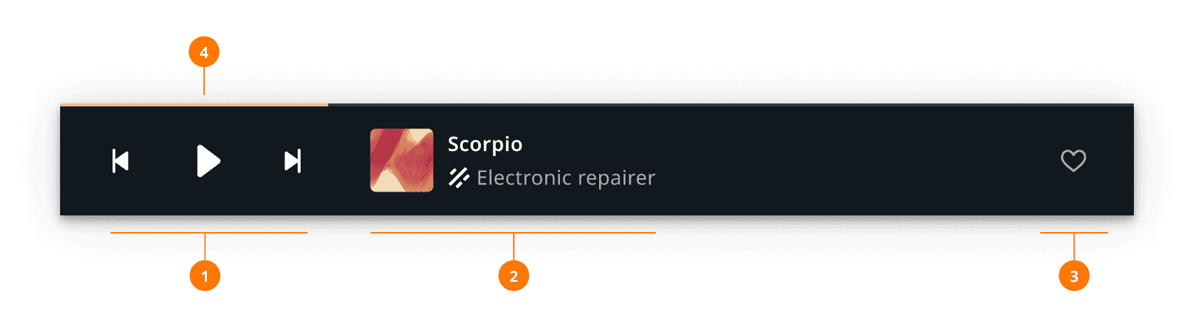
This presents the primary playback controls (1), metadata of the currently playing content (2),
secondary playback controls (3) and progress (4). The primary controls (for example, play, next)
control the progression of the playback, while the secondary controls (for example, like, favorite,
playback speed, shuffle) are a limited selection of less frequently used controls and custom
source-specific actions. Tapping the Expand button or the metadata sections opens the
Expanded Process Panel.
| Section | Use |
|---|---|
| 1. Playback controls | Play/pause, next, previous. |
| 2. Metadata | Title, artist, album name. |
| 3. Secondary playback controls | Favorite, playback speed, shuffle, expand. |
| 4. Progress | Progress of the playback. |
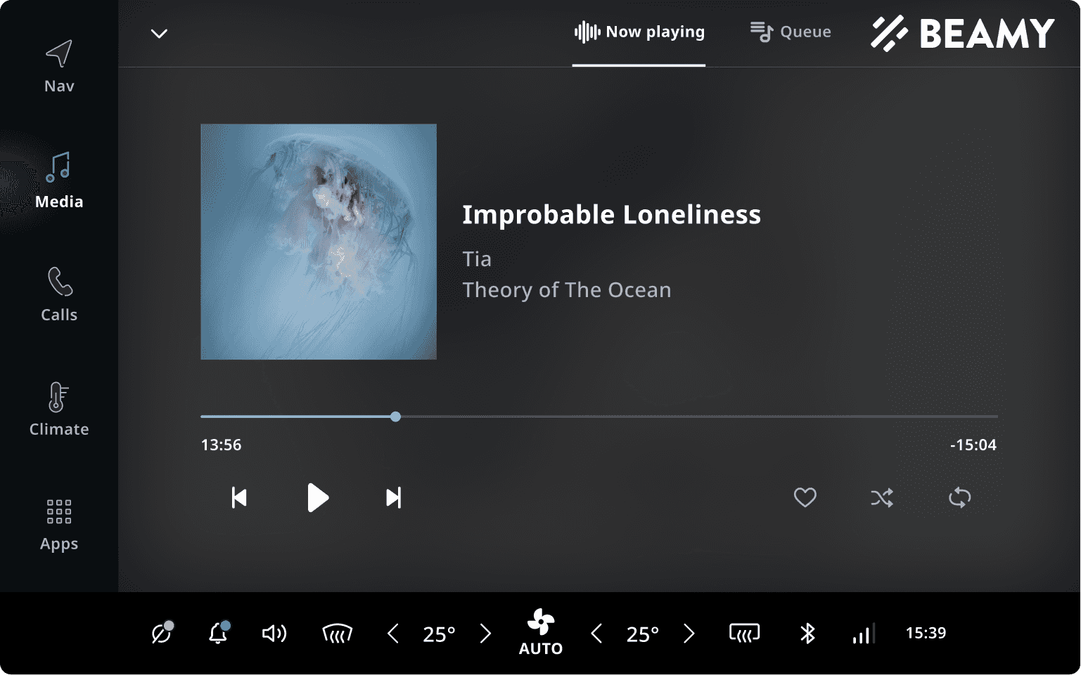
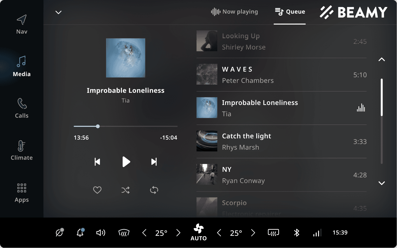
Media playback - Expanded Process Panel
The Expanded Process Panel
presents the currently playing content in a full-size layout, providing access to the full
collection of playback controls and custom actions, and additionally gives access to the playback
queue (by pressing the Queue tab on the top). Pressing the Collapse button closes the expanded
process panel, and returns to the previously opened page in the media application.
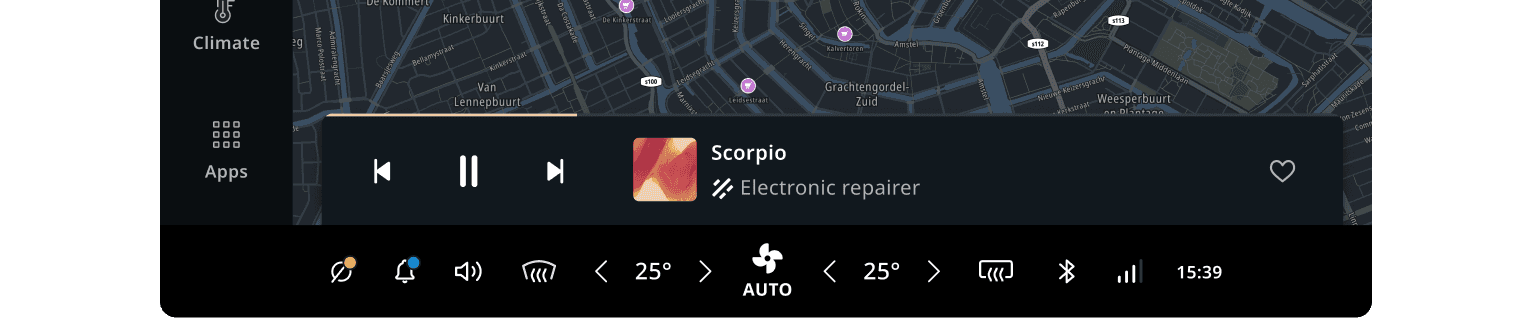
Media playback - Main Process Panel
The Main Process Panel displays the media that is currently playing on top of the navigation application. This makes it possible for users to view and control media playback without leaving the navigation/driving task.
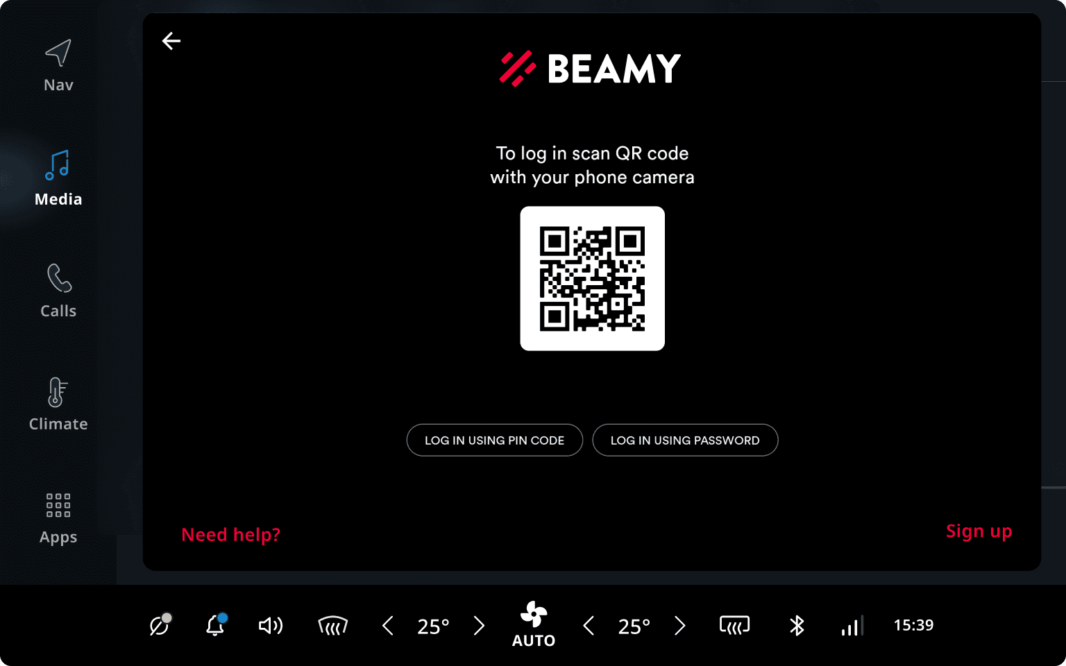
Source login
When a source requires the user to login before opening it, a login screen is shown inside a modal window. The login UI is provided by the third-party media source and usually cannot be styled or customized. When login completes, the user is redirected to the media browser. If login fails, the user is taken back to the dashboard.
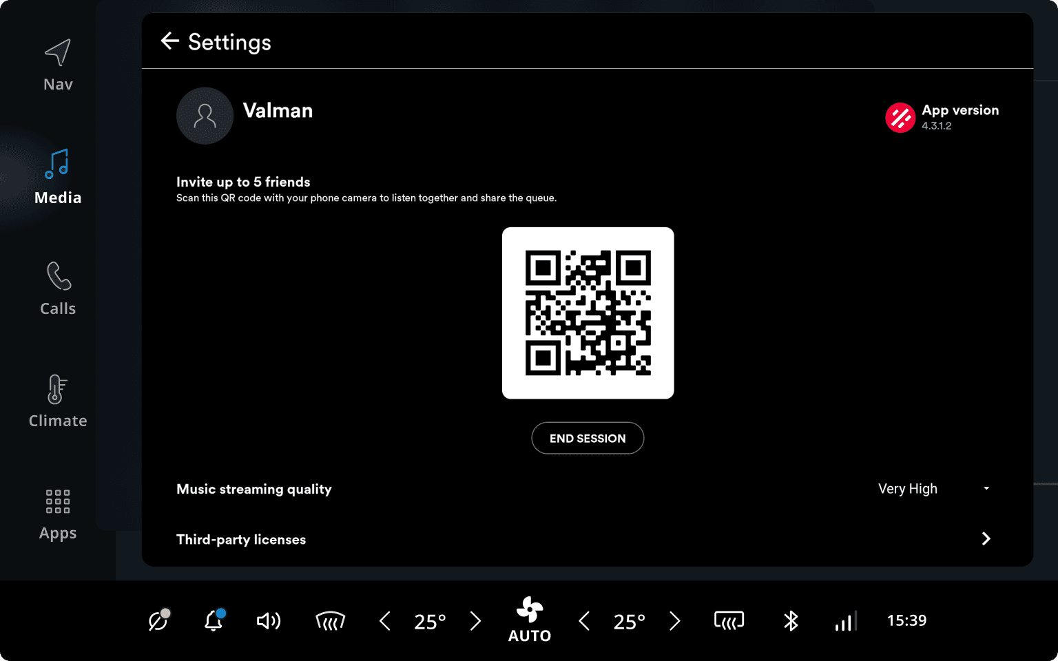
Source settings
Sources may provide custom user settings, accessible from the settings icon in the top right of the media browser. Similar to the source login, this UI is provided directly by the media source and presented (by default) inside a modal. As such, it can not be customized or styled.
Flow overview
To change sources, the user always has to navigate back to the dashboard. Playlists and the search view are displayed in sub-pages. Controlling playback is important, so it is available on every view and even on the TomTom Digital Cockpit home panel.
Customization
TomTom Digital Cockpit as a platform is modular, and applications can be replaced and customized as a result. That being said, at this point not all aspects of the media application are customizable or individually swappable. If something highly custom is required, replacing the entire application frontend is probably the best option. However, it will save a lot of time to stick with the stock media application and customize it to your needs.
| Component | Customizable |
|---|---|
| Theme | The Media App and Mini Player use the TomTom Digital Cockpit platform theming. This means all colors, dimensions, typography, etc. follow the system theme. |
| Source selector | Currently the source selector is not individually replacable or customizable, but given enough demand this can be offered. |
| Expanded Process Panel | Currently the Expanded Process Panel is not individually replacable or customizable, but given enough demand this can be offered. The content (controls, logo use) can be customized through the use of policies. |
| Main Process Panel | The Main Process Panel is displayed outside of the Media app. It can be removed by configuration. The layout itself can’t be changed. The content (controls, logo use) can be customized through the use of policies. The Main Process Panel can be changed by customizing the system UI. |
| Task Process Panel | The Task Process Panel is displayed inside of the Media app. It can be hidden by configuration. The layout itself can’t be changed. The content (controls, logo use) can be customized through the use of policies. The mini player (outside the media app) uses the Task Process Panel. |
| Source browser | The source browser (including search and playlist view) can be replaced as a whole on a per-source basis. This way a source can live within the media app but still offer a custom UI internally. |
| Errors and system feedback | The text and illustrations of different error toasts and empty states are customizable. When and how they occur however is not. |
| Sources | The data delivered by sources should typically be taken at face value, as writing a lot of source-specific code is hard to maintain. The behavior and appearance of a source can somewhat be customized (logos, custom controls, content, metadata) with the aforementioned policies. For media sources that are not third-party, the behavior and data structure can more freely be customized by changing the standalone application of that media source. |
| Settings and login | The source settings and login screens are not customizable, as they are directly offered by the source application. The way the view is shown (modal, full screen, etc.) is somewhat customizable. |