Typography
Important note:The TomTom Digital Cockpit SDK is not available for general use. Please contact us for more information.
Typography is used to make any writings in the UI legible and match the overall styling.
Typography system
The typography system offers predefined text styles to cover for the most common use cases in the interface. We define 24 styles that are based on a combination of the font size and weight. They are at the very core of the system.

Typography roles
- A set of those styles we assign to six roles that are named to describe their purpose: display, headline, title, label, body and overline.
- There are three variations for each of these roles: large, medium and small.
- Labels have an additional variant to cover active states: active large, active medium and active small.

| Role | Usage |
|---|---|
| Display | Display styles are used for the largest text on the screen. They are reserved for short, important text or numerals. |
| Headline | Headline styles are smaller than display styles. They are used for short, high-emphasis text on smaller components. |
| Title | Title styles are smaller than headline styles and should be used for shorter, medium-emphasis text. |
| Label | Label styles are used as text inside interactive components, such as buttons, tabs, segmented controls, etc. |
| Body | Body styles are used for longer paragraphs of text. |
| Overline | Overline styles are the smallest font sizes, always used in uppercase/capital letters. They are used to introduce a headline. |
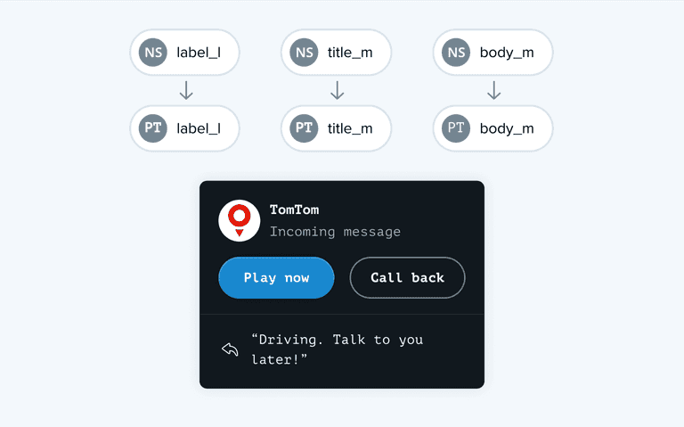
Applying these roles allows simple application in a wide range of use cases. This example uses the Noto Sans typeface for the labels, title, and body:

The typeface can be replaced by another one to achieve a different UI style:

To customize with your own typography, begin by mapping the typeface of your choice to the existing styles, matching font size and weight. This gives you the opportunity to define your own typography system as part of achieving the visual identity of the brand.
