Notifications
Important note:The TomTom Digital Cockpit SDK is not available for general use. Please contact us for more information.
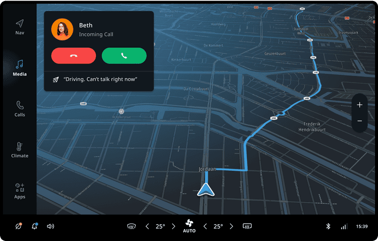
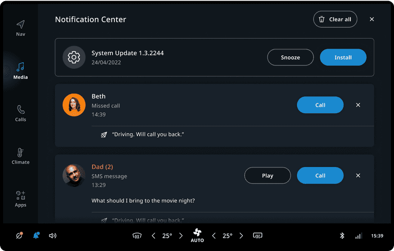
Notifications are pieces of information that are relevant to the user, but typically are not a direct result of user input. They may be presented on the top layer of the system UI as Heads-Up Notifications (HUNs) and/or in a centralized notification history of non-dismissed notifications (Notification Center). Most notifications (except for the voice assistant display cards) are configured using a UI template and a set of properties. A set of rules determines which notifications to show in which context. Through this interface, metadata such as the priority, can be passed to the system UI. The system UI uses this metadata to determine when and how to show the notification. For example, it may choose to suppress a low priority notification while a higher priority notification is active, to avoid distracting the driver. Notifications may be dismissed by the user through system UI functionality, like swiping it away.
Notification containers
The notification container manages the positioning, sorting, and animation of notifications as they come in and go out of view. By default, the heads-up notification container positions the notifications at the top on the driver’s side; the notification center container covers all the available screen space, except the main menu and control center. Multiple notifications can be shown simultaneously, but there are several mechanisms (notification priority, notification suppression, etc.) at work to prevent overwhelming the user with notifications.


Priority
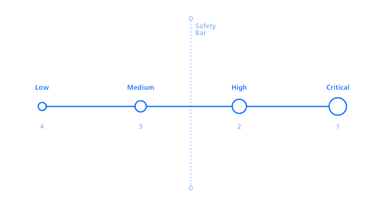
Notification sorting is determined by priority and chronology. Important notifications with High or Critical priority are always shown, even when interacting with the system or while Do not disturb is active. When notifications have the same priority, the newest one is shown first (until dismissed). However, when a higher priority notification comes in, it takes precedence.
Notification dismissal
Notifications can be configured to be dismissible or non-dismissible (also known as Sticky). Non-dismissible notifications cannot be dismissed by the user, but can be removed by the frontend that created it, or by the system UI. When there are at least two dismissible notifications both heads-up notification container and notification center container will give an option to the user to dismiss all dismissible notifications. For the heads-up notification container, a "Dismiss All" button is added as the last item. For the notification center container a "Dismiss All" button is present in the title bar at the top.
Notification suppression
The notification suppression is a platform mechanism that, when enabled, suppresses notifications with Medium and Low priority. The notification lock may be linked to a global toggle (for example Do not disturb) or automated contextually. By default, the notification suppression is enabled when the user has interacted with the screen in the last 5 seconds.

Anatomy
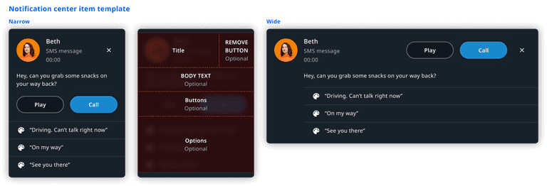
Most notifications follow the same template and can be built with a single configurable UI component. We strongly recommend to use the template for creating new notifications. It comprises a set of optional fields that can be combined to cover almost all use cases, and adapts to both narrow and wide containers. Furthermore, it shows the notification creation time when displayed in the notification center container. Finally, when shown in a wide notification center container, a close button is added to the notification. To adjust the template to suit a custom system UI, you can use custom fragment customization. The following images are examples of a possible structure.


Examples
Here are some examples of notifications that can be created using the notification template.

Customization
The notification list for both the heads-up notifications and in the notification center can be customized in terms of styling, positioning, and general appearance.
| Component | Customizable |
|---|---|
| Backdrop | The position, style and animation of the notification backdrop can be changed in the system UI. |
| Position | The position of the heads-up notification list and the notification center can be changed in the system UI. |
| Animation | The animations of the backdrop and individual notifications are customizable. The animation used for notification panels can depend on the transition source or destination. For example, notification panels can dismiss towards the bottom when transitioning to a process panel. |
| Theming | The styling of the notification content, container, and backdrop can be modified by changing the system theme. |
| Notification layout | The stock notification layout can be changed by applying custom fragment customization. It is also possible to create a notification panel with a completely custom layout. |
| Non-dismissible notification background | The background for non-dismissible notifications can be changed. |
| Notification content | Notifications can be populated by applications/plugins in any way. However, the notifications created by existing applications (for example, the communication app) currently cannot be modified. |
| Notification data model | The notification data model cannot be modified or extended at the moment, because existing applications rely on the current data being available. |
| Notification filtering and sorting | The system can implement a custom filtering and sorting mechanism to determine which notifications should be visible. However, the main way to know the urgency of a notification is limited to its priority (Low, Medium, High, Critical). |
| Communication notifications | Limited customization options exist for communication notifications. It is possible to add more than one quick reply option (OEM), and for the user to change the text of the quick reply message. |
| Dismissal behaviour | It is also possible to change the dismissal behaviour in a custom System UI. For example, replace the swipe-to-dismiss gesture with another mechanism. |
In addition, the notification center container has further customizations.
| Component | Customizable |
|---|---|
| Header layout | The layout of the header of the notification center containing the title, the dismiss all button, and the close button can be customized. |
| Empty state layout | The layout that is shown in the notification center when there are no notifications which can be changed. |
| Enter and exit animations | The enter and exit animations for switching between the heads-up notification list and notification center can be changed. |