Empty State View
Important note:The TomTom Digital Cockpit SDK is not available for general use. Please contact us for more information.
Empty State View informs users that the expected content will not be displayed.
The control is usually shown when an error or the status blocks the regular flow of the experience, and when there is no content or the content is not relevant anymore. It tells the users what happened and how the situation may be resolved.
Anatomy
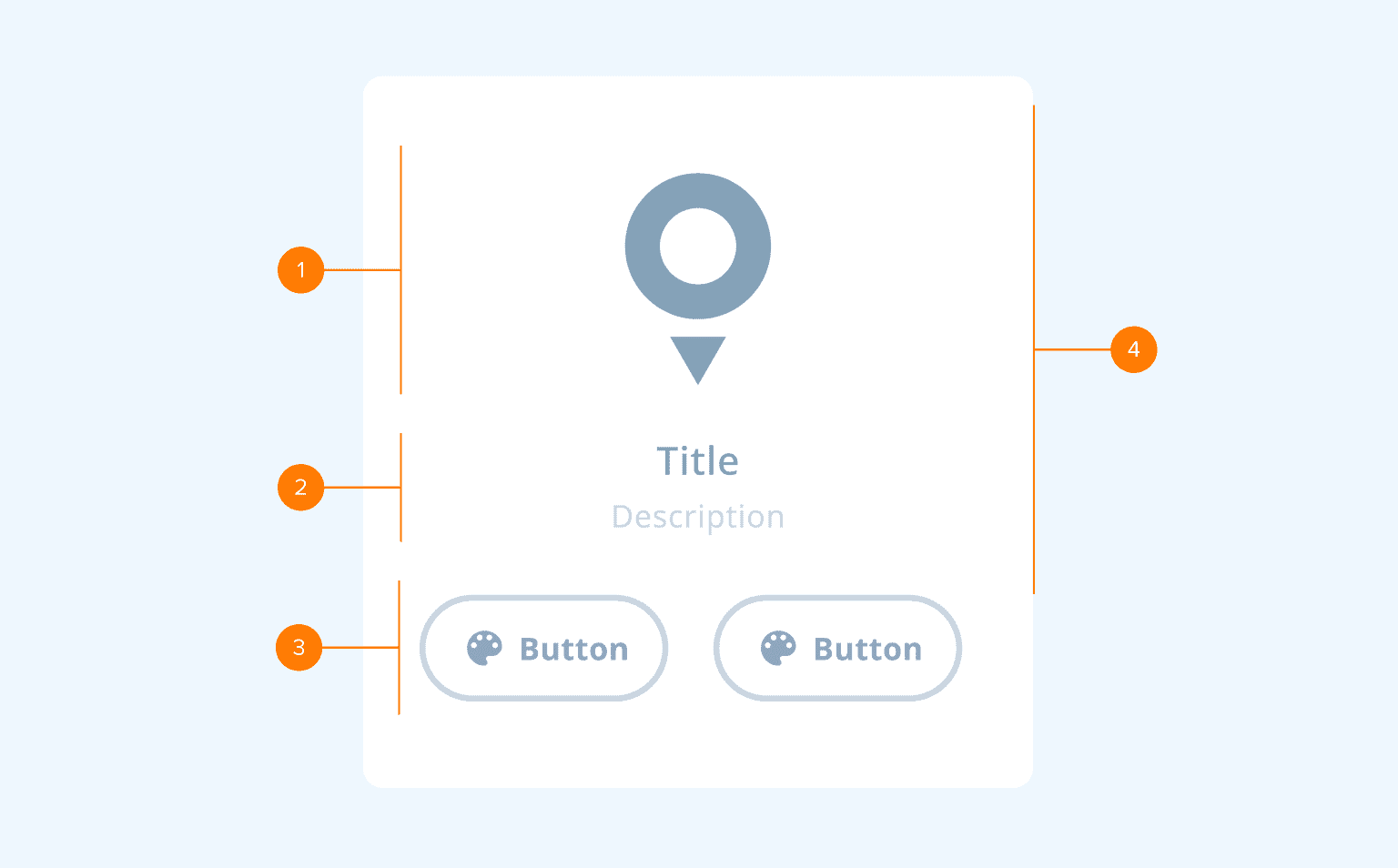
- Graphics section: This section is used to provide more context with a visual cue and create a more delightful experience. It features a graphic element (illustration).
- Text section: This section informs users that there is either no content to display or the reason for the error that occurred. It features two text fields: title (main message) and description (extra information or helpful text).
- Actions section: This section is used when an empty state or an error state requires action from a user. It features two buttons (Primary and Secondary), whose visibility can be configured.
- Scroll view: The graphics and text sections are placed inside a Scroll View and are scrolled together if the Empty State View does not fully fit within the viewport.
Usage
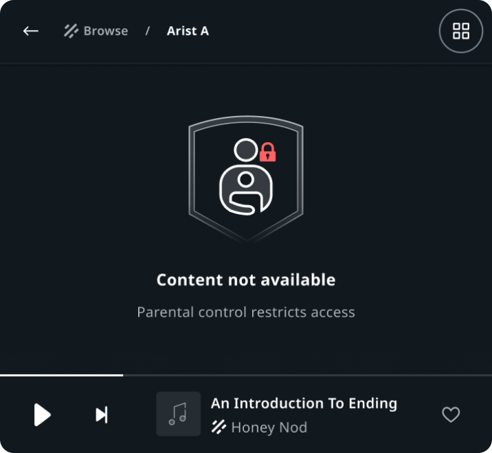
Artist view in Entertainment
"Content not available" empty state.
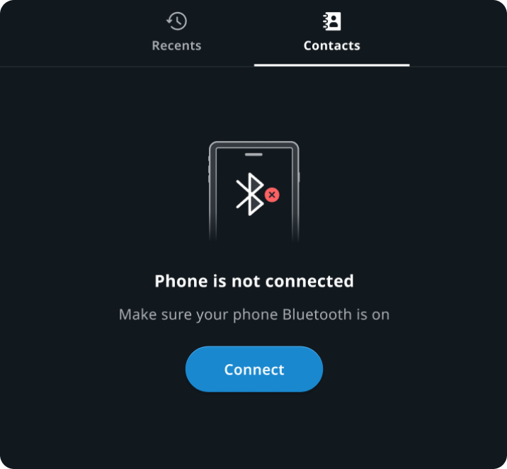
Contacts in Communication
"Phone is not connected" empty state.
Customization
| Type | Customizable |
|---|---|
| Theming | The sizing of the graphics, text, margins and paddings can be adjusted. Additionally, it is possible to change the styling of the text and buttons. |
| Configurations | Different combinations of available sections (graphics, text and actions) are supported. |
| Content | The text can be changed and icons can be replaced. |