Information Control
Important note:The TomTom Digital Cockpit SDK is not available for general use. Please contact us for more information.
Information Control is a control composed of different elements (e.g., text, icons, etc.) to present various types of information in a view.
The control is primarily used as a list item and appears in different places across the system, like lists, contacts, etc.
Anatomy

- Container: The background of the Information Control. It includes a background color property.
- Head section: This section is used to provide more context with a visual cue and creates a more delightful experience. It features the main graphic element (image or icon) of the Information Control.
- Main section: This section is used to display data. It features multiple text fields and a rating bar.
- Tail section: This section is used for additional elements (icon or label) to provide more context or emphasize the action.
Head section
The head section can be configured to one of the four predefined graphics styles:
- Artwork: Squarish image used primarily for media artworks.
- Avatar: Circular image mainly used for avatars (for example, contacts).
- Icon: Icon that is always tinted with the color of the primary text line.
- Default: Icon that is shown as the original given asset.

Main section
The main section can display up to three text lines and a rating bar as the last row. Each text line can be a multiline and optionally feature an icon which, for example, can be used to emphasize the source of data shown. The rating bar features five icons by default (which can be configured), and a dedicated label to indicate the rating provider.

Tail section
The tail section supports different configurations of the label and icon. They can be used to display extra information (for example, distance, unit), emphasize an action (for example, "next →") or indicate the source of the shown data (for example, brand logo).
Usage
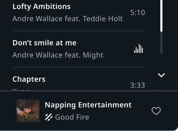
Playlist view in Entertainment
"Napping Entertainment" currently playing media item and a list of playlist songs.
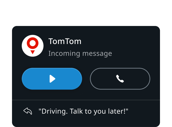
Incoming message notification
Notification header and "Driving. Talk to you later!" quick reply.
Customization
| Type | Customizable |
|---|---|
| Theming | The graphics, text, margins, and padding sizing can be adjusted. Additionally, changing the styling of the container, text, tintable icons, and rating bar is possible. |
| Configurations | Different combinations of available sections (head, main, and tail) are supported. |
| Content | The labels can be changed and assets can be replaced (unless coming from a third-party service). |