Colors
Important note:The TomTom Digital Cockpit SDK is not available for general use. Please contact us for more information.
Colors in the user interface help to create a hierarchy of information, to meet legibility and contrast standards, and assign the correct meaning to UI elements.
Color system
At the core of the color system is the color palette, a set of colors and tones used in a design language. For every color in the palette (base color) there are eight additional tones (100 - 900) generated that differ in the amount of light present in the color. Tone 100 is the lightest tone in the range, tone 900 is the darkest tone in the range.
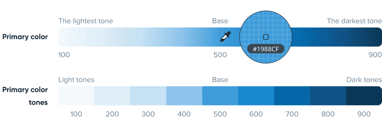
You can see TomTom Digital Cockpit’s color palette in the following image:
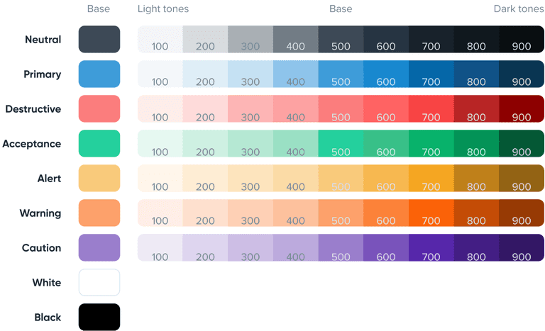
Black and white are part of our color system, but they do not have a tonal palette.
Color Roles
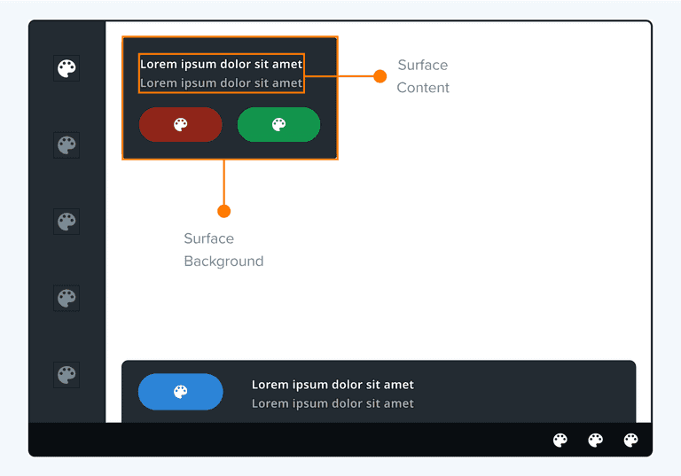
A selection of base colors and tones from the color palette forms a color group that is assigned to UI elements sharing the same role in the interface (for example, primary color assigned to primary button). A color group consists of a background color and content colors.
The content colors are assigned to anything that goes on top of the background. We differentiate between the different levels of emphasis that determine the contrast to the background.
Color groups
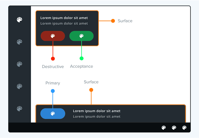
Which color group to use depends on the intended role of the UI element.
| Group | Usage |
|---|---|
| Surface | Contained areas such as panels, notifications, process bar, VPA, etc. |
| Primary | Primary actions such as primary buttons. |
| Secondary | Secondary actions such as secondary buttons. |
| Destructive | Critical events that require immediate action, such as confirming a deleting action. |
| Acceptance | Positive events that require immediate action, such as accepting an incoming call. |
Background and Content Colors
Background colors within a color group are only used for the background of the specific UI component.
Content colors are used for elements that appear on top of the background, such as text or icons. Different emphasis levels help to create a hierarchy of UI elements that go on top of a background.
Emphasis levels
The fewer elements you have on a page, the easier it is to understand what you intend to communicate. As more elements are added to our designs, it becomes difficult for the eye to distinguish what to focus on first. There’s a need to introduce a visual hierarchy and to structure the content.
Important elements should stand out the most; the contrast between the colors helps to define the relationship. Elements with the highest emphasis have the most contrast with the background and are more visible than subdued elements.
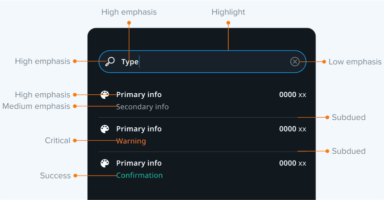
After you’ve considered what should stand out and what should be muted, you can use any of the following methods to create emphasis:
| Role | Usage |
|---|---|
| High, medium and low emphasis | High emphasis commands the most attention. High emphasis elements are accompanied by medium and low emphasis elements that perform less important actions. |
| Subdued | Subdued state communicates when a component or element isn’t interactive, and should be de-emphasised in a UI, such as dividers. |
| Highlight | Highlight state communicates when a user has highlighted an element. It is usually accompanied by another color (usually accent), such as focused search view. |
| Accent | Accent color is used to indicate that some action is needed from the user, usually in combination with highlight color, such as the active state in a search view. |
| Critical and success | Critical and success states indicate errors or successful actions in components, such as an error message in a text field. |
| Alert, warning, and caution | Alert, warning, and caution are used to raise the user’s attention, for example, traffic in an ETA. |
Theming and customisation
Dark and Light Theme
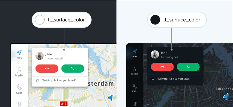
Design tokens currently support two color themes: light and dark. The same design token maps to a different value for each theme, so their appearance differs depending on which theme is being used. The color of the surface will determine whether the UI is light or dark.
Customization
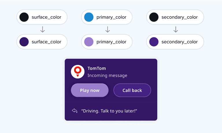
TomTom Digital Cockpit provides a color system that defines and differentiates the product, while giving more control over the styles that matter the most to you. The app's colors adjust automatically and help define and maintain styles that convey your brand. By changing the color token value, customers can create their own theming, aligned with their color system.
