Search View
Important note:The TomTom Digital Cockpit SDK is not available for general use. Please contact us for more information.
Search View is a control that lets users search a collection of content for specific terms they enter.
Anatomy

- Container: The background of the Search View. It includes a background color, stroke width and style, radius, and elevation properties.
- Lead icon: The main graphical element that indicates the state of the Search View (for example, initiate a search, search is disabled) or search type (for example, search within an app).
- Text: Text that indicates the state of the Search View (for example, search, typing) or shows the user input.
- Loader: An animated icon shown while the search results are being loaded.
- Clear input field: Action to clear the search input.
Triggering search
By default, the Search View is displayed in an "inactive" state (see the next paragraph), and the search experience can be activated by tapping it. If the search box is only represented by an icon, it expands so that users can enter text. Additionally, the search trigger can be displayed with the Button control, tapping on which opens the search view.

States
The Search View supports multiple states to indicate its status:

| State | About |
|---|---|
| Inactive | The default state of the Search View before the user starts interacting with it. Tapping on the whole area activates the search experience. |
| Disabled | A state when searching by typing is not possible at the moment (for example, due to safety reasons). Then the icon changes to indicate the disabled state, and the text field states the reason. |
| Active | A state to indicate the start of the search experience - the search box becomes highlighted and the type cursor is shown in front of the label. |
| Typing | A state when the user starts typing - the text’s style changes. |
| Searching | A state that indicates the search activity. |
| Results | A state to indicate the finished search query. The search box style changes back to normal. |
Usage
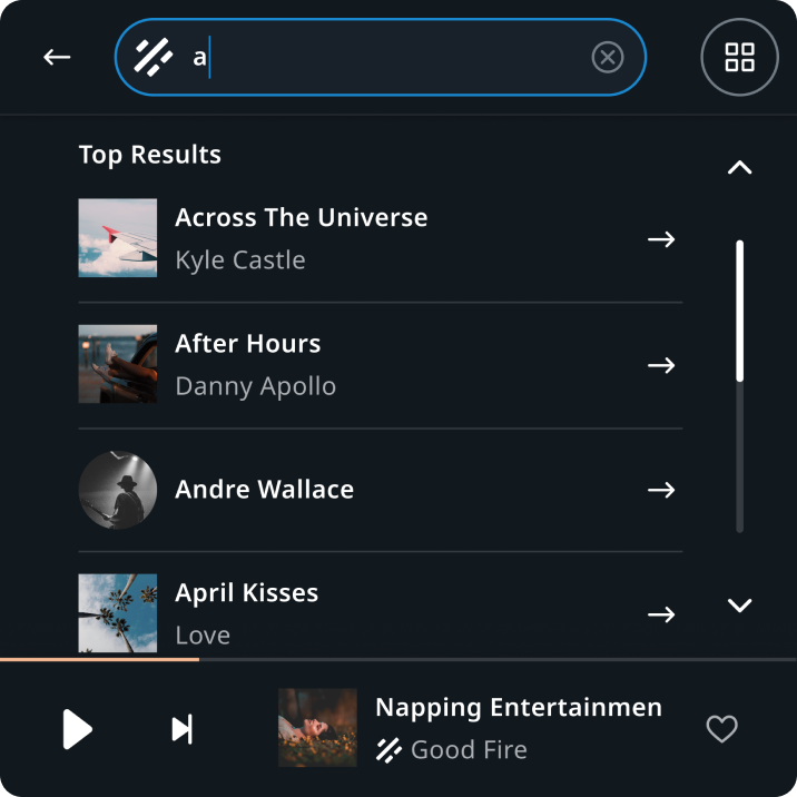
Search in Entertainment
Search in a media source
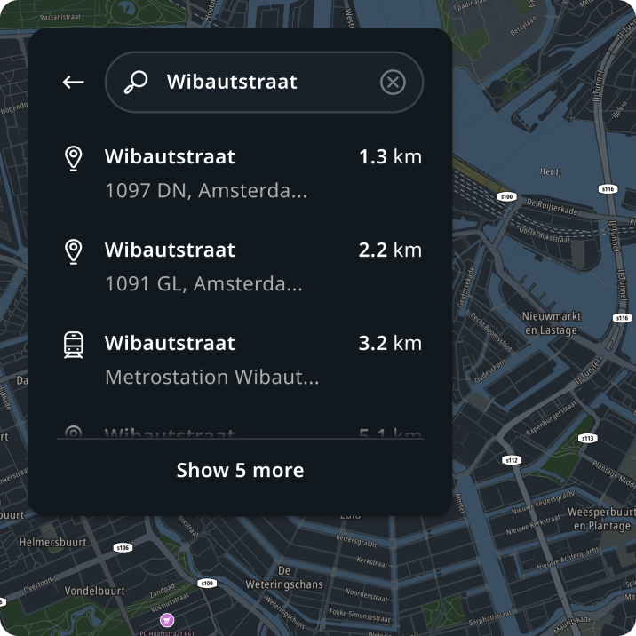
Search in Navigation
Location search
Customization
| Type | Customizable |
|---|---|
| Theming | The sizing of the container, text, margins, and paddings can be adjusted. Additionally, it is possible to change the styling of the container (background, border, and elevation), text, type indicator, and icons. |
| Configurations | Normal and minimized Search Views are supported. Icons can be configured. |
| Content | The labels can be changed and icons can be replaced (unless they are non-customizable map assets or coming from a third-party service). |
Step 1. Update generic search view style
Customize search view height, paddings, and icon sizes. Sizing, spacings, and radius attributes offer a variety of options to choose from. Select the ones that best convey the look and feel of your brand. The following example shows different applied sizing and spacing attributes.
Customize search view label styles. Search view labels are assigned to the "label" display text style generally used inside the interactive component. The following example illustrates how the label can look when changing the "label" display text style.
Also see: Foundations Typography. We advise customizing the type system first.
Creating custom text styles in UI Controls can potentially lead to unwanted inconsistencies.

Step 2. Theme search view states
The search view is shown on top of different surfaces in the UI, and therefore this group's colors are applied to its content. Change the background fill and border styles.
Also see: Foundations Colors. We advise customizing the color system first (global and system styles) before doing any component-level customizations.
Using colors outside of the color palette can potentially lead to unwanted inconsistencies.

Step 3. Local customizations
Customize the search view appearance in different panels and layouts, choose configurations to display, and change assets.
Choose the configurations. By default, the "icon+label" configuration is used in panels, and the “icon” configuration (tertiary button style) is used in headers. The "icon" configuration can also be used when the screen has insufficient space for other search view types. However, you can select the most fitting configuration in each use case and define the width of the search box.

Customize the assets. The "magnifying glass" icon is the default in search views. However, it can be configured to indicate the search within a category (e.g., POI category), voice input with a microphone icon, etc. In addition, it can be configured to provide a more branded search experience using a logo (e.g., searching within a source of the media app).
