UI Controls
Important note:The TomTom Digital Cockpit SDK is not available for general use. Please contact us for more information.
UI Controls are one of the key building blocks of our design system. They have been created to solve specific UI problems and support a variety of applications. The systematic reuse of the UI Controls helps to create visual and functional consistency across the user interface.
Each control offers a set of customization properties that can help you achieve the look and feel of your brand.
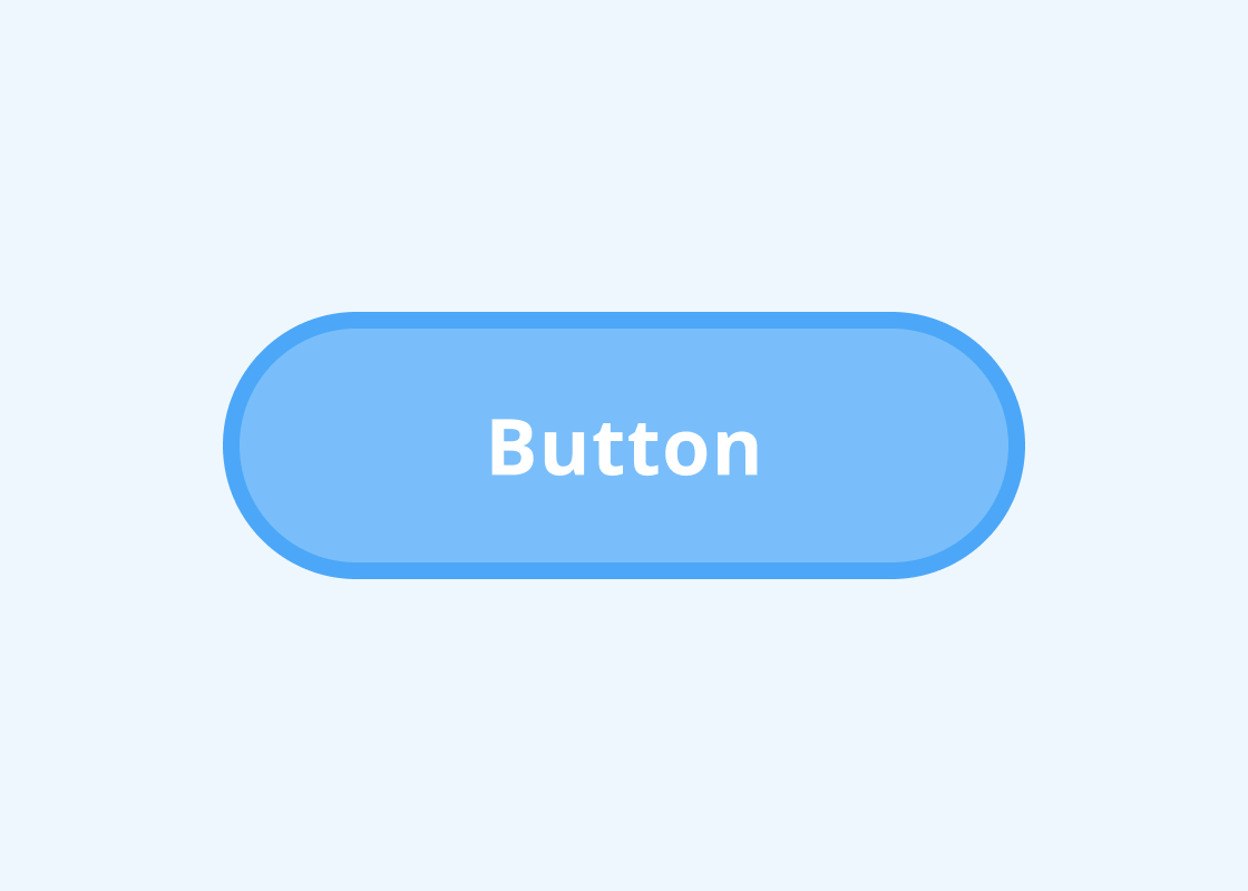
Button
An interactive element that communicates the action a user can take.
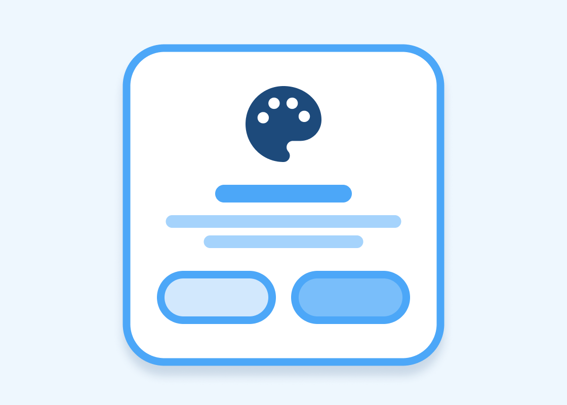
Empty State View
A screen that is not yet populated with data or information.
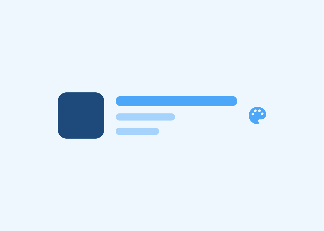
Information Control
The content displayed as text lines with optional small images or icons.
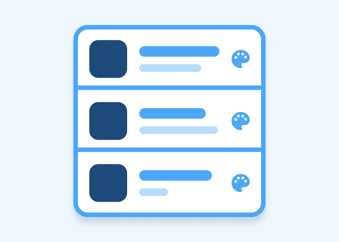
List
The information displayed or organized in a logical or linear formation
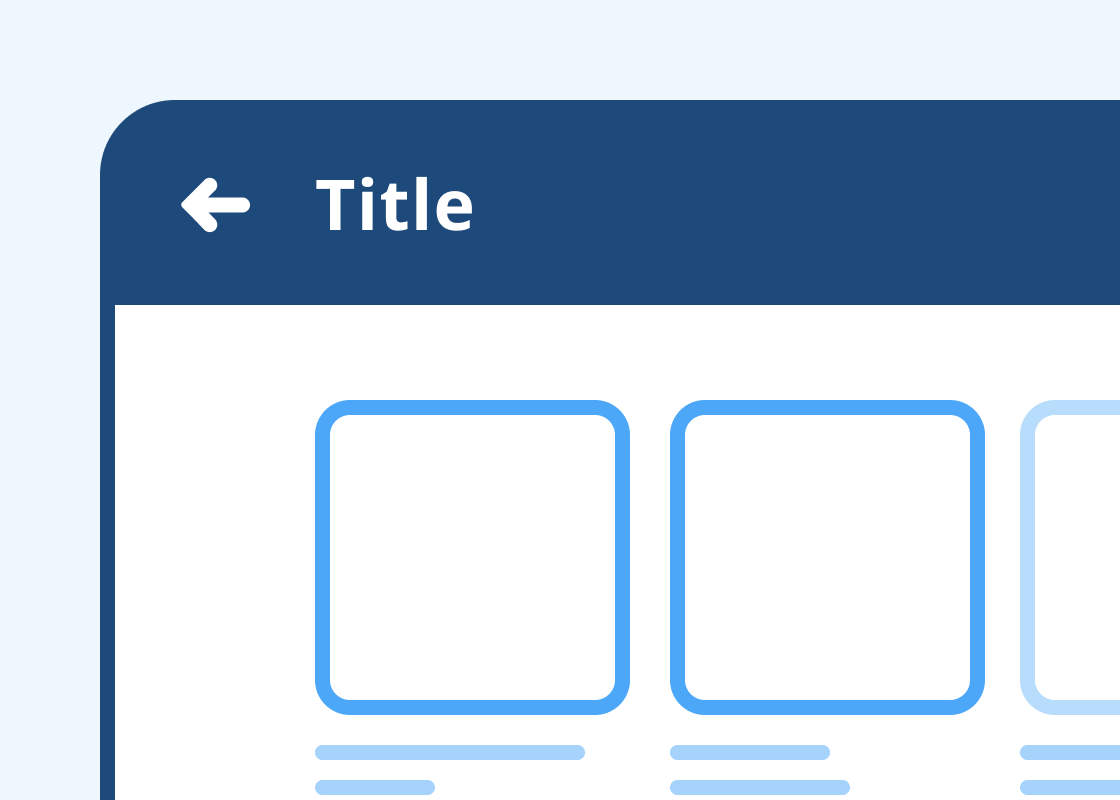
Navigation Bar
An interactive bar that aids users in accessing information in applications.
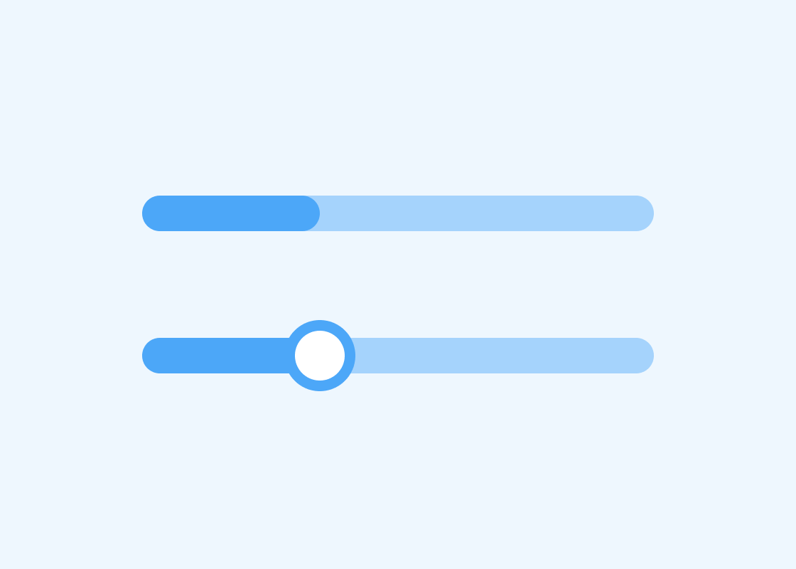
Progress & Seek Bar
A visual representation of the status of ongoing processes.
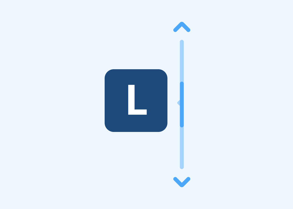
Scroll Bar
Interactive bar that indicates a user location on a page that is larger than the viewing space.
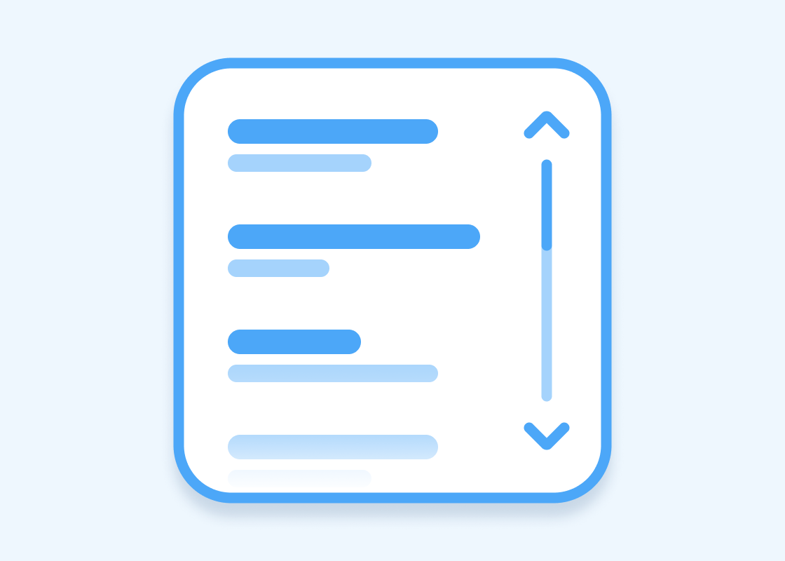
Scroll View
Container that displays its content within the scrollable content region.
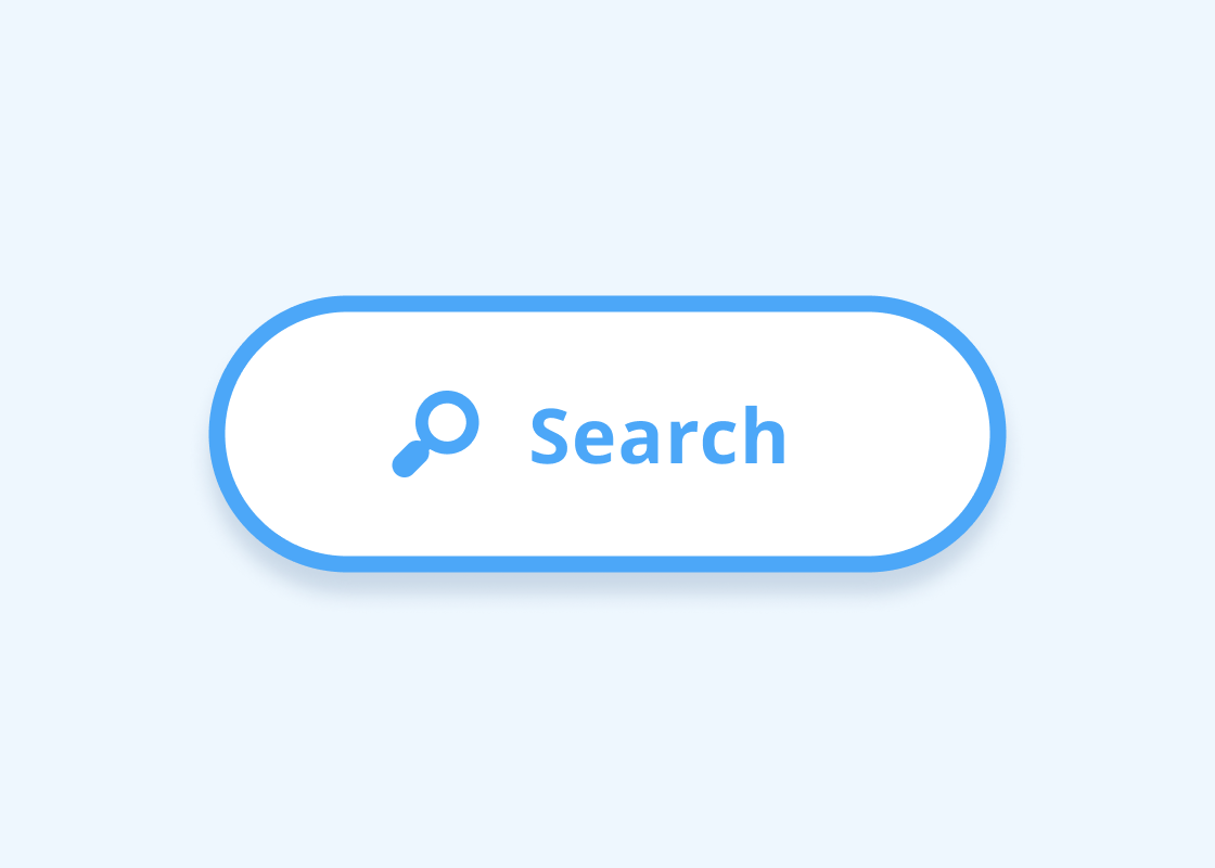
Search View
A graphical control element that is used to carry out search operations by a user
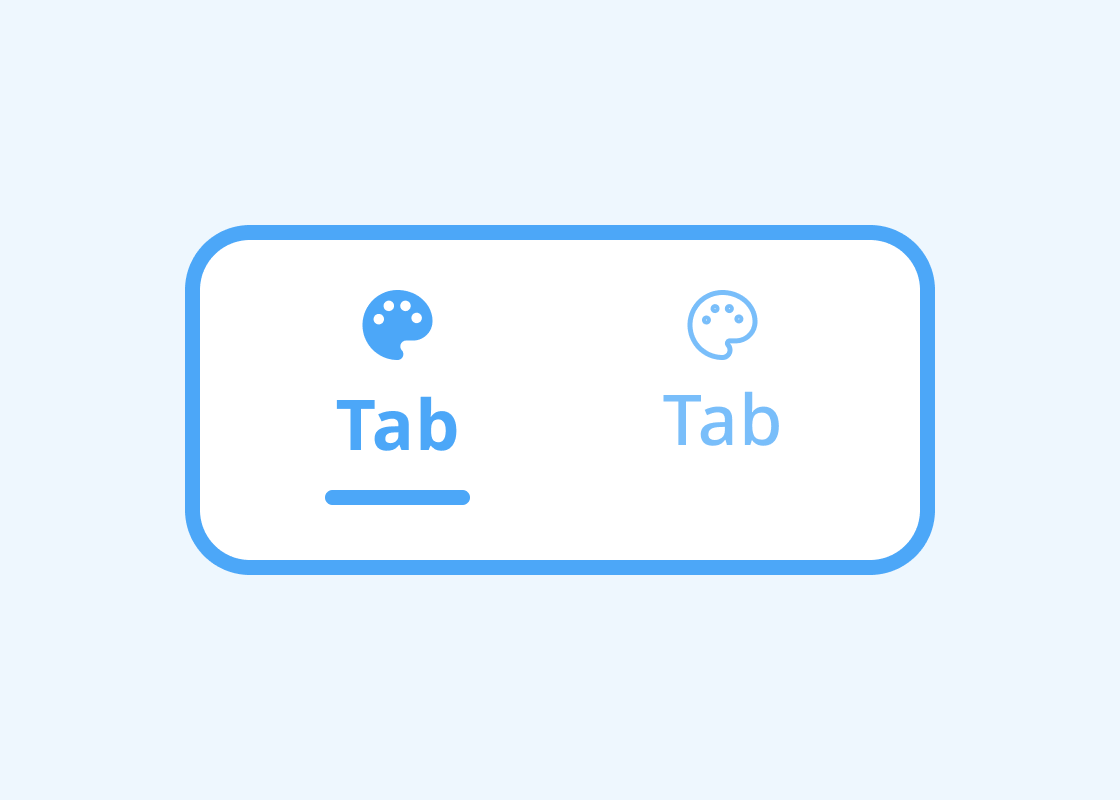
Tab Bar
A set of shortcuts that allows navigating between content at the same level of the hierarchy.
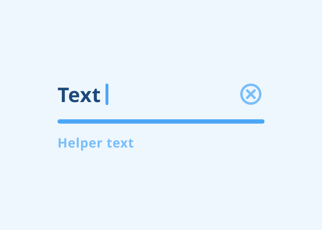
Text Input Field
An interactive control that lets users enter text required to use the service.