Design tokens
Important note:The TomTom Digital Cockpit SDK is not available for general use. Please contact us for more information.
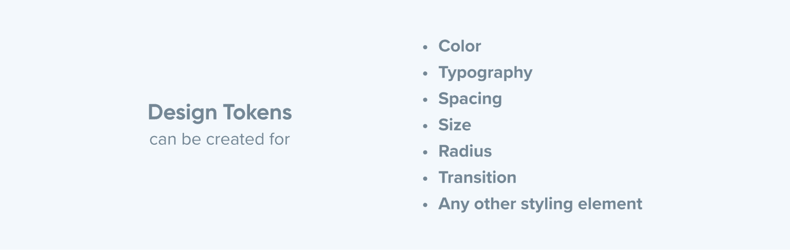
Design tokens represent style values such as colors, typography, sizing, spacing, radiuses, etc. Design tokens replace static values, such as hex codes for color, with self-explanatory names.
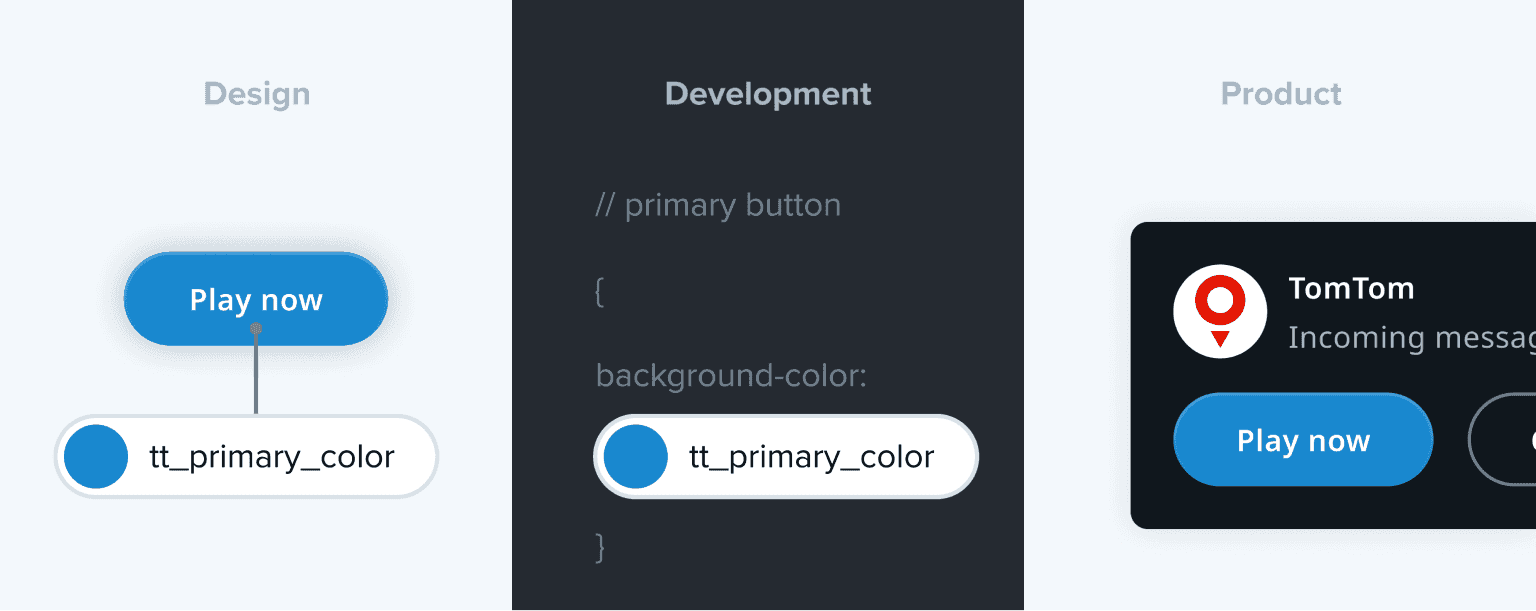
Design tokens secure that style values are shared across design and code (implemented as resource attributes in Android). They enable the creation of a consistent user interface, and make it easy to update or change style values at scale. They build the core of TomTom Digital Cockpit’s theming capabilities.
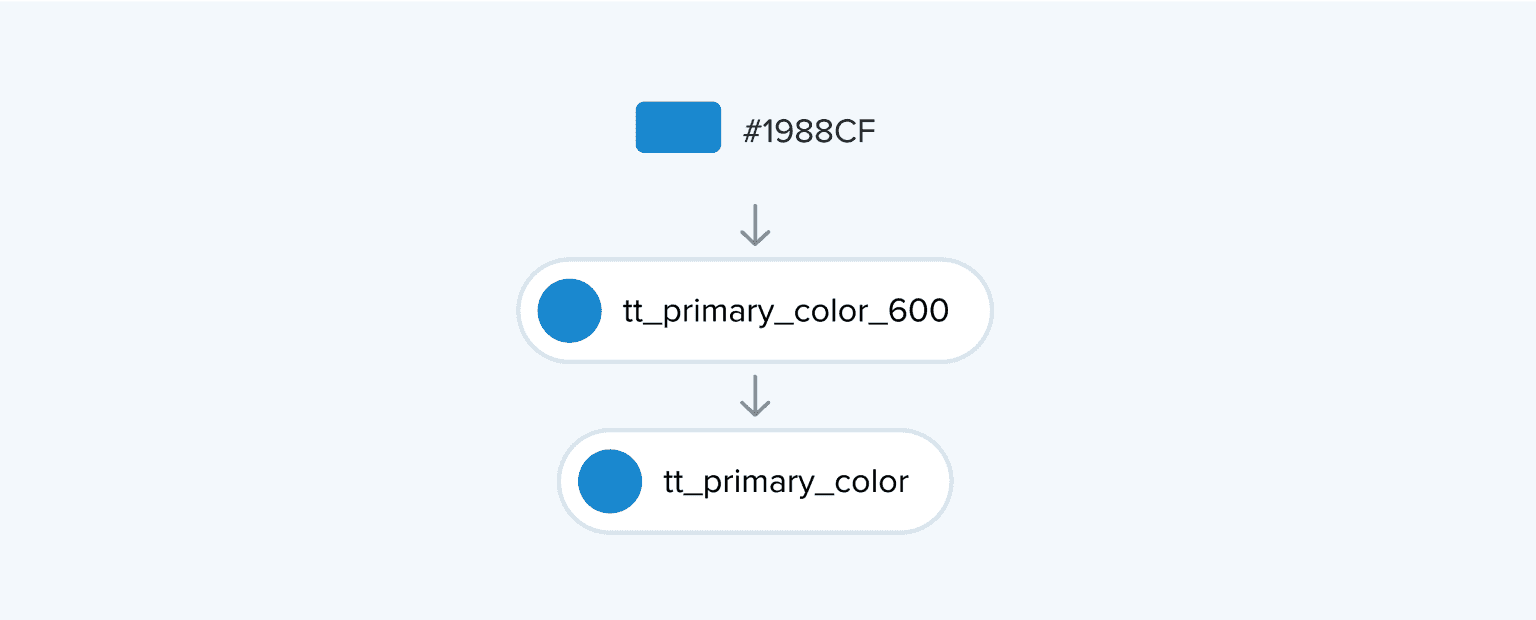
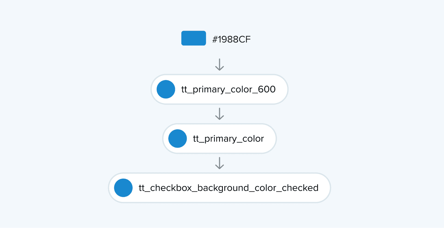
For example, a designer's mock-ups and an engineer's implementation should both reference the same token, called for example primary color to make sure the design and implementation are aligned. The token enables consistent usage of the primary color across the UI and replaces the hard-coded values.
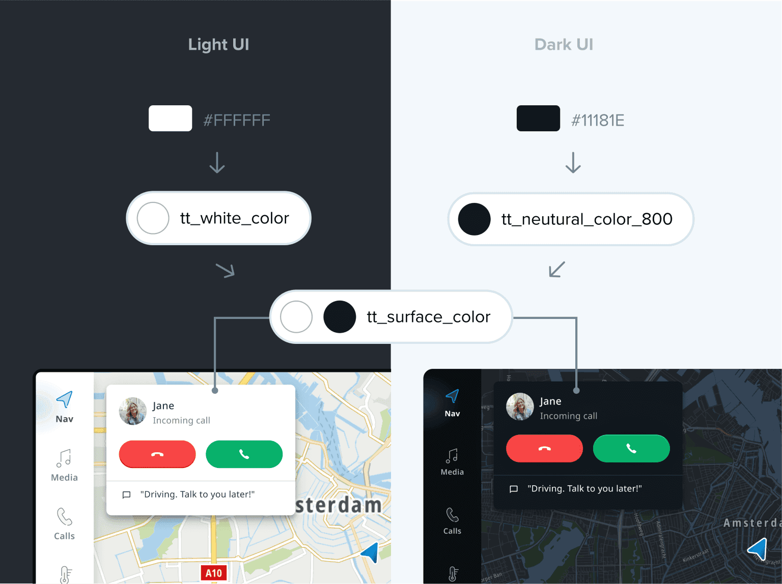
A different UI styling can be achieved by simply replacing the token values:
Token types
TomTom Digital Cockpit has a 3-tier structure: global, system, and component tokens. The global tokens refer to primitive style values, the system tokens refer to these global tokens, and component tokens refer mainly to system tokens:
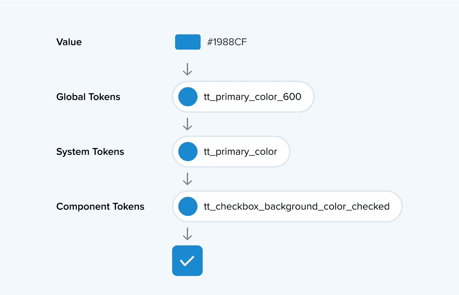
Global tokens
A global token defines a primitive value in our design system. This can be directly used, but mainly is inherited by the system and component tokens. When the value of a global token is updated, all the connected system and component level tokens are updated as well.

System tokens
A system token represents the role and intent of a styling value in the UI, and should refer to a global token. For example, When applying a color theme, the system token refers to another global color token, depending on the context.
Component tokens
The component level allows customizing every aspect of individual components, apart from the rest of the UI. The component tokens often refer to global, but mainly to system level tokens. Their names are very specific to the component element that is targeted.
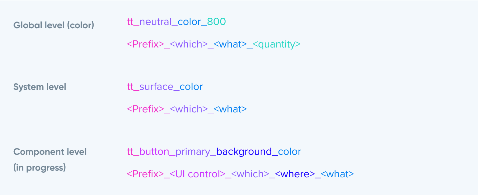
Token naming convention
A design token’s name describes how it should be used, and each part communicates one piece of its usage. The naming helps us understand how to assign tokens when we create the interface, but also how to update the value of a token when we want to customize the interface.

| Field | Description |
|---|---|
| prefix | Represents the design system and/or company name (for example, tt for the TomTom Design System). |
| UI control | Defines the UI control. |
| which | Represents the role of the primitive in the UI (for example, on the surface). |
| where | Optional - Determines the place where it is used (for example, used as content on top of a surface). |
| state | Optional - Determines the state of the place where it is used (for example, a selected state). |
| what | Refers to a specific token type (for example, a color token). |
| quality | Optional - Represents the type of what (for example, a highlight color). |
| quantity | Optional - Determines the level of quality (for example, a high/medium/low emphasis). |
Examples