Text Input Field
Important note:The TomTom Digital Cockpit SDK is not available for general use. Please contact us for more information.
Text Input Field lets users enter and edit text.
Anatomy

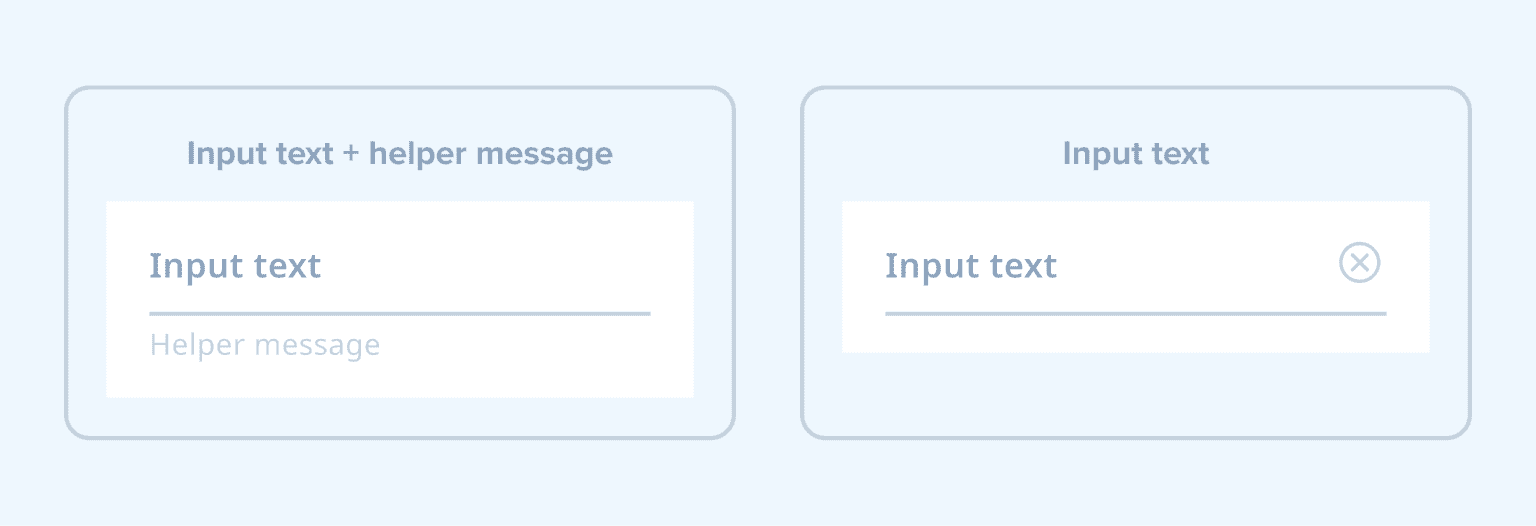
- Input text: Text that shows the user input, or a hint for required information when nothing has been entered yet.
- Helper message: Text that provides more context for required user input, or information about an error that occurred and how to resolve it.
- Trailing icon: Action to clear the input field.
- Activation indicator: A line that indicates the active state of the text field.
The Text Input Field supports the following configurations:
States
The Text Input Field supports multiple states to indicate its status:
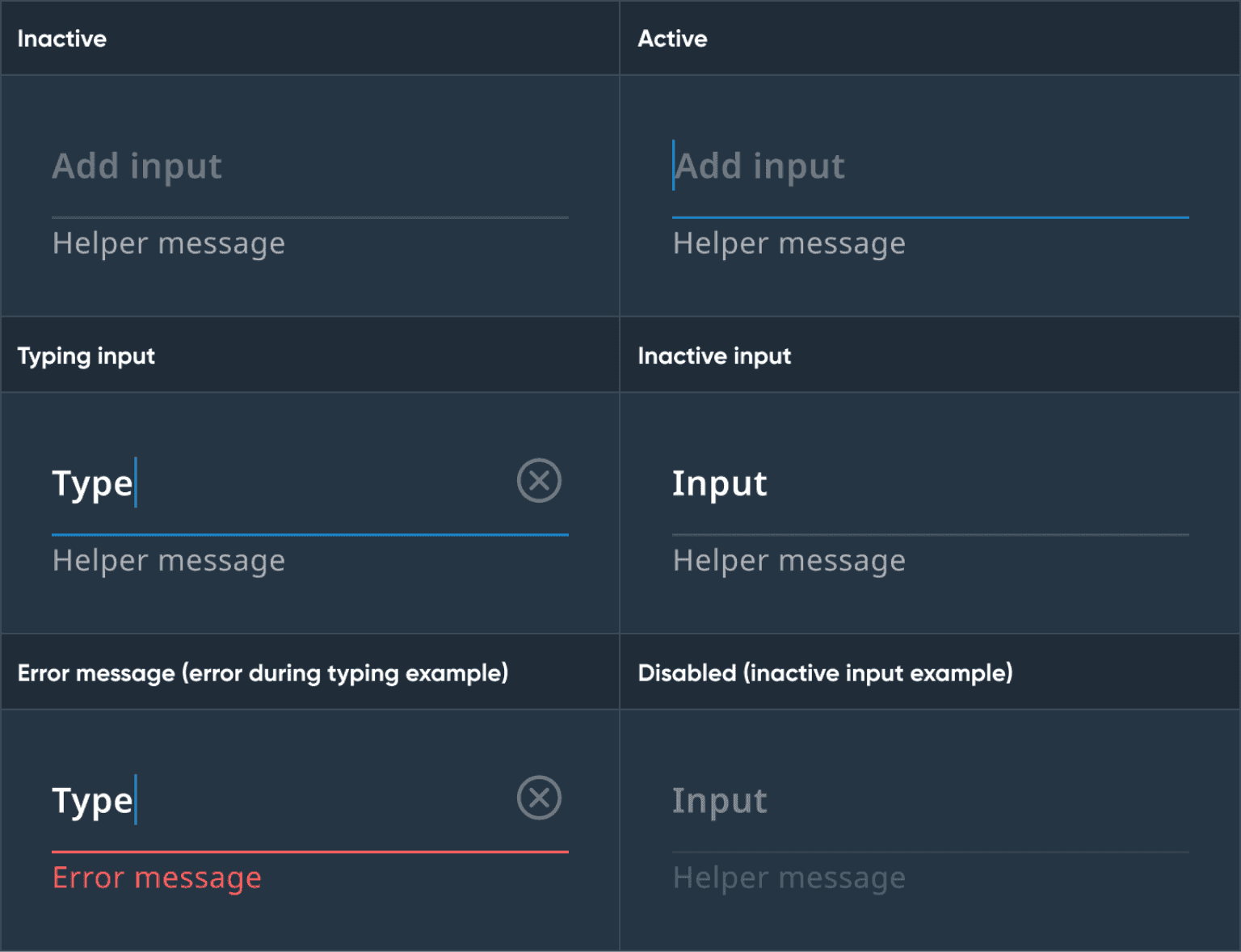
| State | About |
|---|---|
| Inactive | An empty state of the input field. It is shown when a user has not provided any input, there was no predefined input, or the input text has been cleared. The label shows the intended action. |
| Active | A state when the user starts interacting with the empty or cleared input field. The activation indicator becomes highlighted, the type cursor is shown before the label, and the "clear" icon is shown at the end of the input field text. |
| Typing input | A state when the user starts typing. The input text style changes. |
| Inactive input | A state to indicate the finished input query. The style of the activation indicator changes back to normal. |
| Error message | A state that indicates the error state when the input provided was incorrect or missing. The assistive text describes the current problem and turns red along with the activation indicator. |
| Disabled | A state when typing isn’t possible at the moment (for example, due to safety reasons). |
Usage
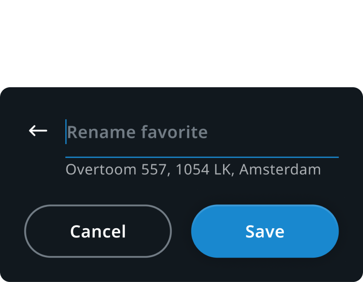
Favorites panel in Navigation
Renaming the saved location
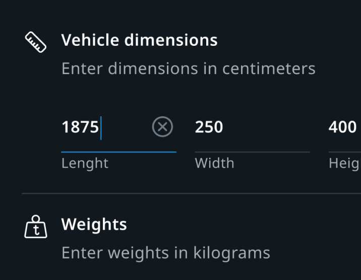
Vehicle settings in Navigation
Adjusting vehicle parameters
Customization
| Type | Customizable |
|---|---|
| Theming | The sizing of the text, activation indicator (height), trailing icon, margins, and paddings can be adjusted. Additionally, it’s possible to change the styling of the text, activation indicator, and trailing icon. |
| Configurations | The visibility of the helper message can be configured. |
| Content | The hint, helper message, and error message text can be changed. Also, the trailing icon can be replaced. |