Designing Experiences for Drivers
Important note:The TomTom Digital Cockpit SDK is not available for general use. Please contact us for more information.
TomTom has done extensive research on how drivers interact with vehicle infotainment systems. Here are some best practices that designers should know when designing for drivers.
Easy to interpret UI
The UI presented to drivers should be easy to interpret, to ensure drivers keep their eyes on the road.
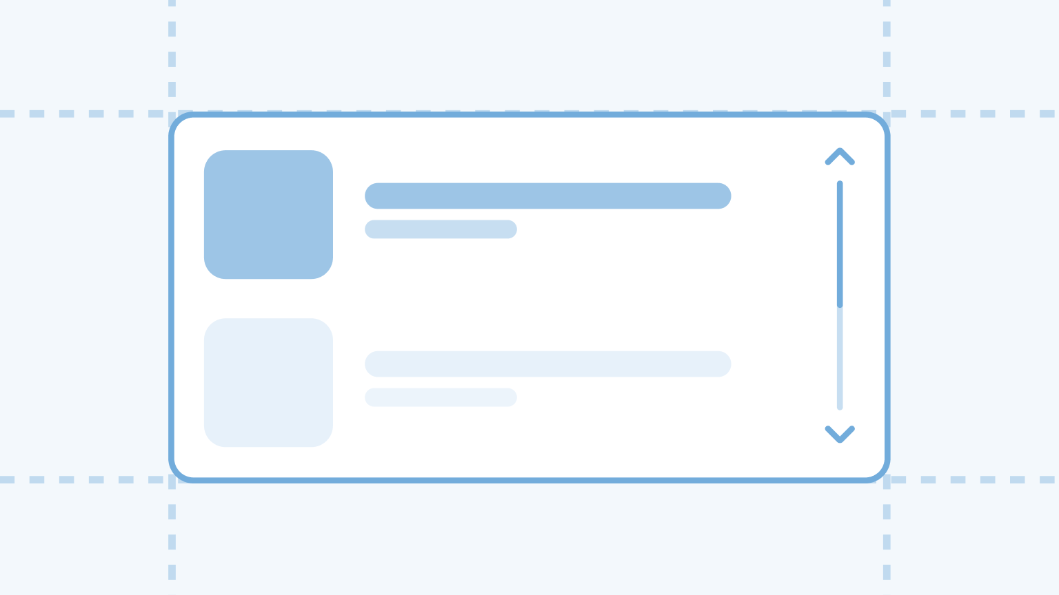
Screen position: reachability & glanceability
Consider the size and position of the display(s) in the car for reachability and glanceability.
Feedback of processes
Feedback should be obvious, so drivers need less time to understand the status of the system.
Follow standards
Following standards helps drivers to quickly understand how to use the system.
Disable distracting features while driving
Features that are not intended for use while driving should be disabled, to prevent distraction.
Reduce the time to complete tasks
Consider the number of inputs and whether inputs are interruptible.
Easy to interpret UI
The UI presented to drivers should be easy to interpret, to ensure drivers keep their eyes on the road for as much time as possible.
Factors that play a role in a scannable UI are the size, the contrast, the layout, and the amount of information presented on the screen.
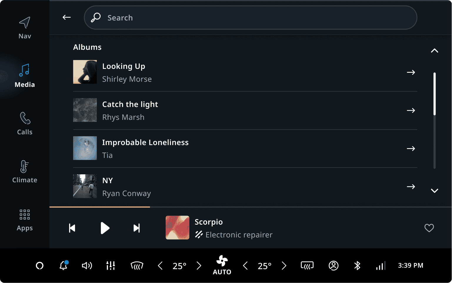
Example: Through evaluative research, we learned that drivers can feel overwhelmed by the content if there is too much album art displayed on the screen.
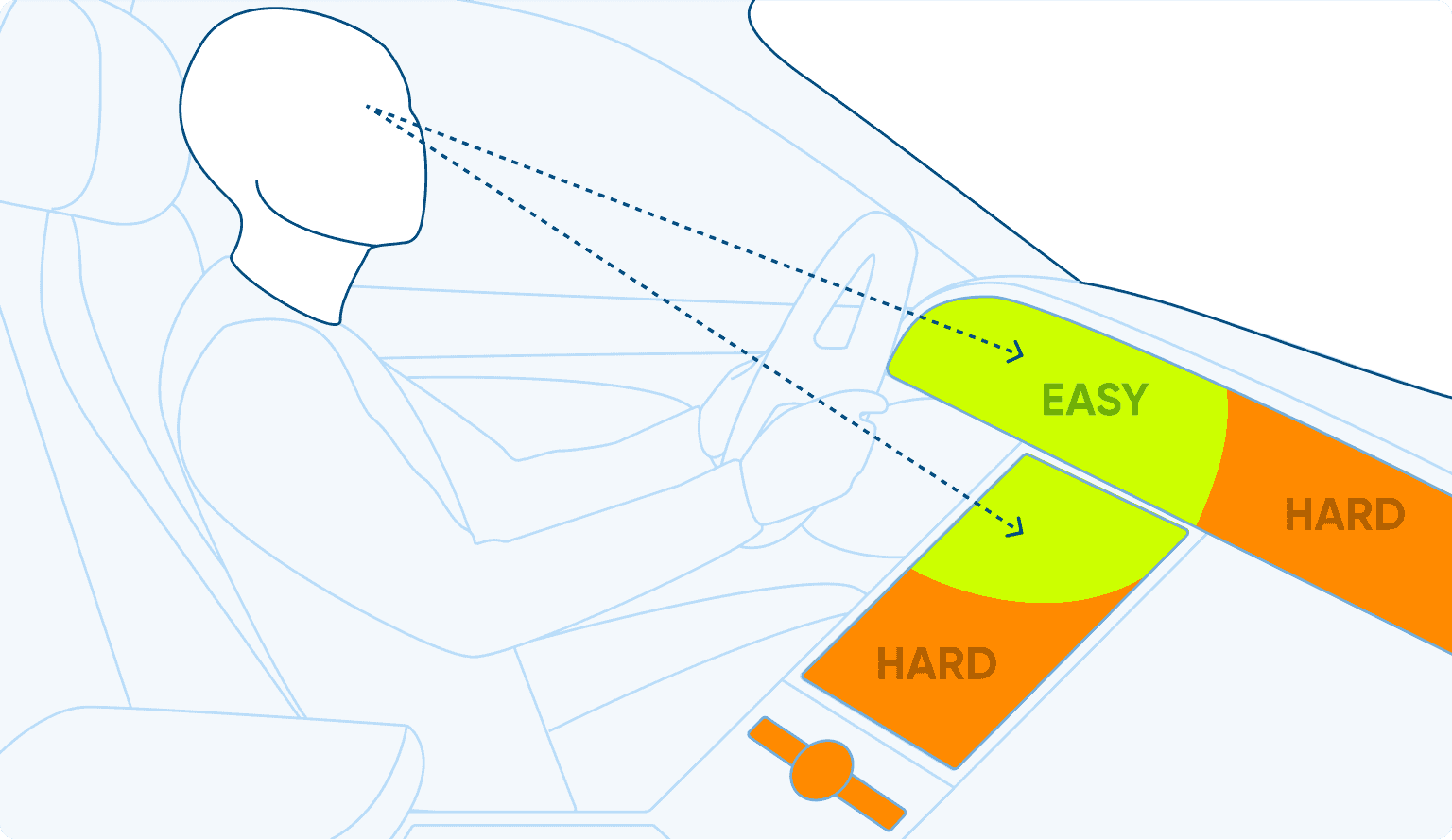
Screen position: reachability and glanceability
Consider the size and position of the display(s) in the car to distribute information over the screen(s). Items that need frequent interaction should be easy to reach. Items that are often glanced at should be easy to see.
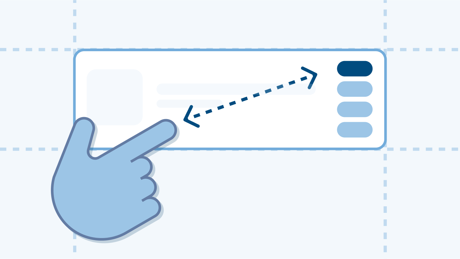
Reachability
In a left-hand drive vehicle, areas of the screen that are within the driver's right arm natural range of motion are the easiest to reach (for most drivers) while driving.
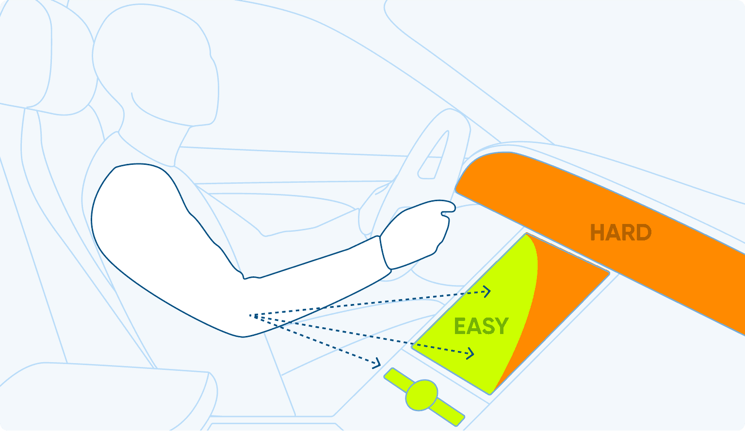
Glanceability
The screen areas closest to the windshield and the driver are the easiest to glance at while driving.
Follow standards
Following standards helps drivers to quickly understand how to use the system. Consider industry standards on colors, naming, iconography, or flows.
The meaning of color depends on the context
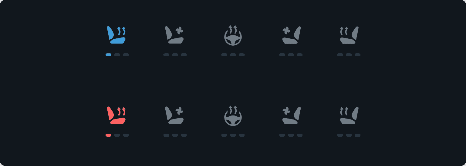
Example: Evaluative research showed the contextual meaning of color. Using a blue color for seat heating was interpreted by drivers as seat cooling.
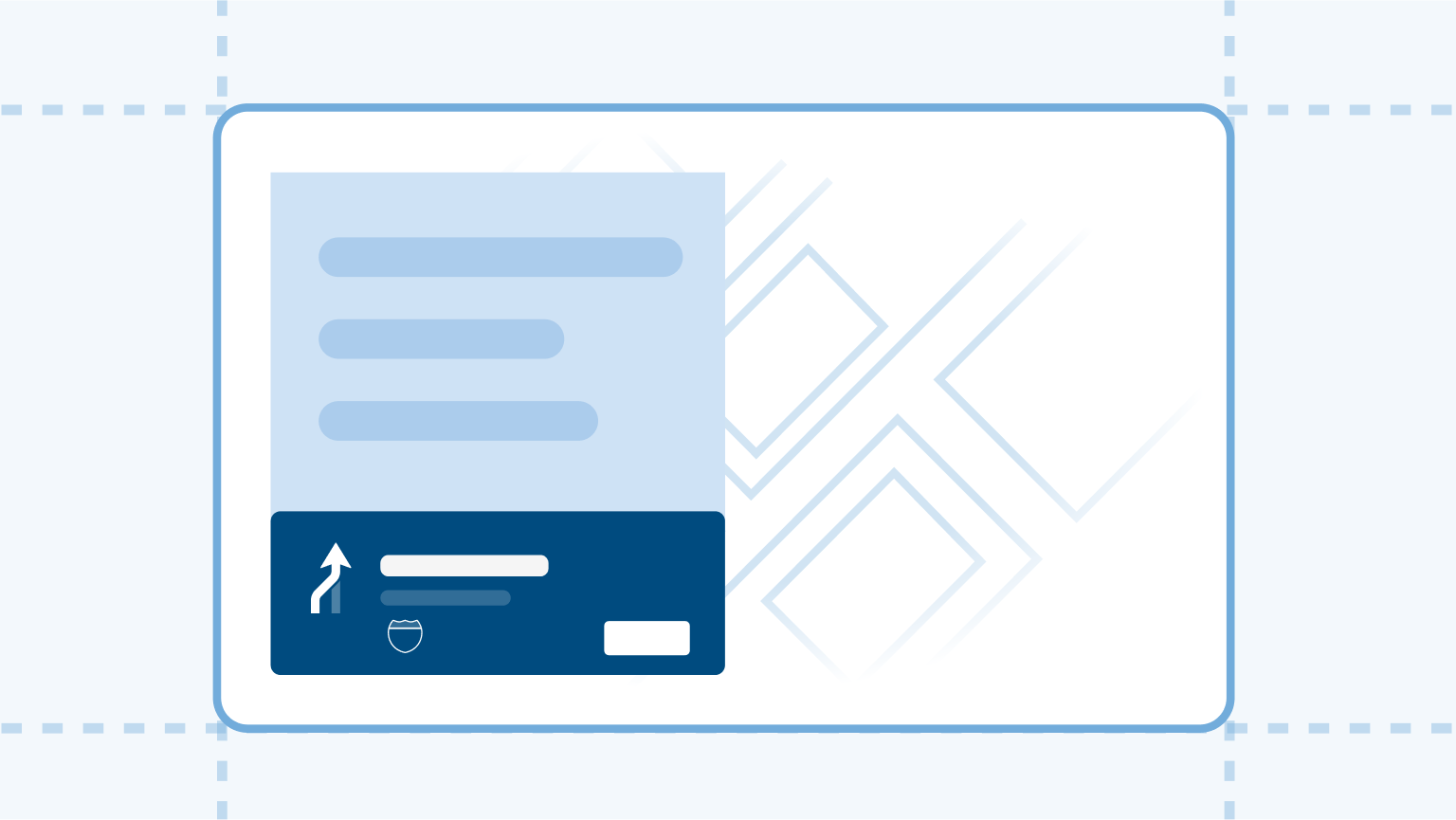
Match the screen with the real world
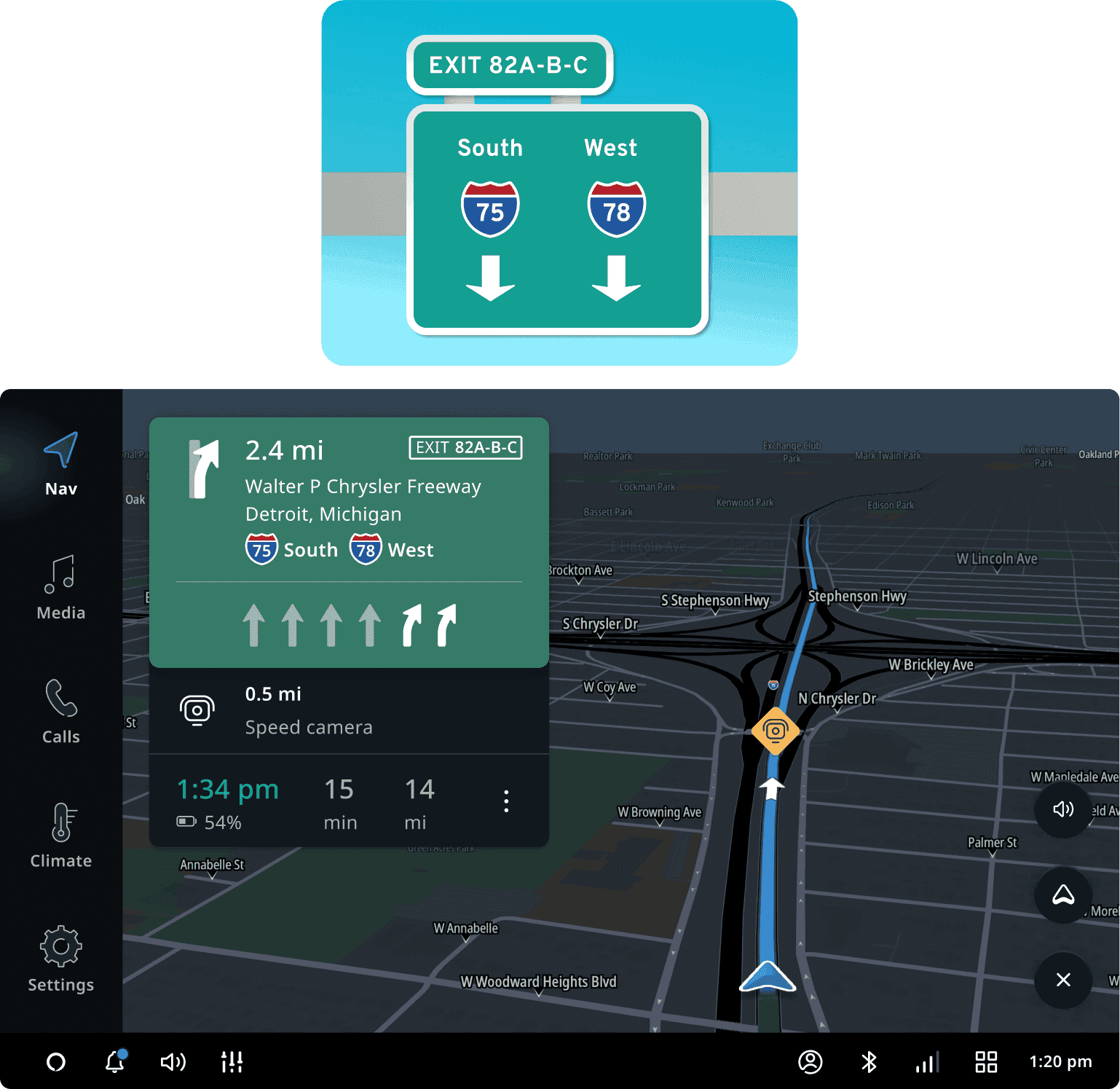
Example: The next-instruction panel matches the real-world color of the signs to easily understand the relation between the UI and the real world.
Feedback of processes
Drivers need visual or audio feedback to know that TomTom Digital Cockpit recognized their input or voice command. Feedback should be obvious, so drivers need as little time as required to glance at the screen and understand the status of the system.
Visual feedback
We learned through evaluative research that drivers need to see visual feedback to know that the voice assistant has heard their command.
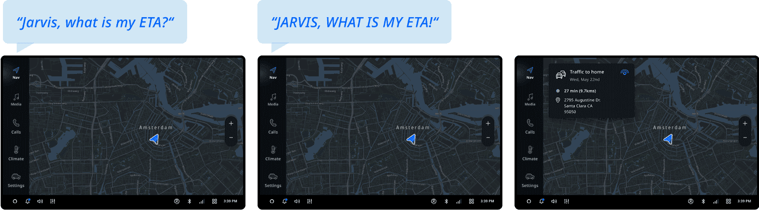
Before: Without visual feedback, users thought the voice assistant had not heard their command and they would say it louder a second time.
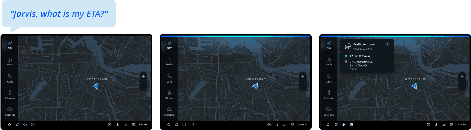
After: When users saw the visual feedback (the chromebar), they recognized that the voice assistant had heard their command and needed time to process it.
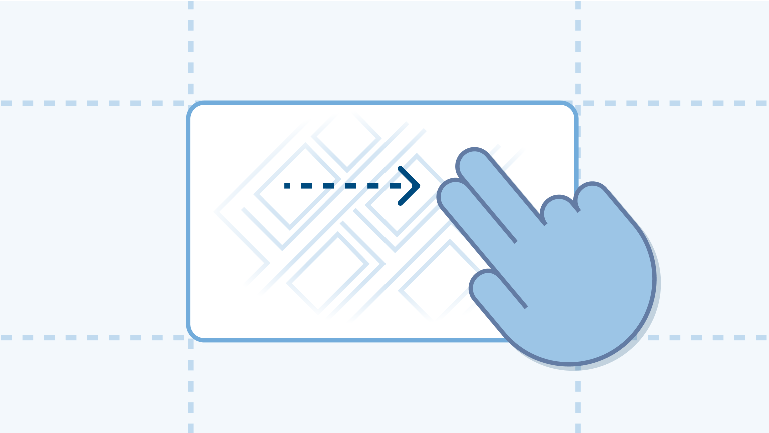
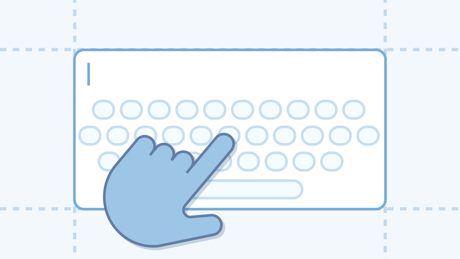
Disable distracting features
Features that are not intended for use while driving should be disabled to prevent distraction. If possible, we encourage alternatives that require less visual and manual distraction (for example, voice assistant).
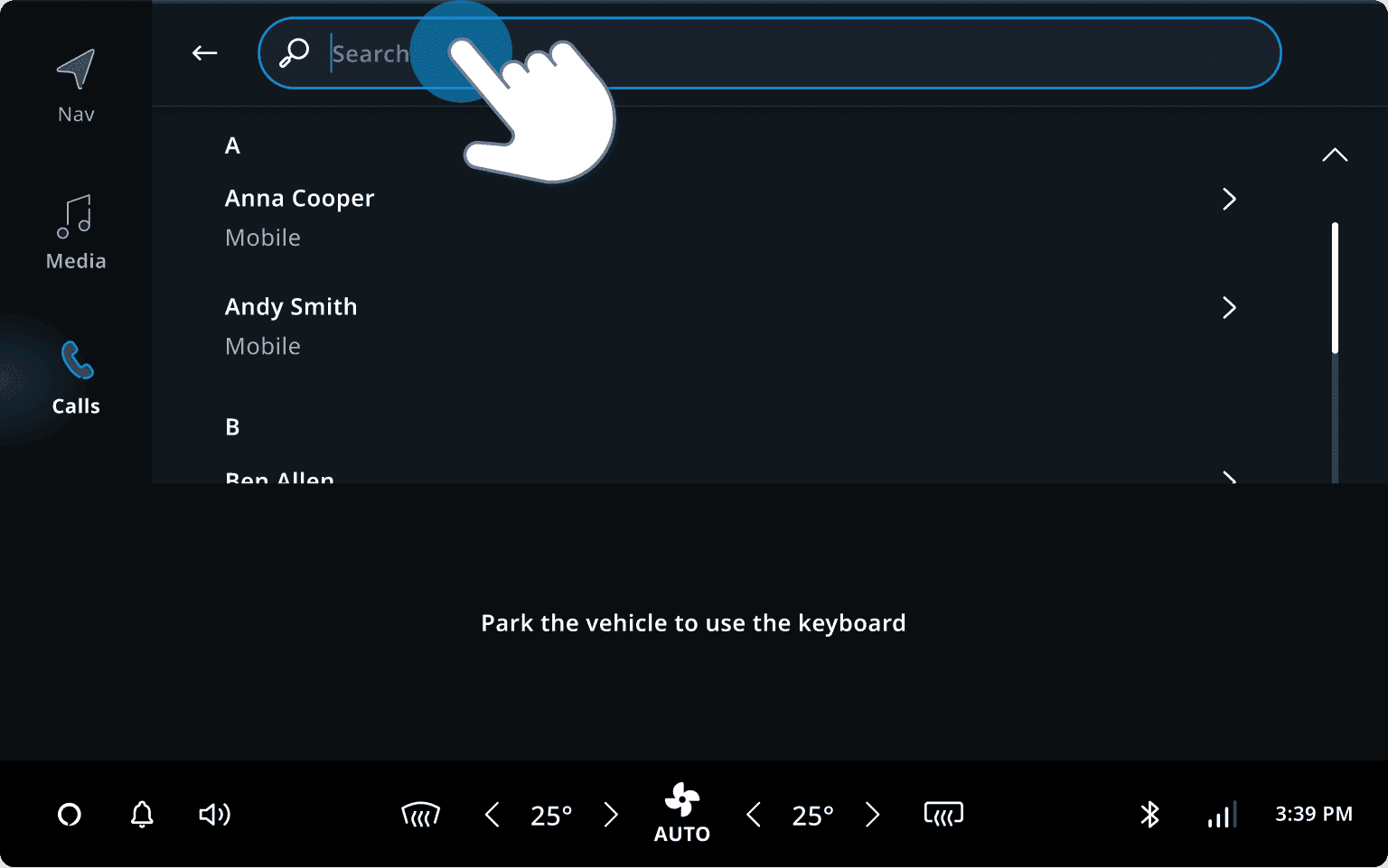
Example: The keyboard to find content in media sources should be disabled. We learned in simulator tests that drivers will use it while driving if it is not disabled.
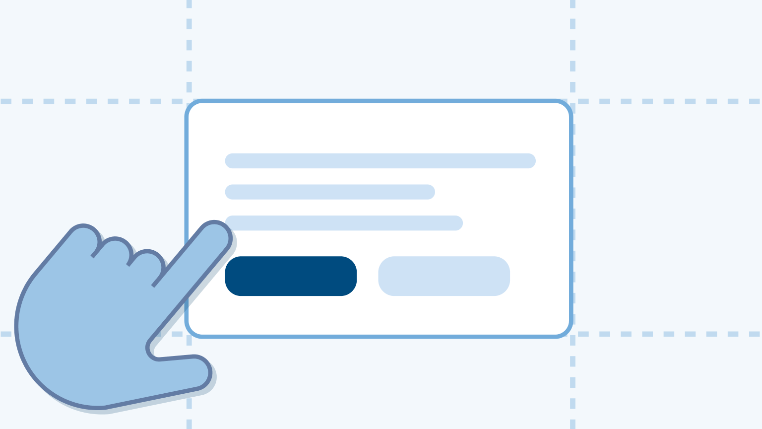
Reduce time to complete tasks
Consider the number of inputs and whether inputs are interruptible. Inputs should be interruptible so drivers can manage their attention between the driving tasks and the screen. The fewer inputs, the less time drivers spend on accomplishing the task.
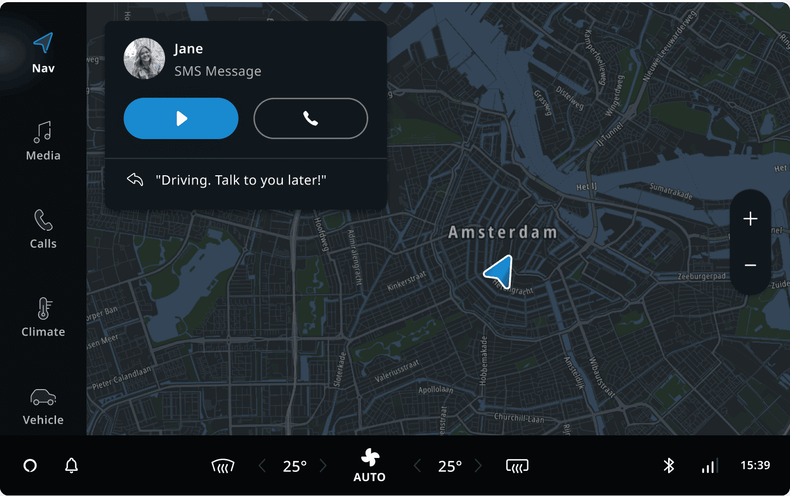
Example: Through research we learned that drivers often call back when they receive a text
message. Therefore, we added the Call back button to SMS message notification. It reduced the
number of interactions required.