Control Center
Important note:The TomTom Digital Cockpit SDK is not available for general use. Please contact us for more information.
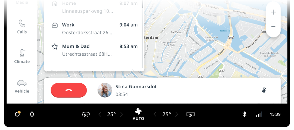
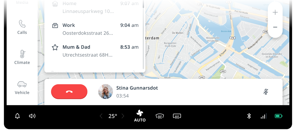
The control center is a collection of controls and indicators that are part of the system UI shell. By default, they are grouped into three sections, and placed into a single bar at the bottom of the screen. However, they are easy to replace or reposition. The main use case for these controls and indicators is having them available as secondary info from any context. This makes them suitable for conveying system status or giving quick access to frequently used controls. For instance, the top level controls section can be used when no hardware controls are available to control HVAC systems, like the defroster.

Anatomy
Three sections of controls are provided by default:
- Driver system status: Buttons placed on the driver side for actions that may frequently be triggered (for example tap-to-talk for VPA).
- Top level controls: Vehicle controls as an optional substitute or extension of hardware controls, particularly for HVAC systems.
- Front passenger system status: Information or status indicators placed on the side of the passenger. These controls still often provide (less frequently used) entry points to relevant flows. For instance, the Bluetooth indicator is the entry point for the device pop-over and pairing flow.
Customization
The control center can be customized in various ways. In general, the stock control center can be fully replaced without much difficulty.
| Component | Customizable |
|---|---|
| Theming | The content color, background and size of the control center are exposed as attributes in the system theme. |
| Replaceable | The control center container, its layout, and the individual sections are all replaceable. |
| Position and orientation | The system UI can position and constrain the control center. However, vertical orientation can be used only in combination with a custom control center frontend suited for vertical orientation. |
| Layout | The system UI can position and constrain the sections (driver system status, top-level control, front passenger system status) freely within the control center container. New sections can be added, but existing sections cannot be individually modified. |
| Content | The content of the individual sections of the control center is not modifiable, but each section can be replaced with a new (custom) control center section. |
| Split | This can be achieved by modifying the system UI layout. |
Levels of customization
The positioning, styling and other aspects of the control center layer can be customized.
Out of the box
The control center from the stock system UI.
Change container
The control center sections are repositioned and themed. The control center container is a custom one, but the content of each section remains unchanged.
Change content
The individual sections are replaced with custom content.