Communication
Important note:The TomTom Digital Cockpit SDK is not available for general use. Please contact us for more information.
TomTom Digital Cockpit comes with a stock application for an in-vehicle communication experience. This communication experience is comprised of two parts - phone calls and messaging. Users can access their entire contact list and call history by using the communication app. They can also make and receive calls from their synced phone book via connected mobile phones. Users can also receive messages through notifications which they can read aloud, call back, and reply to with preset messages.
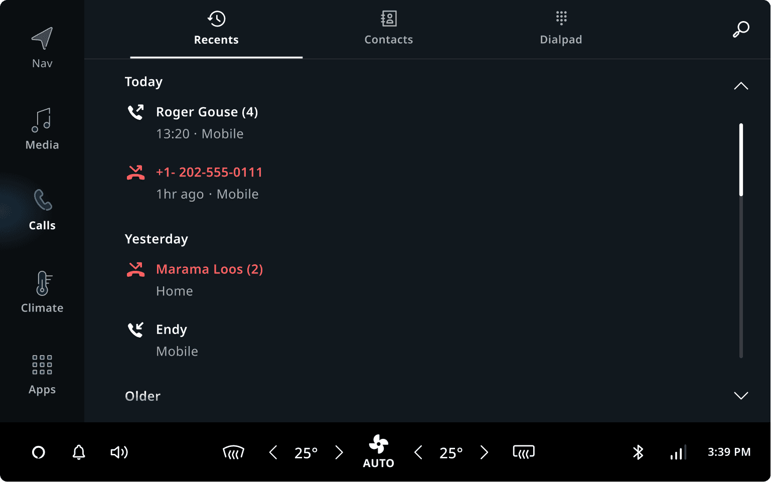
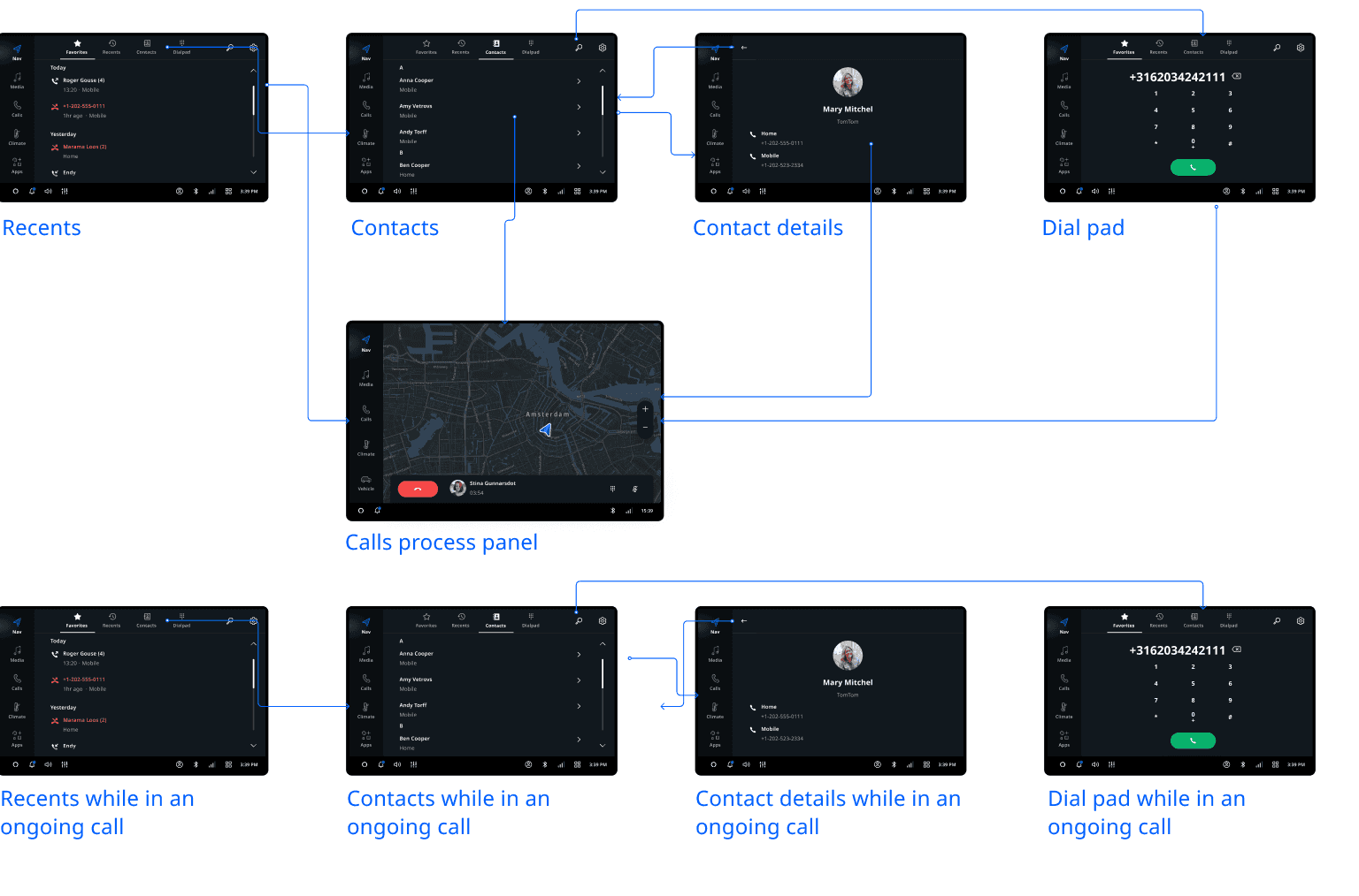
Recents
The Recents tab displays phone call history synced from a connected mobile phone. Calls are categorized into three groups:
- Today: Calls from the current day.
- Yesterday: Calls from the previous day.
- Older: Calls from before yesterday.
The recents list is arranged in chronological order, with the most recent calls at the top of the list. If there are no recent calls for a group, then the group will not be visible in the list.
Contacts
The Contacts tab displays the phone book synchronized from a connected phone. It has two parts:
- Favorite contacts
- All contacts
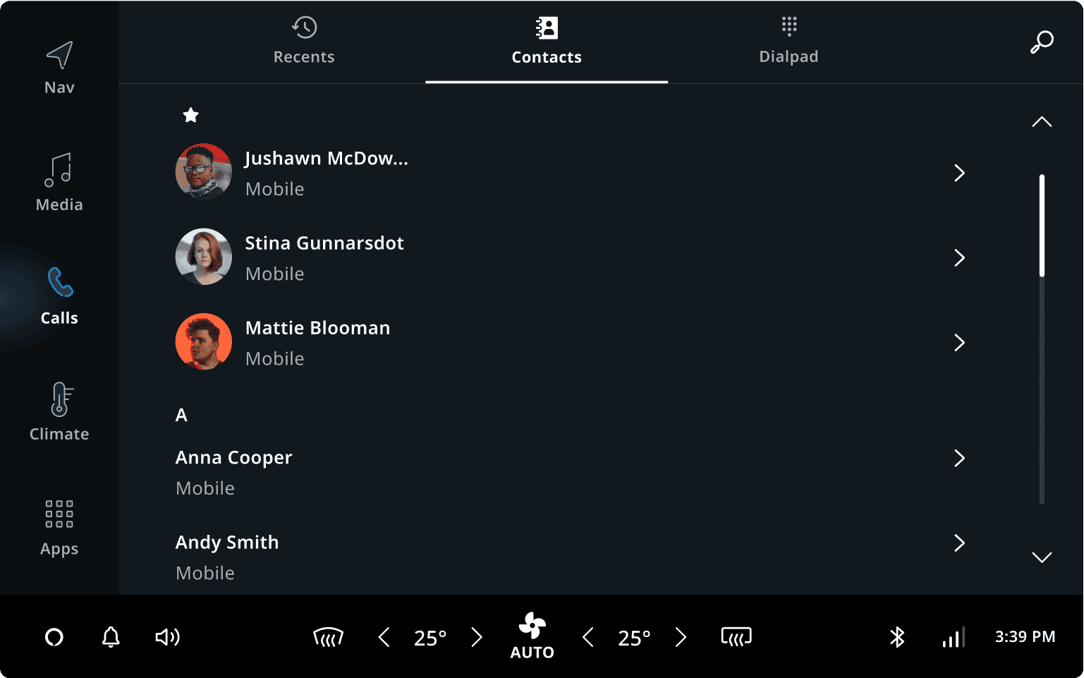
Favorite contacts
The favorite contacts list is a duplicate of what is on the user's mobile phone(s), synchronized with the TomTom Digital Cockpit. Editing or adding favorites in TomTom Digital Cockpit is not supported. If the phone holds no favorite contacts, then the favorites section, including the "star icon" header, is not displayed.
All contacts
All contacts, including favorite contacts, are displayed in the "All contacts" part of the screen. By default, contacts are sorted alphabetically on the first name, and grouped on their first letter. Contact names starting with non-alphabetic characters are listed in the "#" section.
Sticky header
The sticky header fixes the alphabet header to the top of the contact list before, during, and after a user scrolls down the list. When a user scrolls the list, the slider on the right side of the panel moves vertically, indicating the scroll position.
Scroll bar
The scrollbar indicates how far down the user is in the contacts list if the content is taller than the viewable area. The scrollbar lets the user navigate to the rest of the contacts by moving the window viewing area up or down. Tapping anywhere on the scrollbar will move the content by increments equivalent to the height of the screen, with a pop-up alphabet indicator.
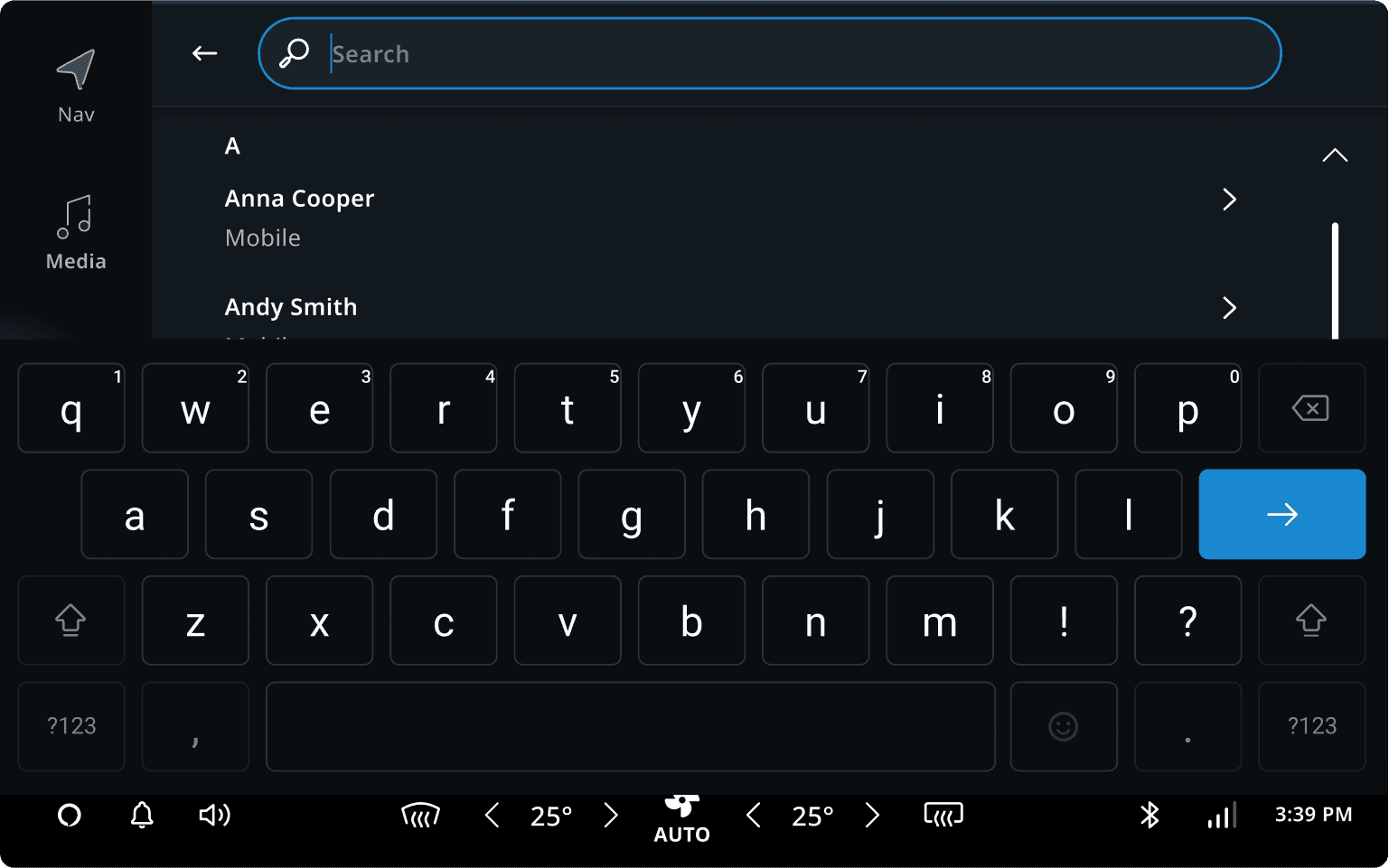
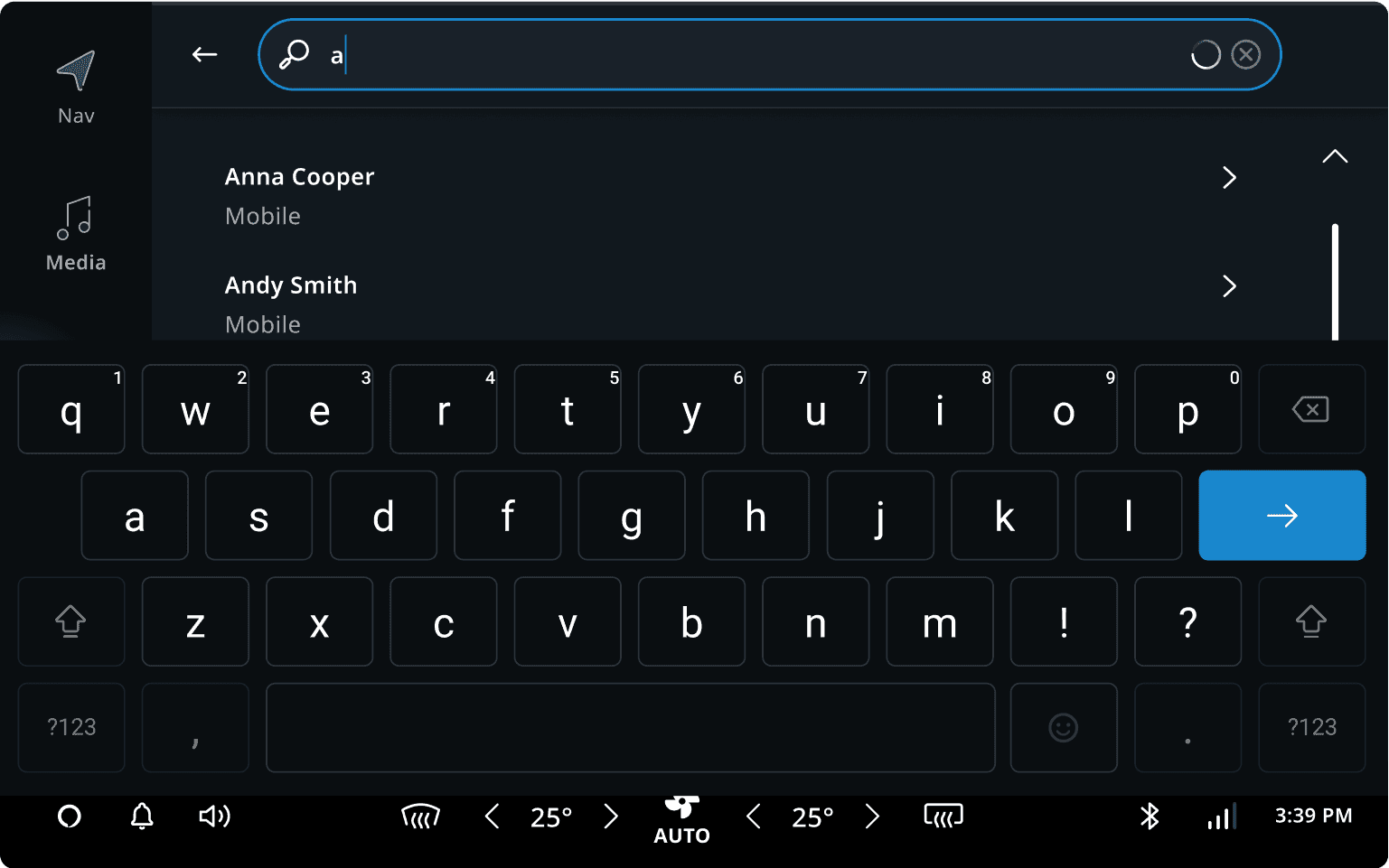
Contact search
When the user taps on the search icon, the Contact search opens in a new view with a keyboard (only when Safety Lock is off). The searches will be automatically completed when a user starts typing.
The content of Contact search starts with a list of All contacts below the search text field.
Users can tap on the Back button anytime to cancel the search and leave the Contact search view.
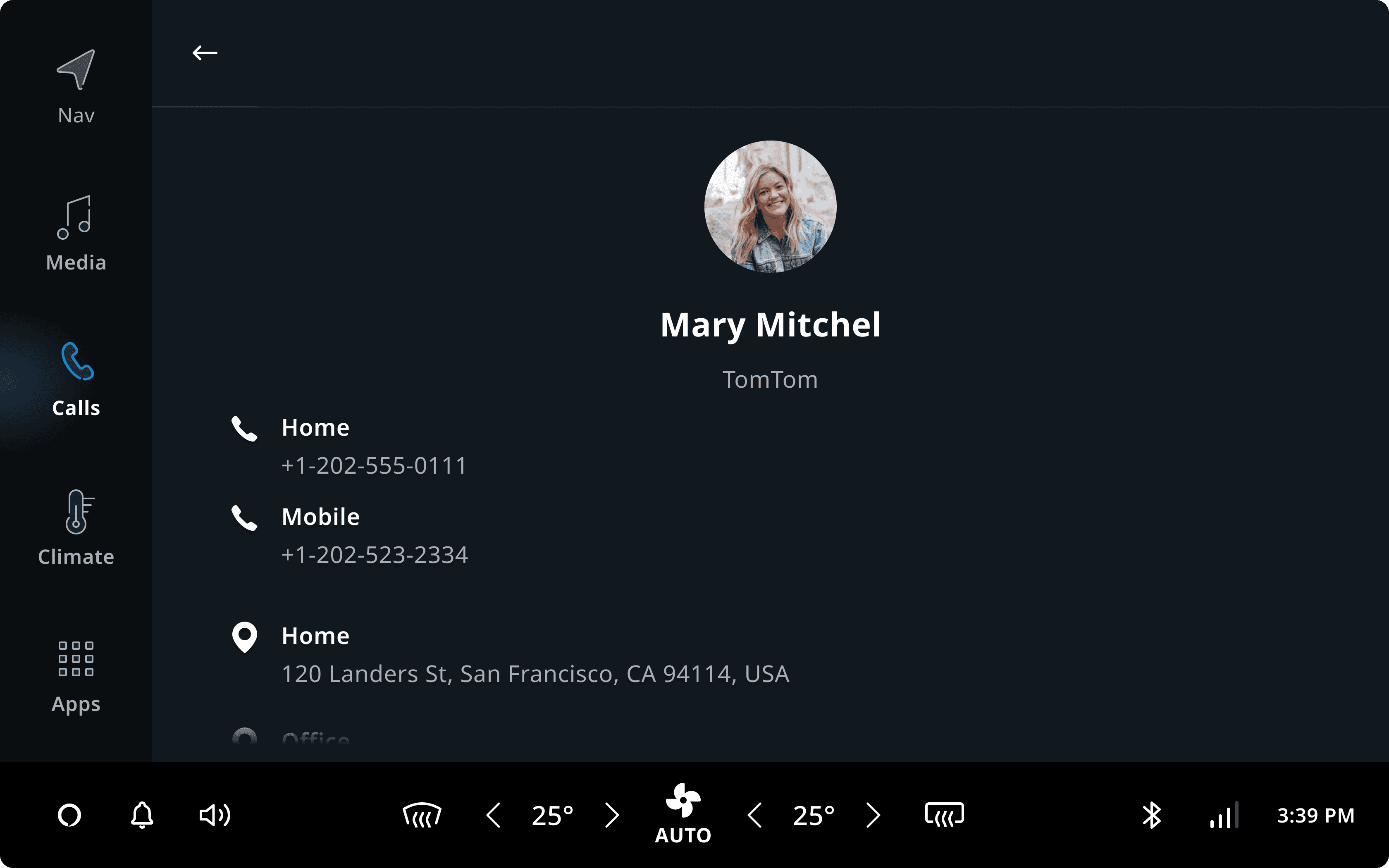
Contact details
The contact details page consists of three sections:
- Avatar image and contact information
- All phone numbers and phone number types
- Addresses displayed without truncation
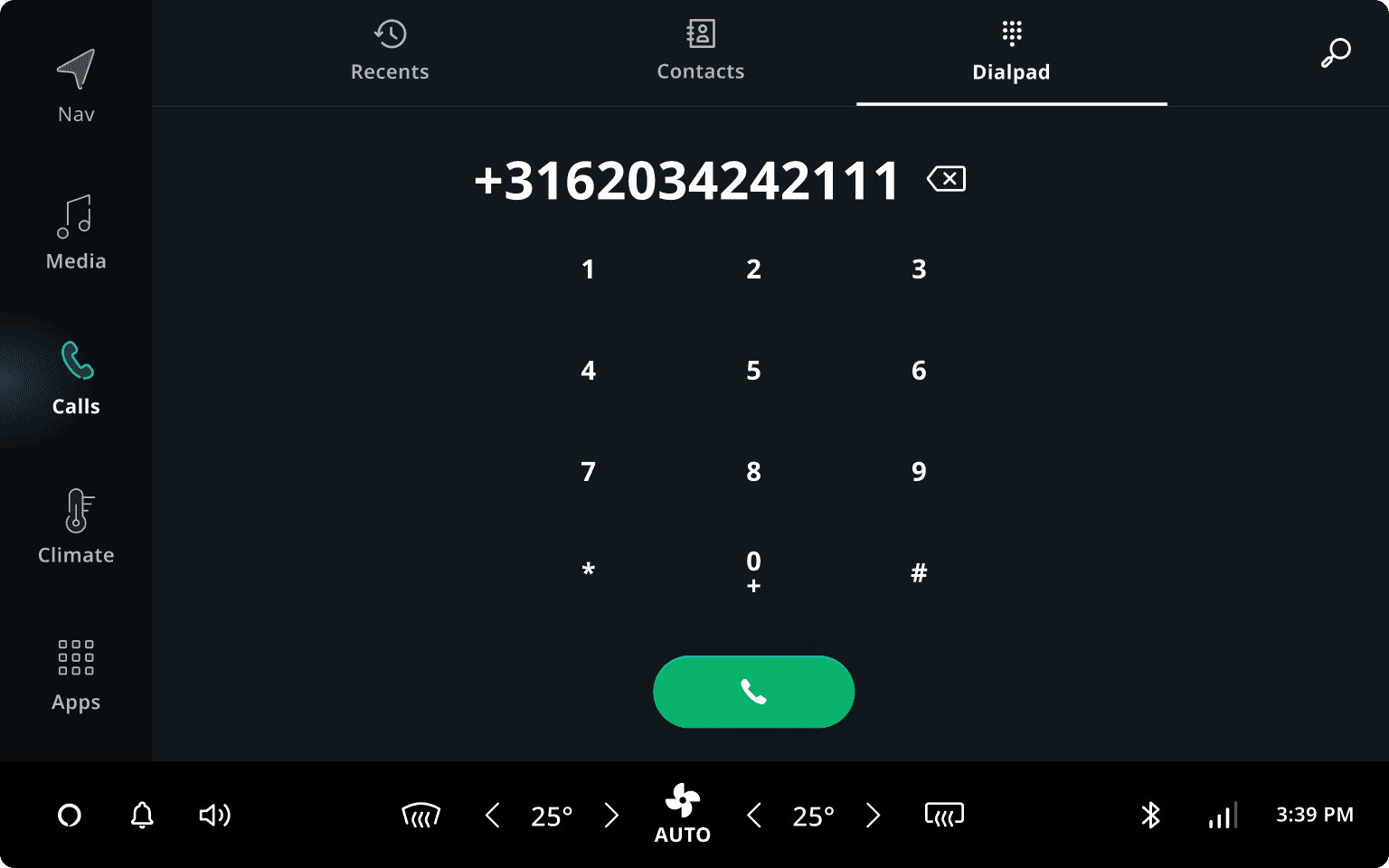
Dial pad
The dial pad can be opened from the tab bar or from the Main Process Panel.
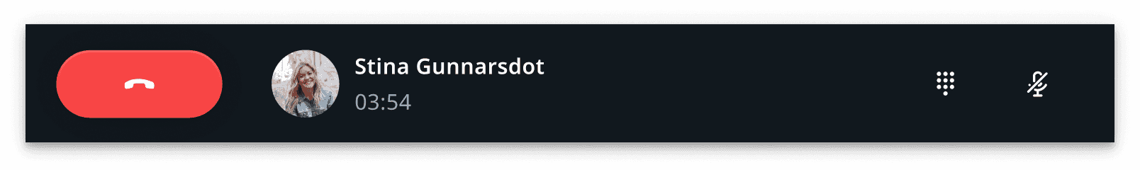
Initiating or accepting a call
When a user initiates or accepts a call, the call is handled by a Main Process Panel which is displayed on the Home Panel. This ensures that essential call management functions are accessible to the user at all times.
User flow overview
Users can react to an incoming call without opening the communication app. Once the call is accepted, the call is handled with a Main Process Panel.
Customizing communication
Only some components in the communication app are customizable or swappable. If a highly customized component is needed, replacing the entire communication application frontend is the best option. However, it will be faster to use the stock communication application and customize it to your needs.
| Component | Customizable |
|---|---|
| Ending a call | The communication app closes automatically after the call is accepted. You can customize it to keep it open. |
| Recents | The look and feel can be customized with theming. The layout and display format is not customizable. |
| Contacts | The look and feel can be customized with theming. The layout is not customizable. |
| Contacts avatar images | Avatar images are only shown for the user’s favorite contacts. |
| Contact search | The search user flow is not customizable. The search icon and the empty state of search results are customizable. |
| Contact details | The look and feel can be customized with theming. The layout is not customizable. |
| Dial pad | The look and feel can be customized with theming. The layout is not customizable. |
| Quick-reply options | 1) Default quick replies: Incoming call notifications have one quick-reply by default, which can be translated into different languages or changed. The user can enable or disable it. 2) Custom quick replies (defined by the user): The user can choose to have no quick replies or add their own quick replies. However, this will require a custom frontend and more development effort. |