Navigation Bar
Important note:The TomTom Digital Cockpit SDK is not available for general use. Please contact us for more information.
Navigation Bar is an interactive header used to navigate between different screens within an app or a panel.
Anatomy
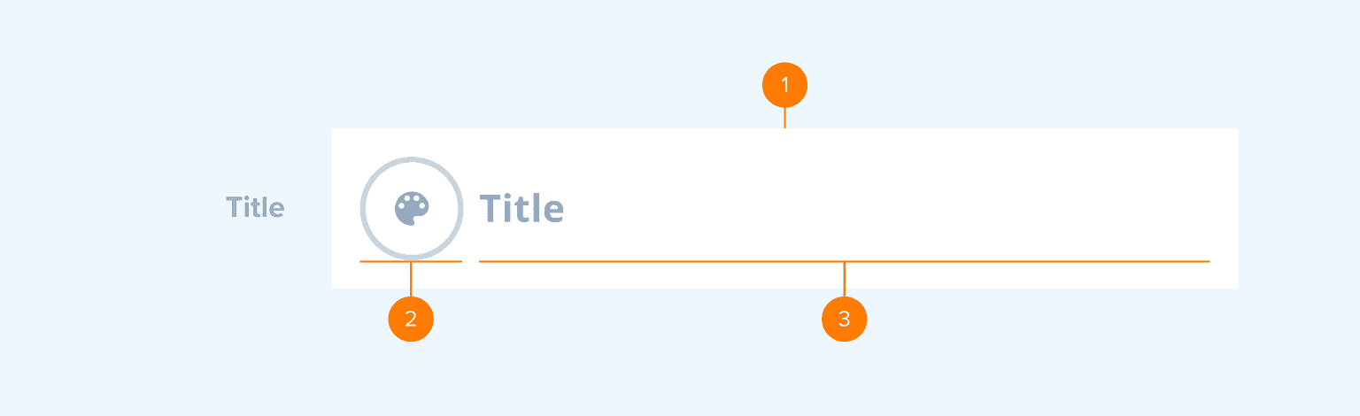
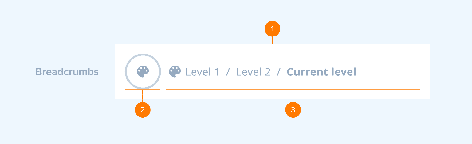
- Container: The background of the Navigation Bar. It includes a background color property.
- Action: Back or close button.
- Content: Title or breadcrumbs. The title describes the content and purpose of a page to users. If the content is organized in a nested, hierarchical manner, the breadcrumbs can be displayed. They show the path to the currently open page, where each step is an interactive element, and users can navigate backward through the stack. The first step of the breadcrumbs can also feature an icon representing the initial screen from which the user navigated (for example, the media source screen).
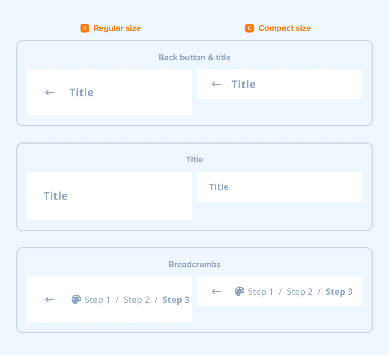
The Navigation Bar comes in two sizes: regular and compact. The regular-size version is typically used as an app or modal header, and the compact-size version is used inside smaller panels. The control supports the following configurations:
Usage
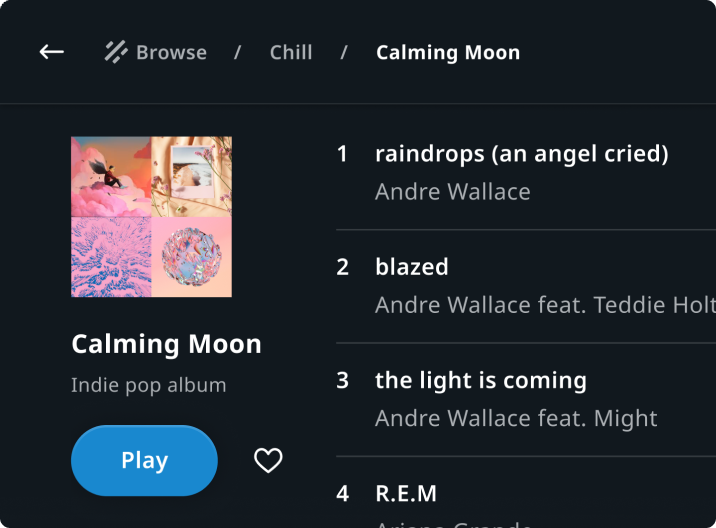
Playlist view in Entertainment
Header featuring the breadcrumbs that show the path to the playlist page in a media source.
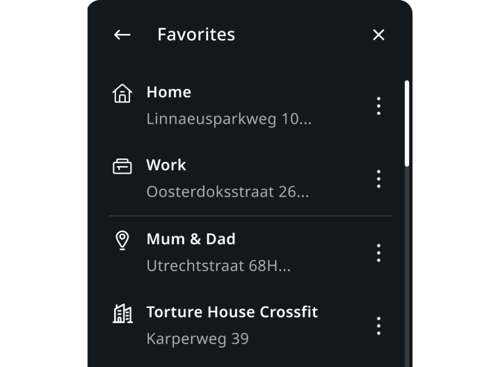
Favourites list in Navigation
Header featuring the "Favourites" title in the favorite locations panel.
Customization
| Type | Customizable |
|---|---|
| Theming | The sizing of the container height, text, margins, paddings, and breadcrumb icon can be adjusted. Additionally, it is possible to change the styling of the container (background and elevation), the text and the back button. |
| Configurations | Different combinations of title, back button, and breadcrumbs are supported. |
| Content | The labels can be changed and the back button asset can be replaced. |