Scroll Bar
Important note:The TomTom Digital Cockpit SDK is not available for general use. Please contact us for more information.
Scroll Bar shows the current scroll position and allows users to move the page content in a predetermined direction.
The control appears when the content is too large to be displayed entirely within the viewport. In some cases, a visible Scroll Bar can aid the speed, ease, and safety of browsing content in the automotive context.
Anatomy

- Track: The background of the Scroll Bar. It includes a background color and radius properties.
- Handle: A sliding element whose size and position correspond to content scrolling on a screen.
- Buttons: Optional, tertiary-type buttons.
- Indicator container: The background of the indicator. It includes a background color, stroke width and style, radius, and elevation properties.
- Indicator content: A label or icon that corresponds to a section in a scrollable area.
Types

| Types | About |
|---|---|
| Interactive scroll bar | Provides users the information about the scrolling position and can optionally include buttons used as anchor points to jump somewhere in a scrollable view (for example, to get back to the top with one tap) or for incremental scrolling (for example, up and down buttons). |
| Interactive scroll bar with indicator overlay | The indicator communicates the exact position in a scrollable area when users directly interact with the Scroll Bar handle. |
Usage
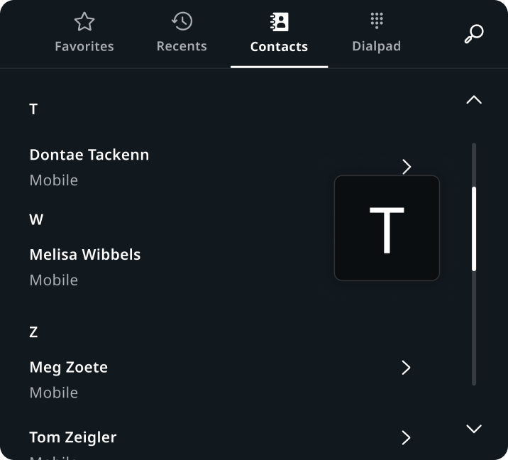
Contacts in Communication
Scroll Bar with up and down buttons and indicator.
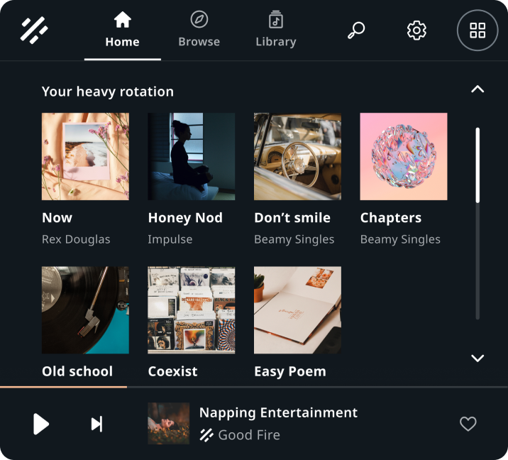
Songs grid in Entertainment
Scroll Bar with up and down buttons.
Customization
| Type | Customizable |
|---|---|
| Theming | The sizings of the Scroll Bar width, margins, buttons paddings, track, handle, indicator container and content can be adjusted. Additionally, it is possible to change the styling of the track, handle, indicator container and content, and buttons. |
| Configurations | Interactive Scroll Bars can configure the number and type of buttons to show. |
| Content | Buttons, track, handle, and indicator assets can be replaced. |