Foundations
Important note:The TomTom Digital Cockpit SDK is not available for general use. Please contact us for more information.
TomTom Digital Cockpit comes with a built-in library of UI styles that can be reused to apply any brand guidelines. For example, choice of colors and typography can reflect the brand or vehicle interior, and the size can adapt to their screen sizes to provide the best user experience for the driver and passengers.
To ensure that custom UI themes meet usability standards, vehicle makers should follow the design principles defined in the Design Guidance section.
Any brand can be expressed using the TomTom Digital Cockpit predefined design system.
Foundations
Foundations form the base of the design language and are essential for building a cohesive user interface.

Design tokens
Design tokens represent small, repeatable design elements such as colors, typography, etc.

Colors
Applied in a way to provide a hierarchy of information and to meet contrast standards.

Typography
A type system with flexible font styles to ensure legibility standards.
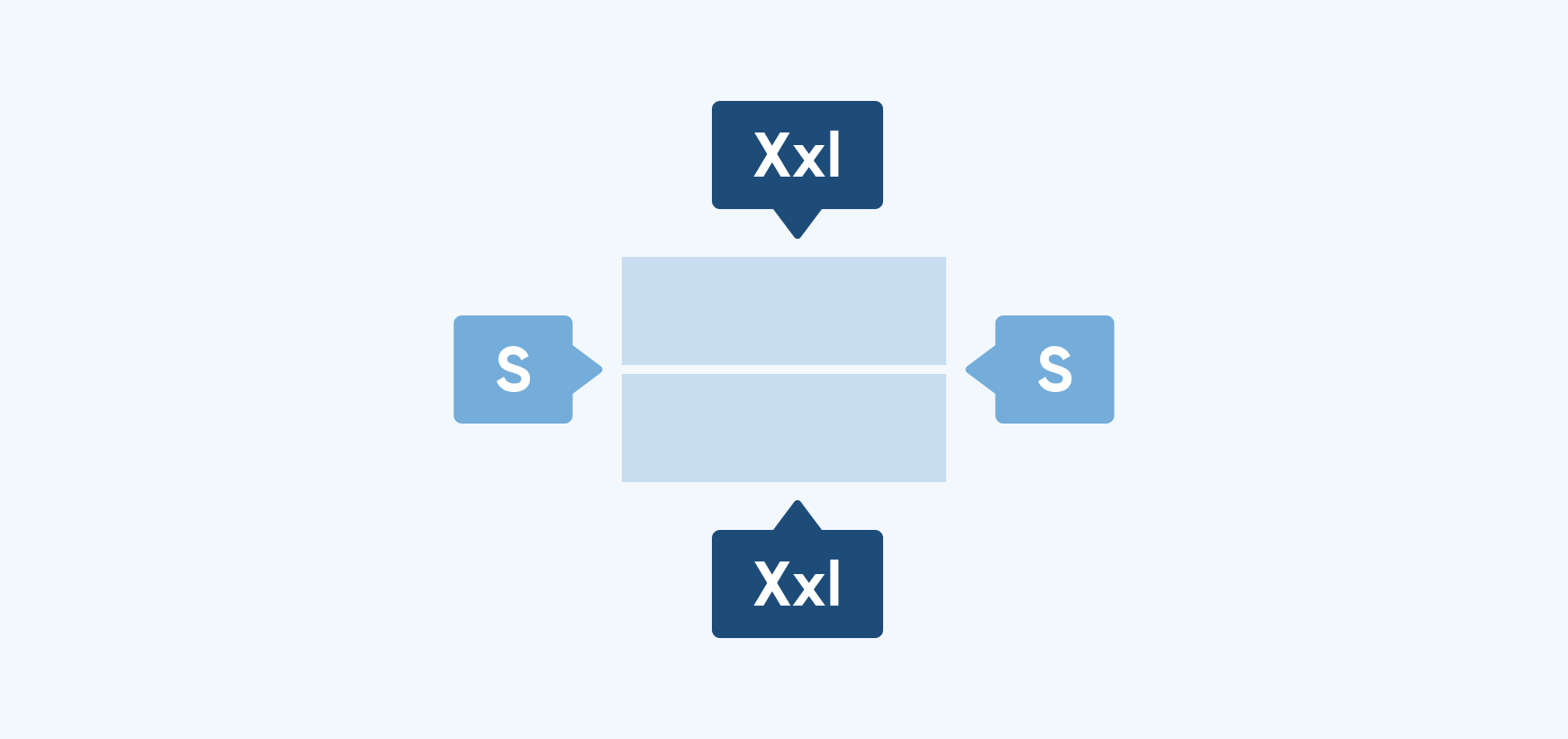
Size and spacing
Used to set the sizes and spacing of elements according to a predefined scale system. (Documentation available soon.)

Shape
All shaped components use values from the predefined set of radiuses. (Documentation available soon.)

Elevation
Shadows in our system are created using Android's elevation feature. (Documentation available soon.)

Motion
Provides guiding principles for the use of animation in an automotive context. (Documentation available soon.)