Markers
Overview
The Marker composable displays a custom marker on a map. The Marker composable must be placed inside a map container: like the content block of TomTomMap. This ensures they are properly attached to the map’s context.
See the Getting Started guide to add the TomTomMap to your app.
Displaying a marker
To display a marker, the first step is to create instances of MarkerData and MarkerProperties.
The essential property for MarkerData is:
geoPoint- The geographic location of the marker.
1val amsterdam = GeoPoint(52.379189, 4.899431)2markerData = MarkerData(3 geoPoint = amsterdam,4)
The required properties for MarkerProperties are:
1markerProperties = MarkerProperties(2 pinImage = ImageFactory.fromResource(R.drawable.ic_marker_pin),3)
Next, add the marker to the map using the defined MarkerData and MarkerProperties instances:
1TomTomMap(2 infrastructure = mapDisplayInfrastructure,3 modifier = modifier,4 state = mapViewState,5) {6 Marker(7 data = markerData,8 properties = markerProperties,9 )10}
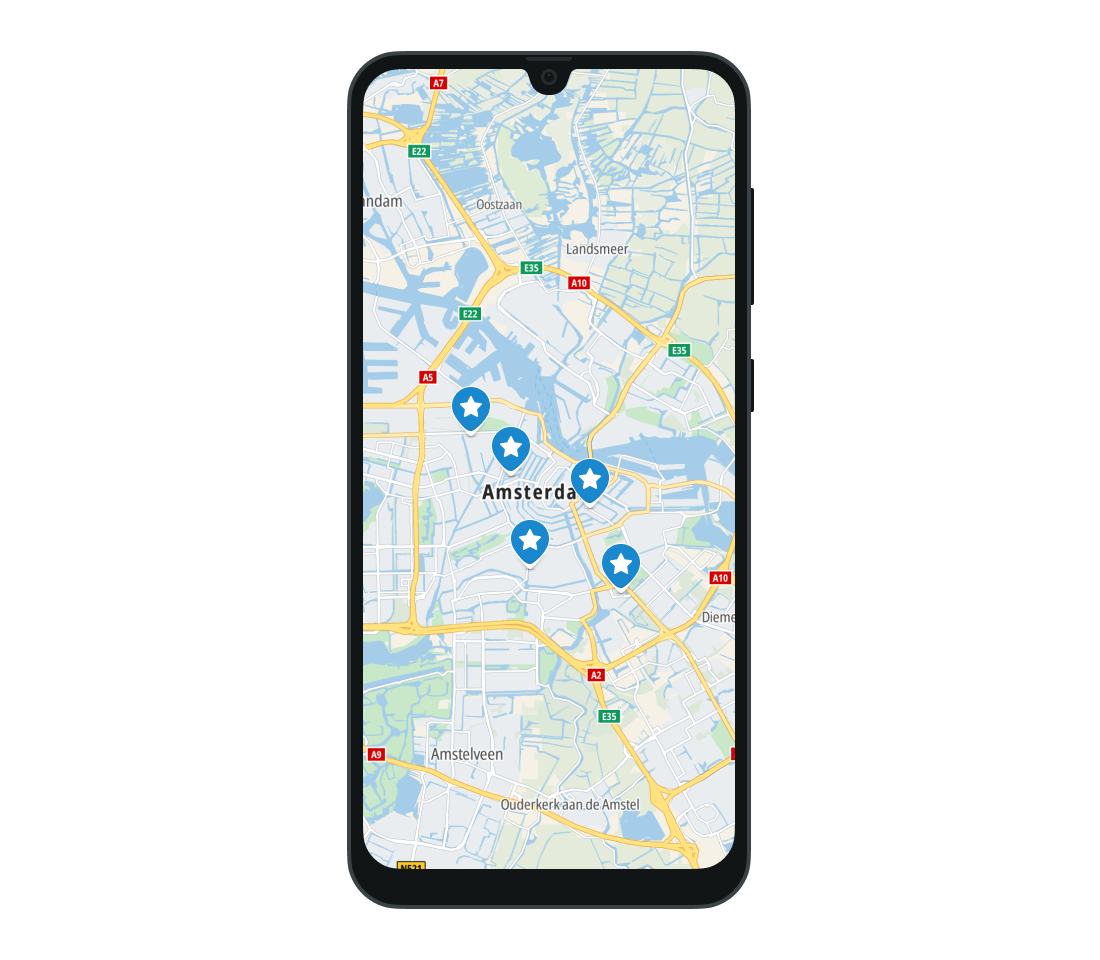
The marker will be displayed at the provided geographic location. The Map SDK does not impose a limit on the number of markers added to the map. In order to reduce memory usage, the images used for markers are cached. > Note: The user’s device may have limited resources, which can reduce the performance of the application.
Styling
A custom image for the marker must be defined using the ImageFactory object. ImageFactory allows you to create images from a variety of sources:
- Bitmap
- Drawable from resources
- Assets
- URI
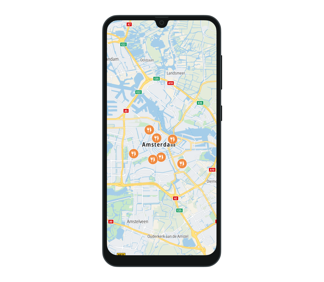
When you then create the MarkerProperties object you can specify its pinImage property which is the bottom layer of the marker and defines its boundaries. The background of the marker can be customized with the shieldImage property of MarkerProperties. The pinIconImage defines a layer used to display an icon on the pin. It will be placed over the background. Note that the pinIconImage will be rendered only within the boundaries of pinImage.
1val markerProperties = MarkerProperties(2 pinImage = ImageFactory.fromResource(R.drawable.ic_marker_pin),3) {4 pinIconImage = ImageFactory.fromResource(R.drawable.ic_marker_icon)5}6TomTomMap(7 infrastructure = mapDisplayInfrastructure,8 modifier = modifier,9 state = mapViewState,10) {11 Marker(12 data = markerData,13 properties = markerProperties,14 )15}
Example: the property is set to the orange marker pin, which is a background for the fork and knife icon set as pinIconImage.
Dynamic content
You can remove or hide a marker using the isVisible parameter of the Marker composable or control its presence in the composition based on a condition. Here’s how the visibility and removal works:
Hiding the marker
By setting the isVisible property of the Marker composable to false, the marker can be hidden. The marker remains part of the UI hierarchy but is simply not displayed.
1Marker(2 data = markerData,3 properties = markerProperties,4 isVisible = true, // Marker is visible5)
Control flow
To remove the marker entirely from the composition, you can use an if statement or a conditional. As standard in Compose UI, control flows can be used to control the content of the map.
1if (isVisible) {2 Marker(3 data = markerData,4 properties = markerProperties,5 state = rememberMarkerState(),6 )7}
UI interaction
You can handle click and long-click events performed on markers by specifying the appropriate listeners in the Marker composable. Use onClick and onLongClick for handling the events.
1Marker(2 data = markerData,3 properties = markerProperties,4 onClick = {5 // Your code goes here6 },7)
'onClick':
1Marker(2 data = markerData,3 properties = markerProperties,4 onClick = {5 // Your code goes here6 },7)
'onLongClick':
1Marker(2 data = markerData,3 properties = markerProperties,4 onLongClick = {5 // Your code goes here6 },7)
Showing balloon-like overlays
A balloon is a common UI pattern — a popup view that appears on top of the map, typically when the user taps a marker. Rather than a dedicated balloon API, this pattern is achieved in Compose by anchoring any custom composable to a geographic coordinate on the map. This gives you full control over content, styling, layout, and interactivity.
To create a balloon-like overlay:
- Render the
TomTomMapand your custom UI inside a common parent (e.g.,Box). - Convert the target
GeoPointto screen coordinates withMapViewState.getScreenOffsetForGeoPoint(). - Position the composable with
Modifier.offset. - Use standard Compose state to show or hide the overlay — for example, in response to a marker click.
1val geoPoint = GeoPoint(52.379189, 4.899431)2val cameraState = mapViewState.cameraState.data3val offset by produceState(4 initialValue = Offset.Unspecified,5 key1 = geoPoint,6 key2 = cameraState,7) {8 value = mapViewState.getScreenOffsetForGeoPoint(geoPoint) ?: Offset.Unspecified9}1011Box(modifier = modifier) {12 TomTomMap(13 infrastructure = mapDisplayInfrastructure,14 state = mapViewState,15 )1617 if (offset.isSpecified) {18 var contentWidth by remember { mutableIntStateOf(0) }19 var contentHeight by remember { mutableIntStateOf(0) }2021 Box(22 modifier = Modifier23 .offset {24 IntOffset(25 x = (offset.x - contentWidth / 2).roundToInt(),26 y = (offset.y - contentHeight).roundToInt(),27 )28 }29 .onGloballyPositioned {30 contentWidth = it.size.width31 contentHeight = it.size.height32 }33 .background(color = Color.White)34 .padding(horizontal = 12.dp, vertical = 8.dp),35 ) {36 BasicText(text = "Custom UI")37 }38 }39}
Because this approach relies on regular Compose UI, you can display styled text, images, buttons, or other interactive elements anchored precisely to a map coordinate.
Multiple markers
You can also add multiple markers using the Markers composable.
1Markers(2 markers = listOf(3 MarkerEntry(4 data = MarkerData(5 geoPoint = GeoPoint(52.379189, 4.899431),6 ),7 properties = MarkerProperties(8 pinImage = ImageFactory.fromResource(R.drawable.ic_marker_pin),9 ),10 ),11 MarkerEntry(12 data = MarkerData(13 geoPoint = GeoPoint(51.379189, 5.899431),14 ),15 properties = MarkerProperties(16 pinImage = ImageFactory.fromResource(R.drawable.ic_cafe),17 ),18 ),19 ),20)
The onClick parameter is applied to all markers in the list. It provides the corresponding MarkerId of the clicked marker to the lambda function.
Using MarkersState enables you to programmatically manage marker selection, deselection, and visibility.
The default state can be created using rememberMarkersState().
Next steps
Since you have learned how to show traffic on the map, here are recommendations for the next steps: