Getting started
Introduction
You can customize the Automotive Navigation Application to reflect your brand by adapting both the map and the user interface elements.
This guide walks you through setting up your theming workflow.
You'll learn how to:
- Set up and organize your Figma workspace with the Automotive UI toolkit and Visual assets file
- Install and configure the Tokens Studio plugin for managing design tokens
- Handle theming customizations for second display configurations
1. Set-up in Figma
Every ANA release comes with an updated Automotive UI toolkit version together with the Visual Assets library. The Figma files will be in sync with latest features and theming capabilities. Make sure you have the latest versions.
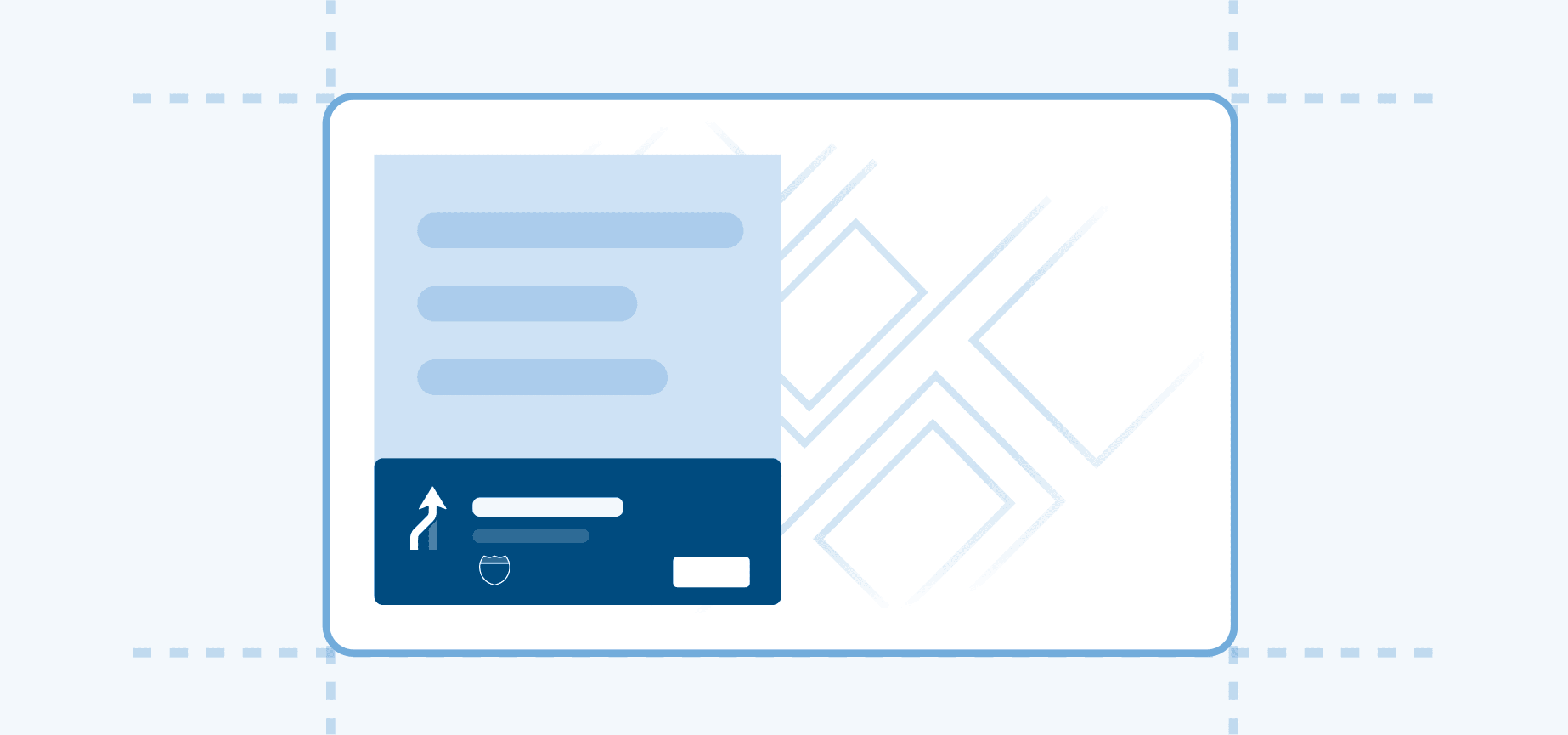
The Automotive UI Toolkit is a Figma file that contains all the core UI components and experience stacks used in our navigation applications. It helps you explore how the navigation UI works and provides a starting point for theming it to match your brand and product needs.
The Visual Assets file serves as the single source of truth for all icons, graphics, and signage in the TomTom navigation application, ensuring a consistent and intuitive visual language across both the UI and the map. You can replace any visual element—icons, graphics, or signage—to suit your needs. By updating assets in this file, all necessary exports for both the map and UI can be generated. Once changes are published, the new assets can be previewed directly in the UI Toolkit.
Automotive UI Toolkit:
Visual Assets:
Once you have the files in your Figma workspace, publish both of them. Publishing is required to establish the connection between the two files.
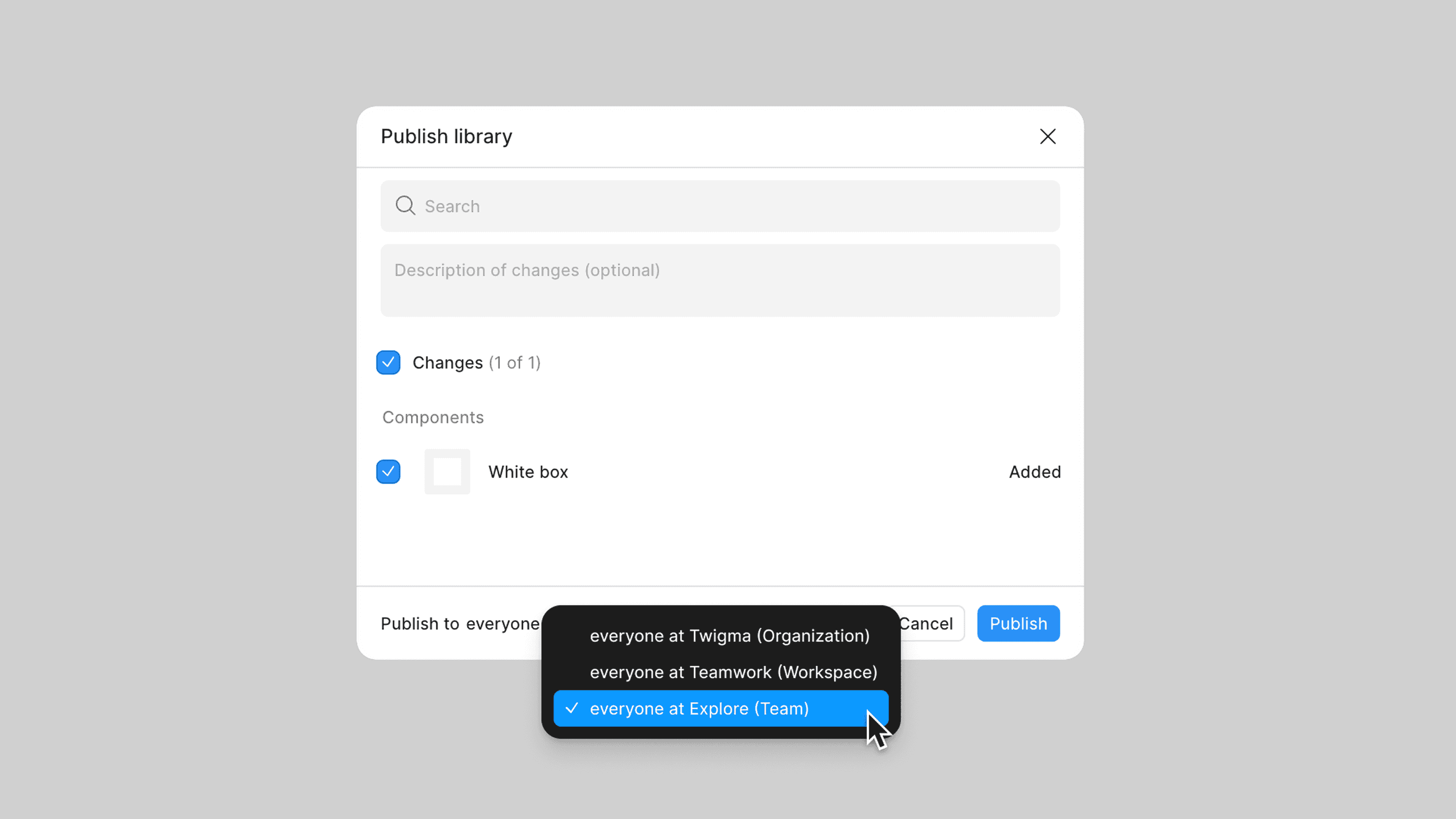
Note: For detailed instructions on publishing libraries, see the Figma publishing guidelines.
To connect the downloaded Automotive UI Toolkit and Visual Asset files, swap the libraries:
- Open Manage libraries
- Locate the missing Visual Asset library
- Swap it with the Visual Asset file you published in your Figma workspace
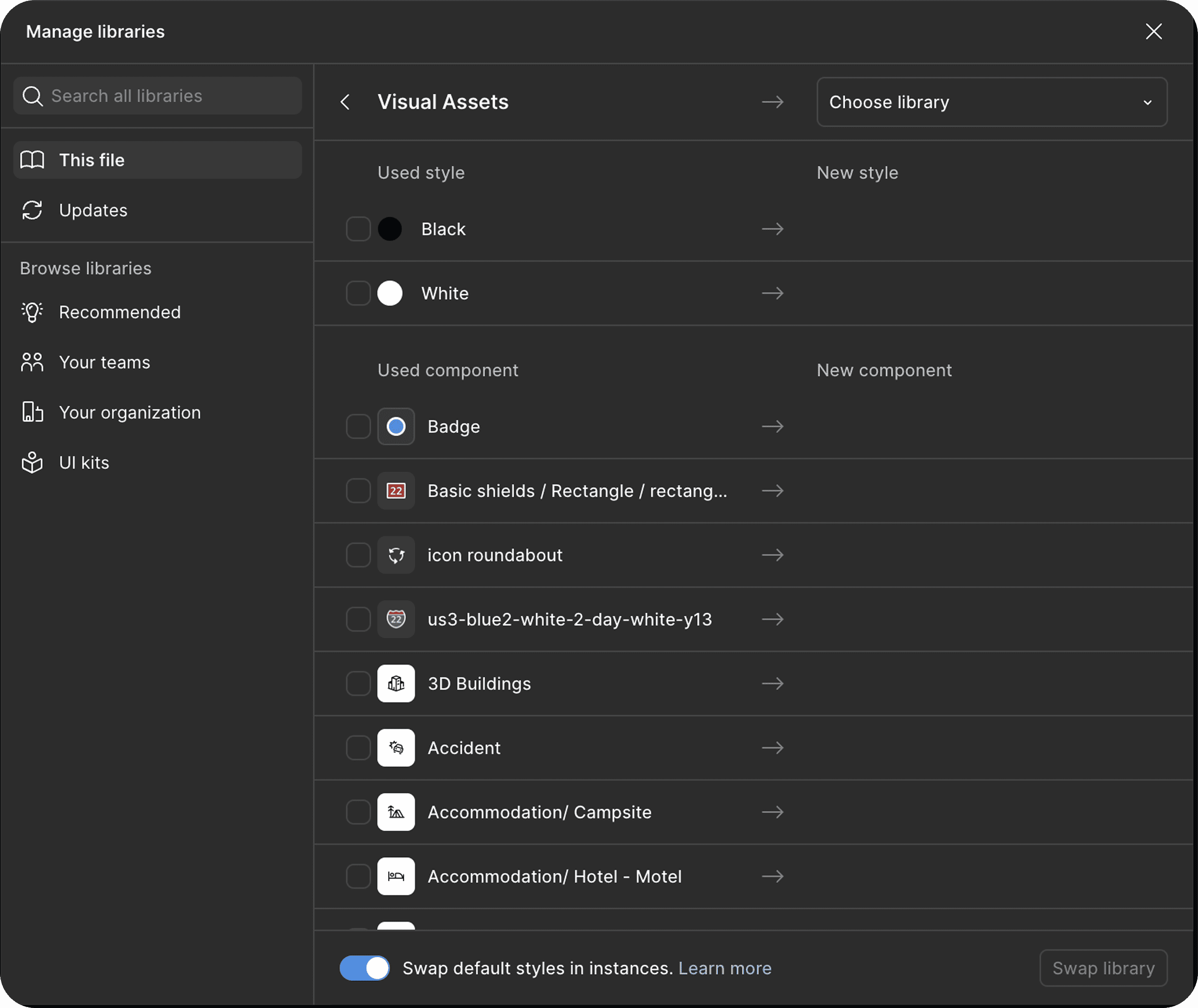
Once connected, any assets you replace in your copy will automatically update in the UI Toolkit.
Note: For more information on swapping libraries, see the Figma library swap documentation.
2. Tokens Studio
At TomTom, we use Tokens Studio to create and manage design tokens, which we export as Figma variables.
- Tokens Studio enables efficient token management
- Figma variables allow smooth use of modes
Both are used together in the UI toolkit. However for theming, we ask to use Tokens Studio directly.
Tokens Studio Quick Start
- Run the Tokens Studio plugin in the Automotive UI toolkit. For help with running the plugin, see this guide.
- Familiarize yourself with the plugin by reviewing the official documentation.
- Use the search function to find the token you want to edit. Follow this search guideline to learn how.
- Select the correct token set (e.g., Light or Dark for colors).
- Right-click the token, choose Edit, enter the desired value, and save your changes. More details are available here.
- Export the token values as variables to apply your updates in Figma. See the export instructions.
3. Set-up for secondary displays or activities
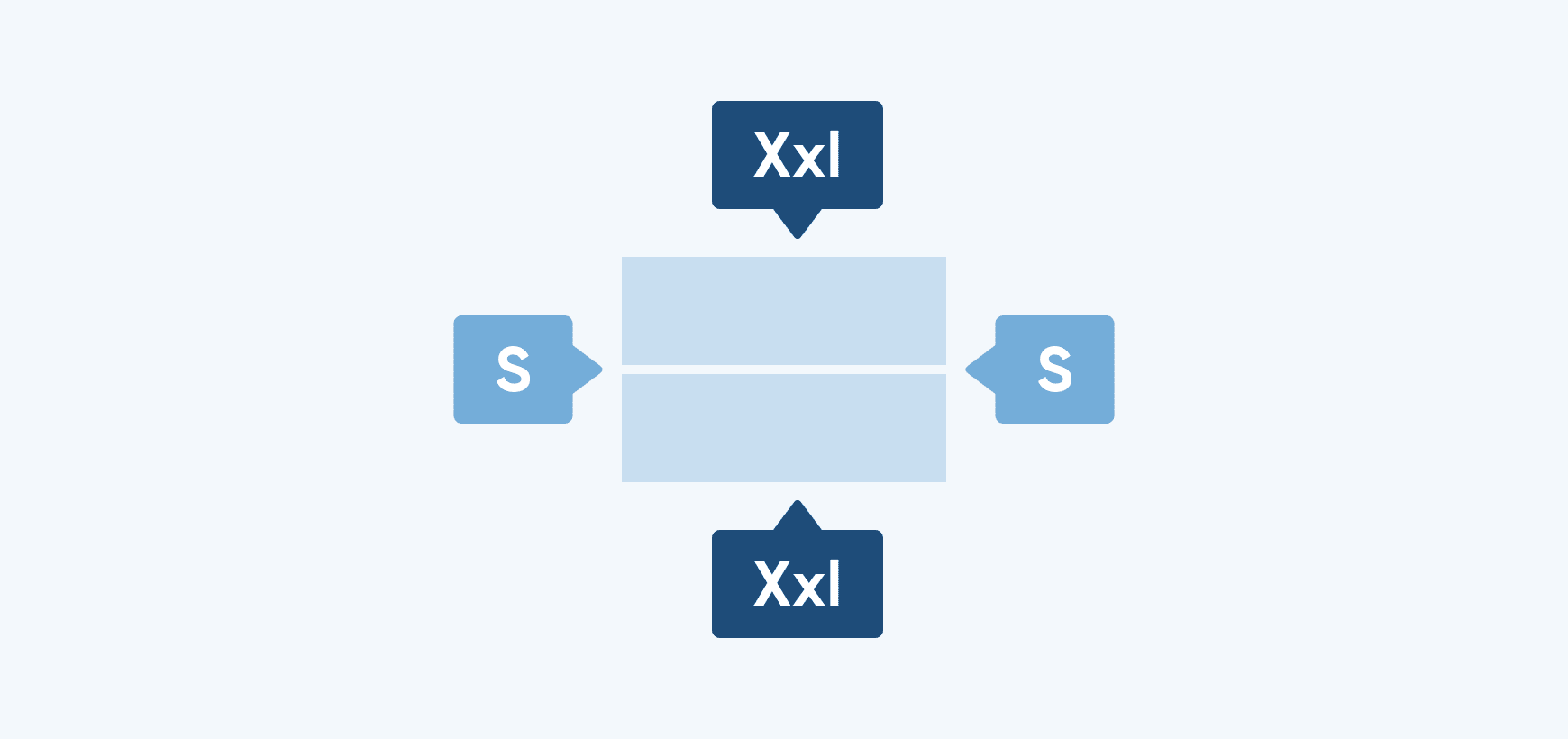
The navigation application supports theming across multiple displays (like cluster or HUD) and activities (like Mini and Micro app). How you set up your Figma files depends on whether you want consistent or differentiated color themes between displays or activities.
Same theme across displays or activities
If you want to use the same color mode across all displays, you can work from a single UI Toolkit file. The adaptiveness framework automatically handles size adjustments based on each display's dimensions—you don't need to configure sizing separately.
Differentiated themes per display or activities
If you want to apply different themes to each display (for example, different color schemes for central stack and cluster), create a separate copy of the UI Toolkit for each display. This allows you to customize token values independently per display.
4. Theming
The Automotive UI Toolkit includes a step-by-step guidance to help you start theming.
You can customize colors, shapes, sizes, icons, and fonts to align the application with your brand.
Follow the instructions to begin updating:
- Colors
- Typography
- Assets
- Radius
- Size
- Spacing
For more information, watch a video Apply your branding:
Recommended resources & guides
Before diving into hands-on theming, we recommend first becoming familiar with our Design System, Design for Driving Guidelines, and Adaptiveness framework.
These resources provide the foundation for creating a consistent and flexible experience, and will help you better understand how to apply your brand effectively to the Navigation application.

TomTom Design System
Design for driving guidelines
Adaptiveness framework
A system for adapting layouts, components, and behaviors across screens, contexts, and driving states.