Create a Custom Theme
Important note:The TomTom Digital Cockpit SDK is not available for general use. Please contact us for more information.
Knowledge of the theming will help you to understand this guide. If you are not yet familiar with it, feel free to take a look at the theming-and-customization.
To provide your own theme to the system, you need to create your
style resources which define
the theme attributes used by the system. Additional to TomTom Digital Cockpit stock theme, if you
want an alternative font theme for example, you can also provide your own theme to the system. To do
that, you need to create your styles and IviThemeRegistrySources which
providing IviThemeComponents that referring to these style resources.
This tutorial shows how to create a custom color theme to the system step by step. For other theme categories mentioned in Theme categories, we follow the same steps to implement them.
The complete source for this example can be found in the following directory in the examples source:
examples/theming/
Create a custom theme component and its flavors
For the custom color theme, we also want to provide light and dark flavors. Let's start from
creating a CustomThemeCategoryStylingFlavor first.
In src/main/kotlin/com/example/ivi/example/theming/CustomThemeCategoryFlavors.kt
1@OptIn(IviExperimental::class)2internal interface CustomThemeCategoryStylingFlavor : IviThemeCategoryStylingFlavor {3 val componentId: String45 val styleFlavorName: String67 override val label: StringResolver8 get() = StaticStringResolver(styleFlavorName)9}
CustomThemeCategoryStylingFlavor is an IviThemeCategoryStylingFlavor and
is used to define enum classes to represent theme flavors for theme categories. The color flavors
are defined like this:
1enum class CustomColorThemeCategoryStylingFlavor(2 override val componentId: String,3 override val styleFlavorName: String,4) : CustomThemeCategoryStylingFlavor {56 /**7 * The custom Light color flavor.8 */9 CUSTOM_LIGHT("customlight", "Custom Light"),1011 /**12 * The custom Dark color flavor.13 */14 CUSTOM_DARK("customdark", "Custom Dark"),15}
Then we start to declare the custom color theme components with flavors in src/main/kotlin/com/example/ivi/example/theming/CustomThemeComponents.kt:
1@OptIn(IviExperimental::class)2val customColorThemeComponents:3 Set<IviThemeComponent.WithStylingFlavorType<CustomColorThemeCategoryStylingFlavor>> =4 colorThemeCategory.createCustomThemeComponents()
customColorThemeComponents is a Set of IviThemeComponent, which has the
style flavor CustomColorThemeCategoryStylingFlavor. Two IviThemeComponents are created for
colorThemeCategory, one for CustomColorThemeCategoryStylingFlavor.CUSTOM_LIGHT
and the other for CustomColorThemeCategoryStylingFlavor.CUSTOM_DARK. To reduce boilerplate code
for different IviThemeCategorys, we implement an extension method:
createCustomThemeComponents in src/main/kotlin/com/example/ivi/example/theming/IviThemeCategoryExtensions.kt:
1/**2 * Creates [IviThemeComponent]s for each [CustomThemeCategoryStylingFlavor] option that belongs to3 * the receiver [IviThemeCategory].4 */5@OptIn(IviExperimental::class)6internal inline fun <reified SF> IviThemeCategory.createCustomThemeComponents():7 Set<IviThemeComponent.WithStylingFlavorType<SF>>8 where SF : Enum<SF>, SF : CustomThemeCategoryStylingFlavor =9 createComponents {10 formatComponentId(id, "custom.${it.componentId}")11 }1213internal fun formatComponentId(categoryId: String, componentName: String): String =14 listOf(15 "com.example.ivi.example.themecomponent",16 categoryId,17 componentName,18 ).joinToString(".") { it.lowercase() }
Create a theme registry source
IviThemeRegistrySources provide IviThemeComponents
that form an IviTheme. To provide custom themes, we need to define them so
the system can collect theme components from these sources. Let's start to create a core theme
registry source first. Core theme components define the styles which are general for each IVI
domain. For example, the custom color theme component registered in this source defines the colors
that can be used by each IVI domain.
In src/main/kotlin/com/example/ivi/example/theming/CustomCoreComponentsThemeRegistrySource.kt:
1@OptIn(IviExperimental::class)2internal class CustomCoreComponentsThemeRegistrySource(3 registrySourceContext: IviThemeRegistrySourceContext,4) : IviThemeRegistrySource.Components(registrySourceContext) {56 override suspend fun IviThemeCategorySetConfigurator.applyConfig() {7 // `applyConfig` will be invoked by the system to collect theme components. This is the only8 // method we need to override. The details will be explained later.9 }10}
Add a theme registry source to the system
Once an IviThemeRegistrySource is defined, we need to add it to the system.
Each IviThemeRegistrySource is built by an
IviThemeRegistrySourceBuilder. So we need to define one for
CustomCoreComponentsThemeRegistrySource.
In src/main/kotlin/com/example/ivi/example/theming/CustomCoreComponentsThemeRegistrySourceBuilder.kt:
1OptIn(IviExperimental::class)2class CustomCoreComponentsThemeRegistrySourceBuilder : IviThemeRegistrySourceBuilder {34 override fun build(5 registrySourceContext: IviThemeRegistrySourceContext,6 ): IviThemeRegistrySource =7 CustomCoreComponentsThemeRegistrySource(registrySourceContext)8}
IviThemeRegistrySourceBuilder is referred by the Gradle API:
IviThemeRegistrySourceConfig. It can be defined in the top-level
Gradle file, for example themeregistrysources.gradle.kts.
1// In this tutorial, the theming module is implemented by `examples_theming`.2private val themingModule = ExampleModuleReference("examples_theming")34// To allow the Gradle's extra extensions to work, the properties in this file need to use the5// `by extra` delegation to assign the value.6val customCoreComponentsThemeRegistrySource by extra {7 IviThemeRegistrySourceConfig(8 registrySourceBuilderName = "CustomCoreComponentsThemeRegistrySourceBuilder",9 implementationModule = themingModule,10 )11}
The properties defined in this file can be accessed in the build.gradle.kts
by applying this file in it and by using Gradle's extra extension. For example,
12apply(from = rootProject.file("themeregistrysources.gradle.kts"))34val customCoreComponentsThemeRegistrySource: IviThemeRegistrySourceConfig by project.extra56iviInstances {7 create(IviInstanceIdentifier.default) {8 theming {9 addRegistrySources(10 customCoreComponentsThemeRegistrySource,11 )12 }13 }14}
Once customCoreComponentsThemeRegistrySource is added, the system knows how to get the theme
registry source and collect theme components.
Add custom theme components to a theme category
Back to CustomCoreComponentsThemeRegistrySource, it provides custom theme components. Each theme
component has its own corresponding style resource. First, let's define the custom color styles for
light and dark mode. In src/main/res/values/themes_colors.xml,
we define styles as below:
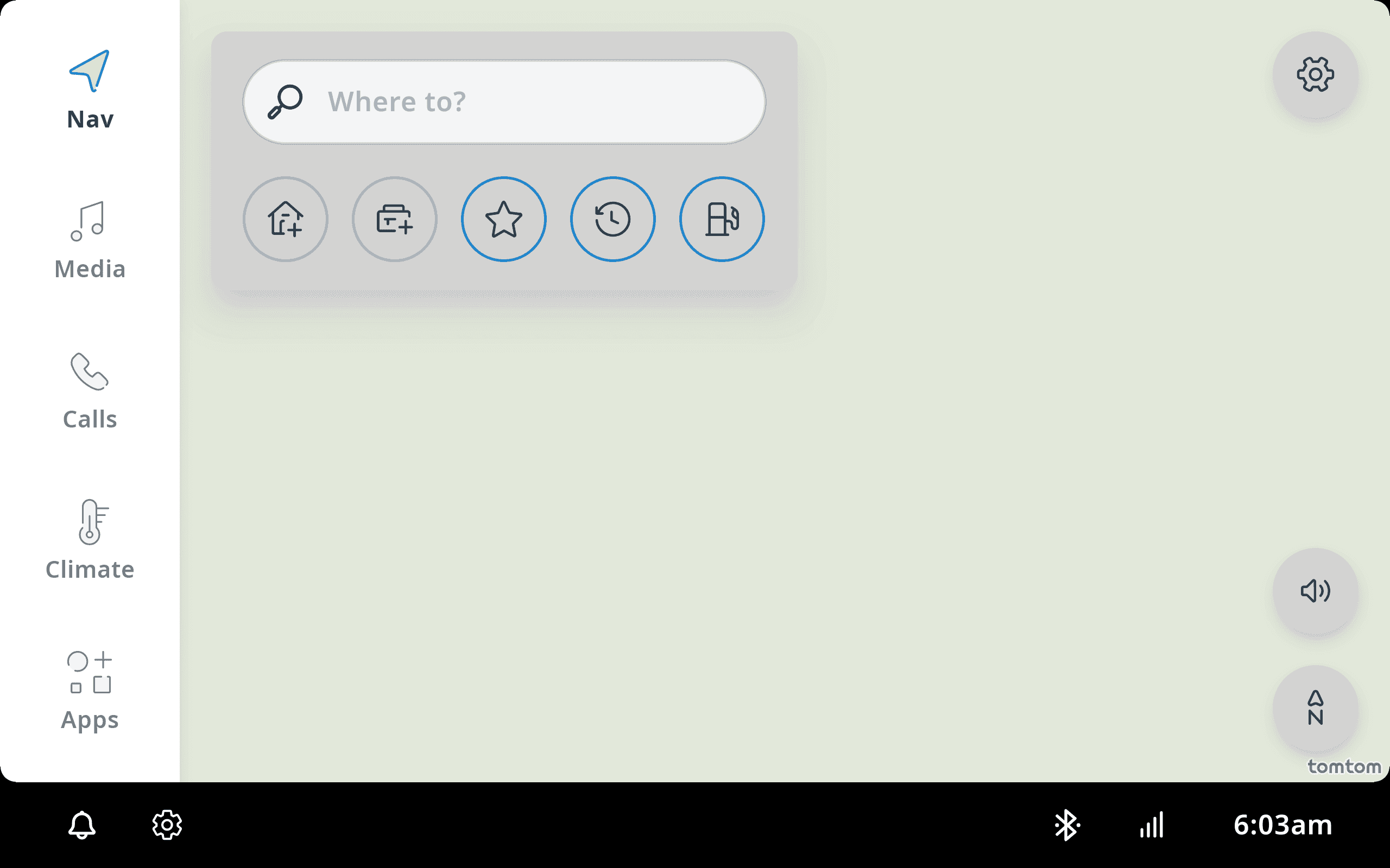
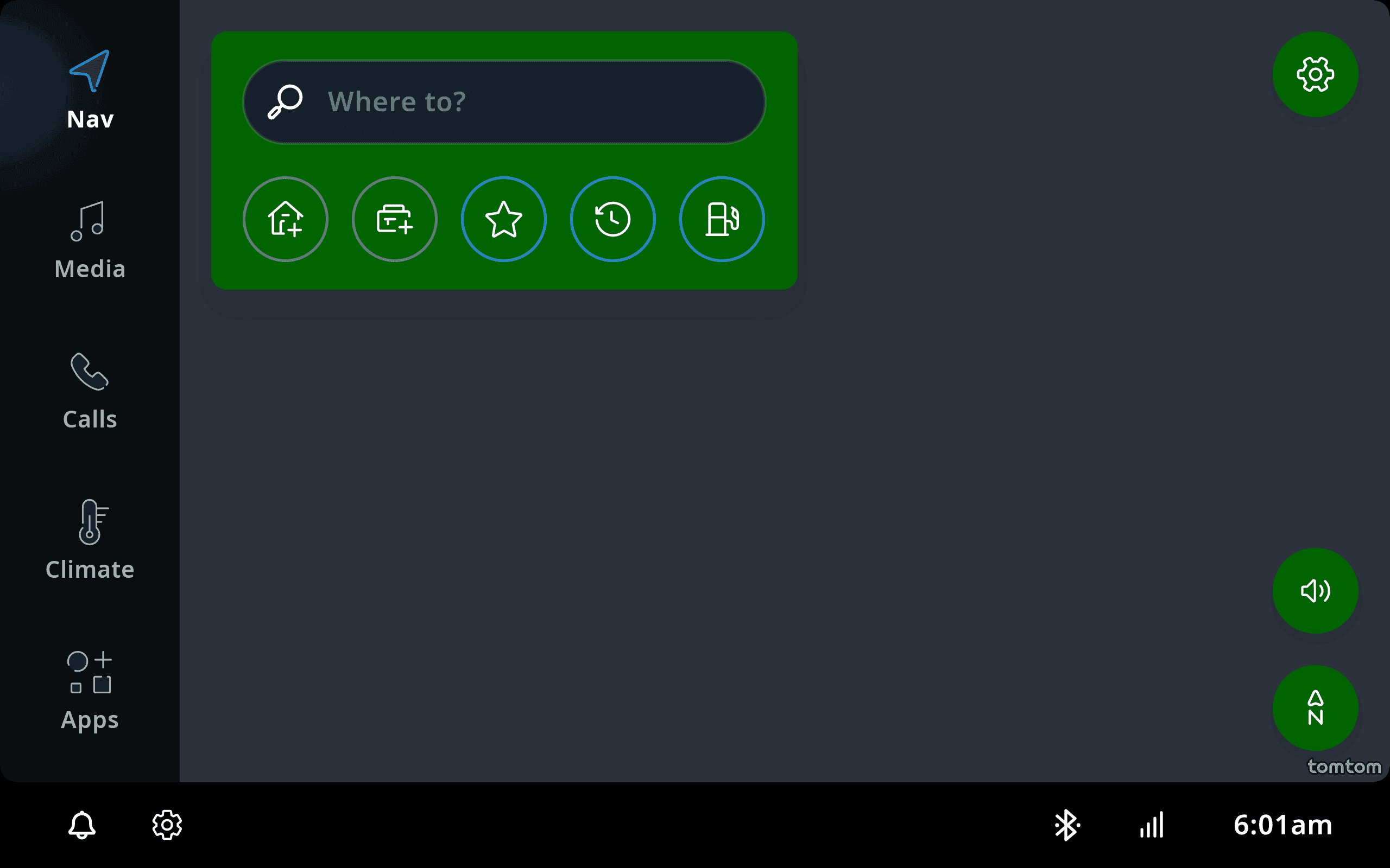
1<resources>2 <!-- We define two styles here: CustomThemeColorDark and CustomThemeColorLight. They inherit3 TomTom Digital Cockpit's stock color styles and only override tt_surface_color with new4 color values. -->5 <style name="CustomThemeColorDark" parent="TtiviThemeColorDark">6 <item name="tt_surface_color">#006400</item>7 </style>89 <style name="CustomThemeColorLight" parent="TtiviThemeColorLight">10 <item name="tt_surface_color">#D3D3D3</item>11 </style>12</resources>
Then in the override function applyConfig, we need to configure the color theme category with
custom theme components. The word configure used here implies the actions to register custom theme
components to a category, and apply style resource to the corresponding theme component.
1@OptIn(IviExperimental::class)2internal class CustomCoreComponentsThemeRegistrySource(3 registrySourceContext: IviThemeRegistrySourceContext,4) : IviThemeRegistrySource.Components(registrySourceContext) {56 override suspend fun IviThemeCategorySetConfigurator.applyConfig() {7 configureColorThemeComponents()8 }910 private fun IviThemeCategorySetConfigurator.configureColorThemeComponents() {11 // Configures the color category.12 configure(colorThemeCategory) {13 // Registers `customColorThemeComponents`.14 registerComponents(customColorThemeComponents)15 // To style the primary stylable resource in the color category.16 toStyle(primaryStyleableResource) {17 // For each custom color theme component(DARK and LIGHT in this example).18 onComponents(customColorThemeComponents) {19 when (component.stylingFlavor) {20 // When Dark flavor21 CustomColorThemeCategoryStylingFlavor.CUSTOM_DARK ->22 // Applies `R.style.CustomThemeColorDark`.23 applyStyle(R.style.CustomThemeColorDark)24 // When Light flavor25 CustomColorThemeCategoryStylingFlavor.CUSTOM_LIGHT ->26 // Applies `R.style.CustomThemeColorLight`.27 applyStyle(R.style.CustomThemeColorLight)28 }29 }30 }31 }32 }33}
Now, for colorThemeCategory, we have registered customColorThemeComponents
and each theme component has its own style resource. But this is not enough. TomTom Digital Cockpit
consists of various domains, such as media, communications, hvac etc..
The CustomCoreComponentsThemeRegistrySource is only for the core theme components. Core theme
components define the styles which are general for each IVI domain. For specific domains, they also
need their own theme registry sources which providing their own specific theme components. So we
continue the similar process for communications domain. Other domains can follow the same
implementation process. Like CustomCoreComponentsThemeRegistrySource, we need a
CustomCommunicationsThemeRegistrySource for communications domain.
In src/main/res/values/themes_colors_communications.xml,
we define two color styles that are identical to TomTom Digital Cockpit's stock styles. You can
change them to experiment the theming customization.
1<resources>2 <style name="CustomThemeCommunicationsColorDark" parent="TtiviThemeCommunicationsColorDark">3 <!-- The current style is identical to the stock one. For more customizations, re-assign4 values to attributes defined in the parent style.-->5 </style>67 <style name="CustomThemeCommunicationsColorLight" parent="TtiviThemeCommunicationsColorLight">8 <!-- The current style is identical to the stock one. For more customizations, re-assign9 values to attributes defined in the parent style.-->10 </style>11</resources>
Just like CustomCoreComponentsThemeRegistrySource, we also need to define a
CustomCommunicationsThemeRegistrySource. In this class, we need to extend
customColorThemeComponents . The word extend, comparing configure used in
CustomCoreComponentsThemeRegistrySource, means we need to extend customColorThemeComponents
for the domain-specific stylable resource with the corresponding style resources.
Note that customColorThemeComponents are already registered in
CustomCoreComponentsThemeRegistrySource.
In src/main/kotlin/com/example/ivi/example/theming/CustomCommunicationsThemeRegistrySource.kt:
1@OptIn(IviExperimental::class)2class CustomCommunicationsThemeRegistrySource(3 registrySourceContext: IviThemeRegistrySourceContext,4) : IviThemeRegistrySource.Components(registrySourceContext) {56 override suspend fun IviThemeCategorySetConfigurator.applyConfig() {7 extendColorThemeComponents()8 }910 private fun IviThemeCategorySetConfigurator.extendColorThemeComponents() {11 // Configures the color category.12 configure(colorThemeCategory) {13 // To style Communications color stylable `TtiviCommunicationsThemeCategoryColors`.14 toStyle(RAttr.styleable.TtiviCommunicationsThemeCategoryColors) {15 // For each custom color theme component(DARK and LIGHT in this example).16 onComponents(customColorThemeComponents) {17 when (component.stylingFlavor) {18 // When Dark flavor19 CustomColorThemeCategoryStylingFlavor.CUSTOM_DARK ->20 // Applies `R.style.CustomThemeCommunicationsColorDark`.21 applyStyle(R.style.CustomThemeCommunicationsColorDark)22 // When Light flavor23 CustomColorThemeCategoryStylingFlavor.CUSTOM_LIGHT ->24 // Applies `R.style.CustomThemeCommunicationsColorLight`.25 applyStyle(R.style.CustomThemeCommunicationsColorLight)26 }27 }28 }29 }30 }31}
For CustomCommunicationsThemeRegistrySource, we also need a builder for it and add it to the
system:
In src/main/kotlin/com/example/ivi/example/theming/CustomCommunicationsThemeRegistrySourceBuilder.kt:
1@OptIn(IviExperimental::class)2class CustomCommunicationsThemeRegistrySourceBuilder : IviThemeRegistrySourceBuilder {34 override fun build(5 registrySourceContext: IviThemeRegistrySourceContext,6 ): IviThemeRegistrySource =7 CustomCommunicationsThemeRegistrySource(registrySourceContext)8}
Then in themeregistrysources.gradle.kts:
1val customCommunicationsThemeRegistrySource by extra {2 IviThemeRegistrySourceConfig(3 registrySourceBuilderName = "CustomCommunicationsThemeRegistrySourceBuilder",4 implementationModule = themingModule,5 )6}
And in build.gradle.kts:
1val customCommunicationsThemeRegistrySource: IviThemeRegistrySourceConfig by project.extra23iviInstances {4 create(IviInstanceIdentifier.default) {5 theming {6 addRegistrySources(7 customCommunicationsThemeRegistrySource,8 )9 }10 }11}
For other domains, we follow the same implementation process as described above.
Select default theme components
Once you define your custom theme components, you may want to make them the default ones adopted by
the system. To do so, we need an IviThemeComponentSelector. The theme
components retrieved from the selector have higher priorities than others not defined in the
selector. To simplify the implementation, TomTom Digital Cockpit provides an API toComponentSelector.
It converts a Set of IviThemeComponents to an IviThemeComponentSelector.
So first we need to declare the Set includes the default theme components.
In src/main/kotlin/com/example/ivi/example/theming/DefaultThemeComponentSelector.kt:
1@OptIn(IviExperimental::class)2private val defaultThemeComponents: Set<IviThemeComponent> =3 // The theme components defined below are selected as the default one per category.4 setOf(5 customColorThemeComponents[CustomColorThemeCategoryStylingFlavor.CUSTOM_DARK],6 )
Then we can transform the Set into a selector.
@OptIn(IviExperimental::class)internal val defaultThemeComponentsSelector = defaultThemeComponents.toComponentSelector()
The following steps are the same as IviThemeRegistrySource. First, we also
need a builder for the selector.
1@OptIn(IviExperimental::class)2class DefaultThemeComponentsSelectorThemeRegistrySourceBuilder : IviThemeRegistrySourceBuilder {34 override fun build(5 registrySourceContext: IviThemeRegistrySourceContext,6 ): IviThemeRegistrySource =7 object : IviThemeRegistrySource.Selectors(registrySourceContext) {8 override fun IviThemeComponentSelectorConfigurator.registerSelectors() {9 register(10 defaultThemeComponentsSelector,11 // `defaultThemeComponentsSelector` is put before the settings selector.12 // When the theme components are selected by clients, the default theme13 // components are overridden.14 IviThemeComponentSelectorPosition.Before(settingsBasedComponentSelectorId),15 )16 }17 }18}
Then in themeregistrysources.gradle.kts:
1val defaultThemeComponentsSelectorThemeRegistrySource by extra {2 IviThemeRegistrySourceConfig(3 registrySourceBuilderName = "DefaultThemeComponentsSelectorThemeRegistrySourceBuilder",4 implementationModule = themingModule,5 )6}
And in build.gradle.kts:
1val defaultThemeComponentsSelectorThemeRegistrySource: IviThemeRegistrySourceConfig by project.extra23iviInstances {4 create(IviInstanceIdentifier.default) {5 theming {6 addRegistrySources(7 defaultThemeComponentsSelectorThemeRegistrySource,8 )9 }10 }11}
See the custom color theme
So far we go through each step to provide a custom color theme to the system. Let's check how the custom light mode and custom dark mode looks in the system.