Frontend Plugins
Important note:The TomTom Digital Cockpit SDK is not available for general use. Please contact us for more information.
Frontend plugins are the user interface (UI) modules of the TomTom Digital Cockpit. Each frontend is an independent module encapsulating the UI of some distinct functionality in the product. The TomTom Digital Cockpit platform provides a number of default, or off-the-shelf, frontend plugins, like the media player, the phone, etc.
Each frontend is developed against a common set of stable platform APIs. These APIs can be used to create new frontends for the platform, or replace an off-the-shelf plugin with your own customized version.

The configuration and inclusion of the frontend plugins in the TomTom Digital Cockpit product are done at build time, thus only the applicable frontend plugins are included in the deployed product.
The TomTom Digital Cockpit product is built and deployed as one Android APK. Therefore, the plugins cannot be replaced, or updated individually after the product has been installed on a device. This requires a new build to be re-installed.
This page provides an overview of frontend related components. If you want to start building a frontend plug-in, see Create a frontend plugin.
Off-the-shelf (stock) frontend plugins
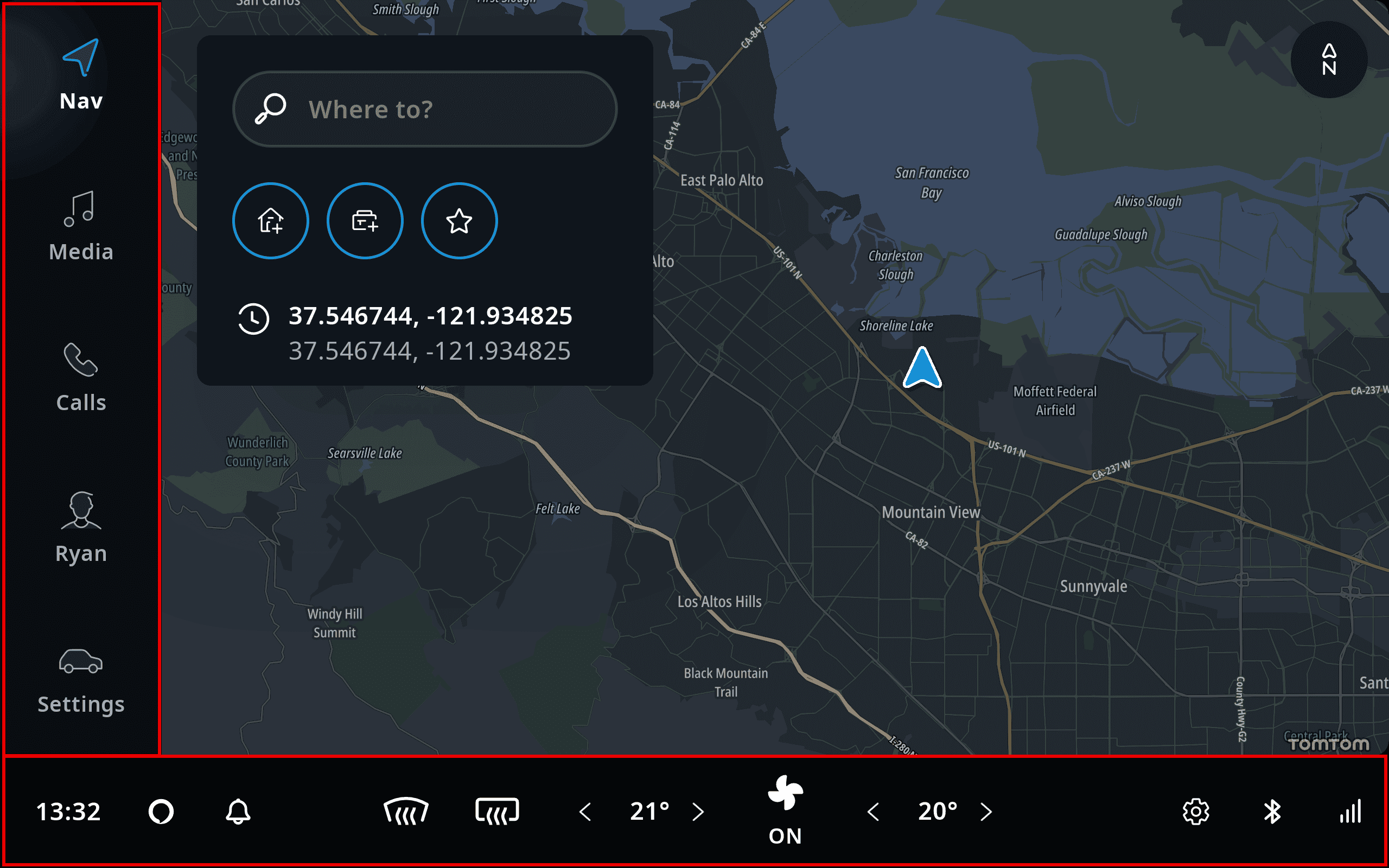
There are a number of off-the-shelf plugins in the TomTom Digital Cockpit platform. In the source repository these are usually referred to as stock plugins. The following picture shows the default view when you launch the example application that comes with TomTom Digital Cockpit. Highlighted in red it shows the HVAC frontend along the bottom and the main menu frontend on the left side with menu items that launch other frontends.
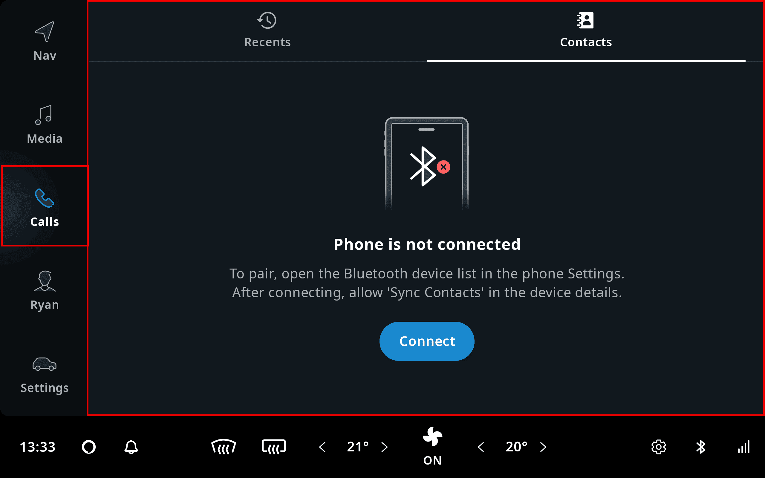
Here is an example of one of the stock launched frontends, containing the UI for the contacts functionality. The frontend and the associated menu item are highlighted in red.
Frontends and panels
Frontends insert parts of their UI into panels, which the system UI processes and displays when needed. A panel represents the intention of a [Frontend] to show a fragment. The arrangement of these panels is orchestrated by the system UI which ensures that the correct parts are displayed and dismissed appropriately.
Panels are used for a wide range of functionalities. This is not limited to opening panels when pressing a menu item, but also notification panels, main process panels, and even the main menu itself.

TomTom Digital Cockpit frontends are designed around using the
MVVM pattern
and Android's Data Binding Library.
TomTom Digital Cockpit has many convenience classes to simplify using these. The
platform_frontend_api_common_frontend module contains the classes needed to
create your own frontend, panel, and fragment using a ViewModel for the data-binding.
Frontend
A Frontend exposes pieces of the overall user interface. For example, there
could be a frontend for the main menu and one for the map view. Each frontend can have one or more
panels associated with it, like a main panel and a notification panel. A frontend can also be
headless, like a phone frontend that might not show a panel until a phone call starts.
To create your own frontend, extend the Frontend class. Also, a
Frontend can be created by its own FrontendBuilder.
Panel
A Panel(see package
com.tomtom.ivi.platform.frontend.api.common.frontend.panels) visually
represents a frontend through an IviFragment, which may be shown in the
system UI. A Panel also is not bound to a specific Android context. And it may be able to be
dismissed. Panels that can be dismissed, such as notification panels,
modal panels, task panels etc., are extended from
DismissablePanel. DismissablePanels can be dismissed by the user, through system UI
functionality, like swiping it away.
Panel lifecycle
Each panel has its own lifecycle. This lifecycle is controlled by the frontend and the system UI.
The lifecycle state starts at INITIALIZED. Once the panel is added to its frontend, the state is
changed to CREATED. If the system UI attaches the panel to a container, the state changes to
STARTED. Finally, a panel is destroyed when the panel is removed from its frontend. The image
below shows the states in a panel lifecycle:

When we go into more detail, the fragment created by a panel will follow the Android fragment lifecycle. The states of the lifecycle of a panel, its fragment and the associated view model are listed in the table below:
| Panel lifecycle state | Fragment lifecycle state | View model lifecycle state | Notes |
|---|---|---|---|
| INITIALIZED | - | - | |
| CREATED | - | - | |
| CREATED | STARTED | Only happens during theme change for previously STARTED panels. | |
| STARTED | - | - | Panel is attached to a panel container, but not shown. No fragment was created. |
| CREATED | STARTED | Panel container can create, but no longer show the fragment. | |
| RESUMED | STARTED | Fragment is shown. | |
| DESTROYED | DESTROYED | DESTROYED |
If the lifecycle of a panel is STARTED, this means that the panel is attached to a panel
container. Some panel containers can receive multiple panels, and will not always display all of
them. Therefore, a STARTED panel doesn't always imply that it has created a fragment.
Once a panel container has presented a panel, it may cache the fragment created by that panel in a
CREATED state, for potential future reuse. When a panel is detached from the panel container, the
fragment can still be used to show an exit animation.
Panel lifecycle and theme changes
TomTom Digital Cockpit has an optimized way of changing theme, which is not a configuration change. During this theme change, the view hierarchy is recreated. The panel will be detached from its panel container, and later attached to a new panel container. The same fragment instance will be attached to this new location and recreate its views.
Panel Types
TomTom Digital Cockpit offers a base set of panel types that can be used. Customers can also define their own
panel types. To create your own panel for a frontend, you can derive from any of the panel classes
in the package com.tomtom.ivi.platform.frontend.api.common.frontend.panels.
Which panel to derive from depends on how the panel should be presented. For example, deriving from
TaskPanel allows you to implement a panel that can be opened through a menu
item.
Home panel
The home panel is the main element shown on the screen when starting TomTom Digital Cockpit. The default home
panel contains a map that allows the user to plan a trip somewhere and navigate to it. A frontend
can provide a home panel by adding a panel that extends HomePanel to its
panels.
Main menu panel
The main menu panel provides a way of accessing the other system frontends. Main menu panels
commonly depend on the MenuService, which provides the menu items and handles
user selections. This allows the menu frontend itself to not have any dependencies on other
frontends directly. A frontend can provide a menu by adding a panel that extends
MainMenuPanel to its panels.
Task panels
Tapping on a menu item in TomTom Digital Cockpit's main menu commonly leads to a panel sliding open. This
panel is called a task panel, and it can be created by adding a panel that extends
TaskPanel to the frontend's panels. It allows the user to perform a certain
task, after which the panel typically is closed again. Task panels can be thought of as an "app"
within TomTom Digital Cockpit.
Task panels can be stacked to create a user flow through various screens. The top-most task panel will be shown to the user, and when that panel is removed, the next task panel on the stack will be shown.
A header with a consistent look and feel across other task panels can be added by placing the
TtNavigationBar control in the panel's layout. This is typically placed
in the top-left of the panel, but may be placed anywhere.
System UI provides task panels with data to populate the navigation bar. System UI calls the task
panel's Panel.onAttached method with a PanelAttachment instance which
contains the NavigablePanelStackContext data. When a task panel's view model
implements the NavigablePanelViewModel interface, a fully populated
NavigationBarViewModel is available in the task panel's view model through
NavigablePanelViewModel.getNavigationBarViewModel.
When your task panel's view model extends from FrontendViewModel,
implementing NavigablePanelViewModel is as easy as inheriting from it; no
implementation is needed. The TtNavigationBar can be populated in the
task panel's layout by assigning
NavigablePanelViewModel.getNavigationBarViewModel to the
TtNavigationBar's ttViewModel XML attribute. Then you have a fully
functioning TtNavigationBar. For example, the system UI may hide the
back button in the navigation bar, if there's only one task panel in the stack. It may also fill in
the breadcrumbs for quick access to other task panels in the stack. The metadata in the task panel
interface, such as the label, can be used to provide the information shown in the navigation bar.
When the user dismisses the panel, like swiping it away, it can trigger the system UI to dismiss the whole task panel stack, rather than just a single one.
Main process panels
Frontends can visualize ongoing processes in the UI, by using main process panels. These can be
created by adding a panel that extends MainProcessPanel to the frontend's
panels. This can be used, for example, to show an ongoing audio streaming process or during a phone
call. The main process panel's metadata is used by the system UI to determine the priority of when
to show them. For example, an ongoing phone call has a higher priority than streaming media. When
both these frontends provide a main process panel at the same time, the main process panel for phone
calls will be shown instead of the one for media.
More information about the MainProcessPanel can be found in
Main process panel. Or, if you
want to start building a MainProcessPanel, see
Create a main process panel.
Task process panels
A task process panel allows a frontend to visualize an ongoing process in all of its task panels. Unlike the main process panel, a task process panel is part of the task panel and as such does not overlap the task panel itself.
TomTom Digital Cockpit's system UI may hide the main process panel when a task panel is opened. However, if
the process is relevant to that task panel, it likely wants to continue presenting that process to
the user; for example, to show a mini player for the currently playing music. In these cases, the
frontend can add a panel extending TaskProcessPanel, which the system UI will
show next to the task panel itself, within the task panel's container. The task process panel will
persist for the whole task panel stack. When task panels get added and removed from the stack, the
same task process panel will continue to be visible. A frontend's task process panel will only be
shown if it also has an active task panel, and will not be shown for task panels of other
frontends.
Notification panels
A notification is a panel that TomTom Digital Cockpit uses to present information to the user.
Each NotificationPanel has its own
NotificationPanel.Priority. The system UI uses it to determine when and how
to show the notification. For example, it may choose to suppress a low priority notification, while
a higher priority notification is active, to avoid distracting the driver.
TomTom Digital Cockpit provides a pre-defined UI template, that clients can
use to present information. The user can also tap on the notification to trigger an action.
Notification panels that choose to useNotificationFragment get this UI
template, but it is not mandatory to use a template. If your panel uses a different layout, then
extending the regular IviFragment, instead of the template's fragment gives
you full control over the contents.
More information about how the system UI handles the notifications can be found in System UI. Or, if you want to start building a notification, see Create a notification panel.
Modal panels
A modal panel is a floating panel that blocks all other user interaction until it has been dismissed. Modal panels are used to display information that:
- Needs attention from the user, like instructions or critical information.
- Requires information in order to continue with a service or workflow.
Modal panels interrupt a user's workflow by design. When active, a user is blocked from the task panel or home panel content. They cannot return to their previous workflow until the modal task is completed or the modal panel has been dismissed.
Modal panels are used for short and non-frequent tasks, such as logging into an account, Bluetooth
device pairing, making small changes, or management tasks. If a user needs to repeatedly perform a
task, consider letting the user handle it in the original panel. Modal panels can be created by
adding a panel that extends ModalPanel to the frontend's panels.
Modal panels can be stacked to create a user flow through various screens. The top-most modal panel will be shown to the user. When that panel is dismissed, the next modal panel on the stack will be shown.
A header with a consistent look and feel across other modal panels can be added by placing the
TtNavigationBar control in the panel's layout. This is typically placed
in the top-left of the panel, but may be placed anywhere.
System UI provides modal panels with data to populate the navigation bar. System UI calls the modal
panel's Panel.onAttached method with a PanelAttachment instance which
contains the NavigablePanelStackContext data. When a modal panel's view
model implements the NavigablePanelViewModel interface, a fully populated
NavigationBarViewModel is available in the modal panel's
NavigablePanelViewModel.getNavigationBarViewModel based on this data. When
your modal panel's view model extends from FrontendViewModel, implementing
NavigablePanelViewModel is as easy as inheriting from it; no implementation
is needed. The TtNavigationBar can be populated in the modal panel's
layout by assigning NavigablePanelViewModel.getNavigationBarViewModel to
TtNavigationBar's ttViewModel XML attribute.
Then you have a fully functioning TtNavigationBar.
For example, the system UI may hide the back button in the navigation bar if there's only one modal
panel in the stack. It may also fill in the breadcrumbs for quick access to other modal panels in
the stack. The metadata in the modal panel interface, such as the label, can be used to provide the
information shown in the navigation bar.
When the user dismisses the panel, like clicking a close button, it can trigger the system UI to dismiss the whole modal panels stack, rather than just a single one.
Control center panels
TomTom Digital Cockpit's control center is an isolated area of the system UI that provides persistent
indicators and controls, that are accessible to the user at all times; for example, clock or
temperature controls. It is populated with various panels extending
ControlCenterPanel. The metadata, which is set in the panel's interface, lets
the system UI determine where to show the panel. For example, a panel with its type property set
to SYSTEM_STATUS_DRIVER will be shown somewhere easily accessible by the driver and may be
positioned differently depending on the location of the steering wheel.
Navigation panel
The NavigationPanel offers functionality for navigation. This includes:
- Quick access to location based search, such as searching for a driving destination, parking spots or charging stations.
- Displaying of guidance information for the active trip.
A frontend can add navigation functionality by adding a panel that extends
NavigationPanel to its panels.
Overlay panels
Frontends can overlay the system UI using overlay panels, which can be created by adding a panel
that extends OverlayPanel to the frontend's panels. Overlay panels are used to
show a temporary visual effect over the system UI's main content area. This can be used, for
example, to visualize the state of a currently active VPA, or to provide large and noticeable
navigation instructions.
Panel templates
Panels in several frontend plugins may have a very similar layout. For example, most notifications have an icon, text and buttons arranged in the same way. These panel-specific layouts are offered by TomTom Digital Cockpit in the shape of templates, that request a view model and put the information that it contains in the right place.
These templates are implemented in the form of a base fragment class. In order to use a template,
your panel's fragment should extend one of these base template fragments. The view model referred to
by your fragment must then also extend the ViewModel type used by that template fragment. The
properties in that template ViewModel can be set by your own view model to populate the template.
Note: It is not mandatory to use a template. If your panel uses a different layout, then
extending the regular IviFragment instead of the template's fragment gives
you full control over the contents.
TomTom Digital Cockpit offers templates for:
Notification panel template
The design of a notification is determined by the template. You can use it by extending
NotificationFragment and specify the content for
each element of the template through NotificationViewModel.
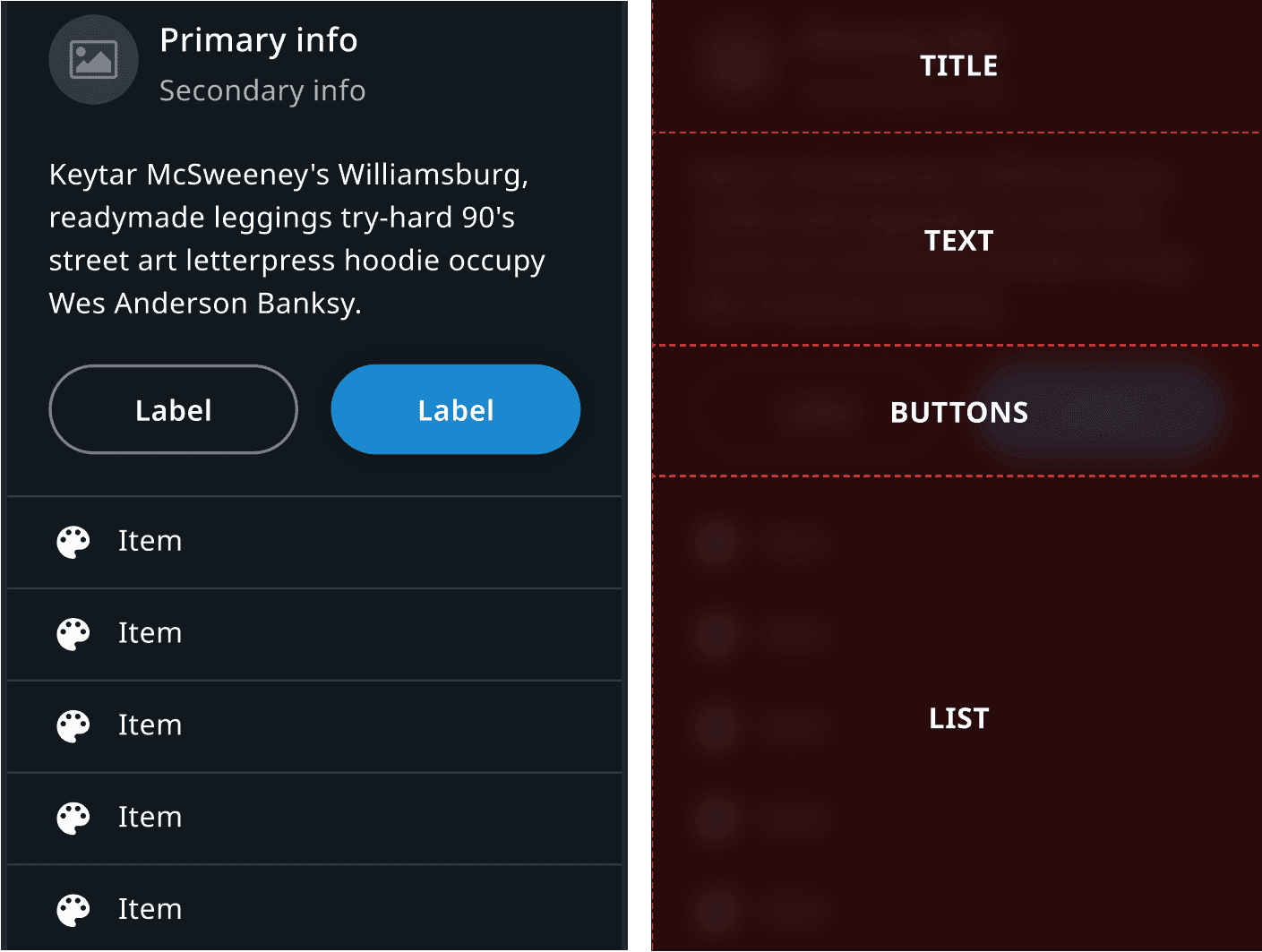
The template consists of several sections:
- The title section gives the user a context for the notifications appearing, like an incoming calling, car warning, etc.
- The text section is used to provide the description for a notification.
- The button section, if applicable, provides the user with the ability to act upon the notification. A maximum of two buttons can be present in the notification. Their type can be configured by the developer, depending on how they want the end-user to be able to interact with the notification.
- The list section provides the user a set of extra options to choose from, like send quick replies, multiple options given by VPA, etc.
Main process panel template
The default template for MainProcessPanels can be used by extending
MainCompactProcessFragment and
MainCompactProcessViewModel from
platform_frontend_api_template_compactprocesspanel.
For More information about the process panel template. please check the Anatomy section in the main process panels page.
Task process panel template
The default template for TaskProcessPanels can be used by extending
TaskCompactProcessFragment and
TaskCompactProcessViewModel from
platform_frontend_api_template_compactprocesspanel.
Modal panel template
The default template for ModalPanels can be used by extending
ModalFragment and ModalViewModel from
platform_frontend_api_template_modalpanel.
Fragment
Instead of Android's Fragment,
IviFragment is the base class for all fragments used by
Frontends in TomTom Digital Cockpit. Typically, IviFragments are
responsible for creating a layout and linking it to a FrontendViewModel. It
provides a helper class IviFragment.ViewFactory that takes care of common
tasks for creating a view, such as inflation, binding a lifecycle owner and ViewModel and
extracting a root view.
ViewModel
A FrontendViewModel is a
ViewModel used by a
Frontend and an IviFragment. It also references a
corresponding panel. This panel reference can be used for different purposes, like dismissing the
panel.
Registration
Each frontend is registered by supplying a set of metadata at build-time which describes the frontend characteristics. Each metadata contains details such as:
- A factory class which can be used by the framework to create the instance.
- Whether the frontend should start at start-up (the default) or start on demand.
- Optionally, a menu item can be added to the main menu to open the frontend's main task panel.
The configuration in the Gradle build files can also specify whether or not this frontend should be replacing an existing stock frontend.