UI Controls
Important note:The TomTom Digital Cockpit SDK is not available for general use. Please contact us for more information.
In TomTom Digital Cockpit, the System UI is made up of a number of panels, such as the main menu, notifications, etc. Each panel visually represents a frontend through a fragment made up of different UI elements like text, images, buttons, etc.
TomTom provides a reusable UI controls library TomTom Android Tools that developers can use to build the user interface of their frontends. These controls are optimized for use in cars and have additional features compared to their built-in Android equivalents. This allows developers to build a consistent look and feel across their whole IVI system and to minimize implementation effort. The controls also support various forms of user interaction. The system wide appearance of the UI controls can be customized through theming.
It is recommended that, where possible, controls from these libraries are used instead of their Android equivalents so that the resulting IVI system has a consistent UI across their frontends. The standard build-in Android control should still be used where no equivalent exists in the UI library or where the Android control provides features not available in the UI library control.
For a complete list of available controls and specific details about each one, see the API
reference of the api_uicontrols module.
It is possible to customize the style of the UI controls by setting their attribute values to
specific theme attributes. The com.tomtom.tools.android.core.theme module declares the view
element attributes that these controls need, to define their appearance. When using these controls,
it is mandatory to define these attribute values. More information on how to theme UI controls
can be found in the Theming
documentation.
The most commonly used TomTom UI controls are:
Other controls that are also available in TomTom Digital Cockpit are:
Common controls
TextView
The TtTextView class is a user interface element that represents a
label control that displays text to the end-user. It acts in a similar way to Android's
TextView
but should be used instead of it (or similar) classes so that the UI of the frontend being developed
is consistent with the rest of the UI of the IVI system.
In contrast to the Android class
AppCompatTextView,
this control also provides predefined option for; Vertical alignment.
This is how a TtTextViews can look when configured in various ways:
A TtTextView can be added to a UI XML layout file in the same way as a
standard Android view. The following example illustrates how to do this and how to style the control:
1 <com.tomtom.tools.android.api.uicontrols.textview.TtTextView2 android:id="@+id/displayLargeText"3 android:layout_width="wrap_content"4 android:layout_height="wrap_content"5 android:text="Display large"6 android:textAppearance="?attr/tt_display_text_style_l"7 android:textColor="?attr/tt_surface_content_color_emphasis_low" />
Predefined styling attributes are provided to help style the text label. More information on these can be found in the Theming and Customization document.
Button
The TtButton class contains an implementation of a basic tappable
button UI control and adds additional features not present in the built-in Android
AppCompatButton
class. These include:
- You can provide a drawable, a text label or both, that will be shown on the button.
- Showing a badge on top of the drawable is also possible. A typical use case could be to inform the user that something has changed, for example, new messages have arrived.
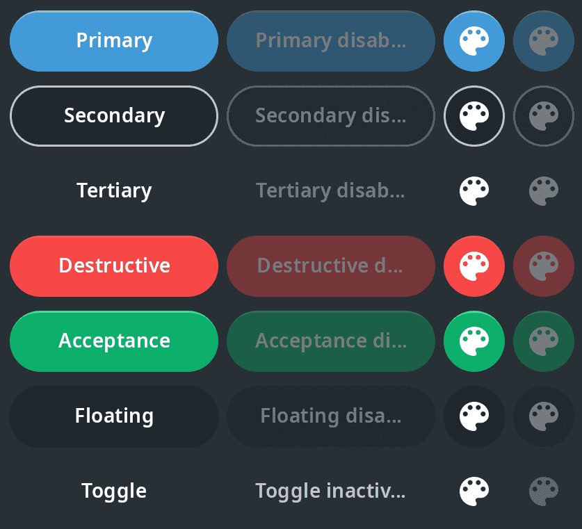
- Several types of buttons are defined. They all have a different appearance and should be used for
different use cases:
- Primary is used for actions with the most emphasis.
- Secondary is used for actions with less emphasis.
- Tertiary is used for actions with the least emphasis.
- Acceptance is used for actions with a positive emphasis that results in success.
- Destructive is used for negative actions, like flow cancellation or data deletion.
- Floating is used for buttons which hover over content to promote an action.
- Toggle is used for buttons which allow the user to change a setting between two states.
The following diagram shows examples of these buttons. The specific appearances such as Destructive and Acceptance can be used to ensure that all buttons with those roles look and behave in the same way across the entire IVI system.
A TtButton can be added to a UI XML layout file in the same way as a
standard Android view.
The following example illustrates how to add a primary button with a text label to your UI:
1<com.tomtom.tools.android.api.uicontrols.button.TtButton2 android:id="@+id/primaryButtonExample"3 style="@style/TtAppButtonStyle"4 android:layout_gravity="center"5 android:text="I am a Primary Button"6 auto:ttActionType="ActionType.PRIMARY" />
where the TtAppButtonStyle style is defined as
1<style name="TtAppButtonStyle">2 <item name="android:layout_marginHorizontal>?attr/tt_spacing_3"</item>3 <item name="android:layout_marginVertical>?attr/tt_spacing_5"</item>4 <item name="android:padding=">?attr/tt_spacing_2"</item>5</style>
The style can be reused so that other buttons with different ttActionTypes have the same
margin and padding.
To add a teriary button with an icon, the following XML code can be used:
1<com.tomtom.tools.android.api.uicontrols.button.TtButton2 android:id="@+id/iconButtonExample"3 android:layout_width="wrap_content"4 android:layout_height="wrap_content"5 auto:ttActionType="tertiary"6 auto:ttDrawable="@drawable/myButtonIcon"7 auto:ttDrawableTint="?attr/tt_surface_content_color_emphasis_high" />
The TtButton API reference describes the other available attributes
which can be used to for example, add an image to the button.
TextInputField
The TtTextInputField class lets the user enter text. You can set a hint text in the input field, as a placeholder for the input text. Also, you can provide a helper text, shown below the input field, to help the user understand which information is requested.
Apart from these you can also provide error text, which is also shown below the input field. This can be used to indicate to the user that the entered input is incorrect, or that an error occurred as a result of the input.
There is a clear icon, for the user to clear the input.

ImageView
TtRoundedImageCardView
The TtRoundedImageCardView class is designed for displaying rounded
images with a small text overlay.
This control consists of layered elements, from top to bottom:
- a text label;
- a foreground image;
- a source image;
- a background image.
The source image can be retrieved from a given URI, optionally showing a placeholder image until the source image has been downloaded.
List
TtListLinearLayout
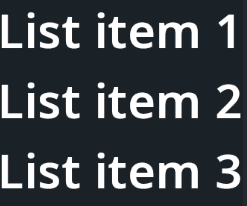
The TtListLinearLayout class presents views as a list.
The TtListLinearLayout adds to the Android class
LinearLayout
the following features:
- You can provide your own ViewModels and item layout to populate view items in this list.
- You can specify the maximum number of items to be displayed in the view.
TtListTableLayout
The TtListTableLayout class presents views as a table, with multiple
rows and columns.
The TtListTableLayout adds to the Android class
TableLayout
the following features:
- You can provide your own ViewModels and item layout to populate view items in this list.
- You can specify the maximum number of items to be displayed in the view.
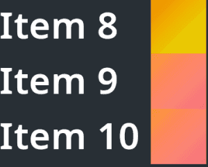
TtListRecyclerView
The TtListRecyclerView class makes it easy to efficiently display large
sets of data.
The TtListRecyclerView adds to the Android class
RecyclerView
the following features:
- You can provide your own
ViewModels and the layout to define how each item looks. TheViewModelcan be:- A header ViewModel containing an image and a text.
- A content ViewModel is used to populate a
TtInformationControl.
- You can provide a sticky header. This is a header view that is always shown at the top of the
TtListRecyclerViewand does not disappear while scrolling.
ScrollBar
The TtScrollBar class is used to control the attached view and to
visualize the scrolling status. Apart from the basic scroll bar functionalities, this control also
provides some dditional features:
- A scroll bar indicator. The indicator is an extra view, shown next to the scroll bar handle and attached to the scroll bar's parent view. It presents some extra information like a text or a drawable, based on the current scrolling position.
- An
upbutton at the top of the bar, and adownbutton at the bottom of the bar. - Scroll by page. A tap-and-hold of the
upordownbutton scrolls the target view page by page. - Scroll to top. A tap-and-hold of the
upbutton scrolls the target view to the top page.
You can configure the TtScrollBar for either scroll-by-page or
scroll-to-top, but not both.
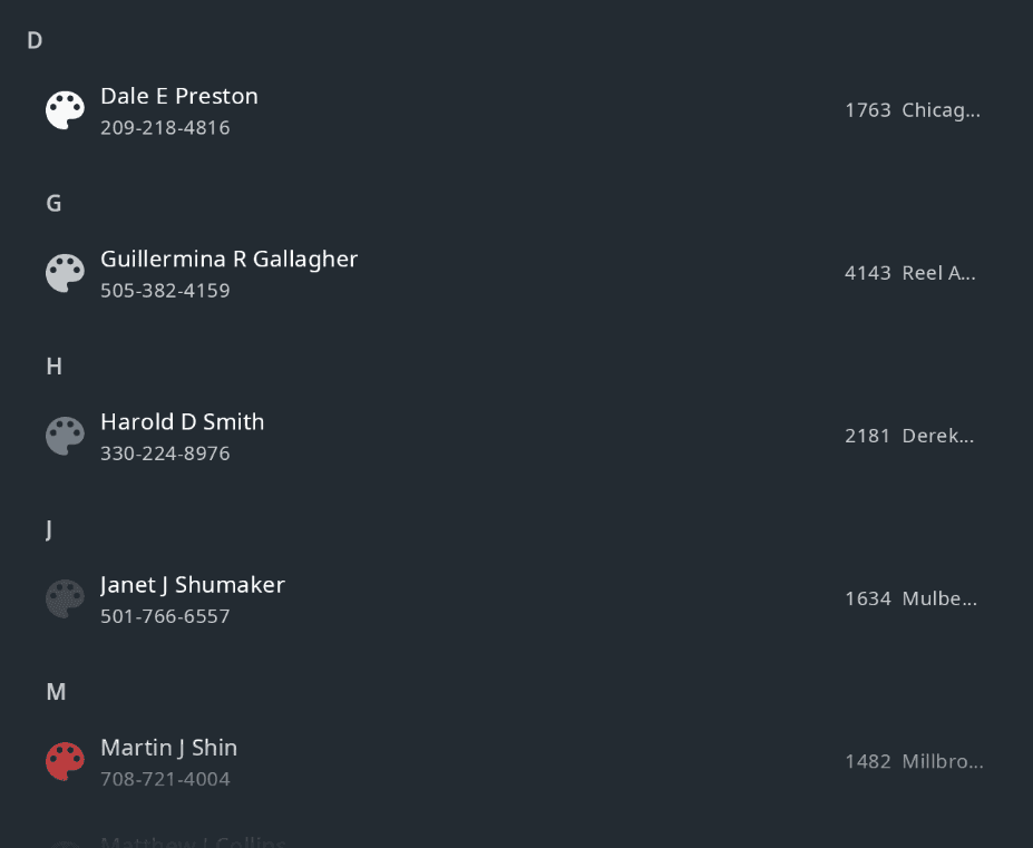
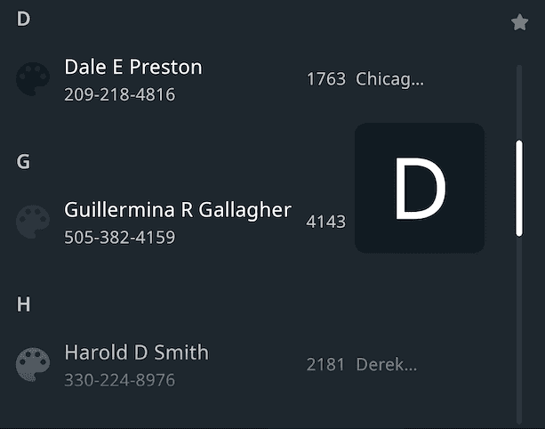
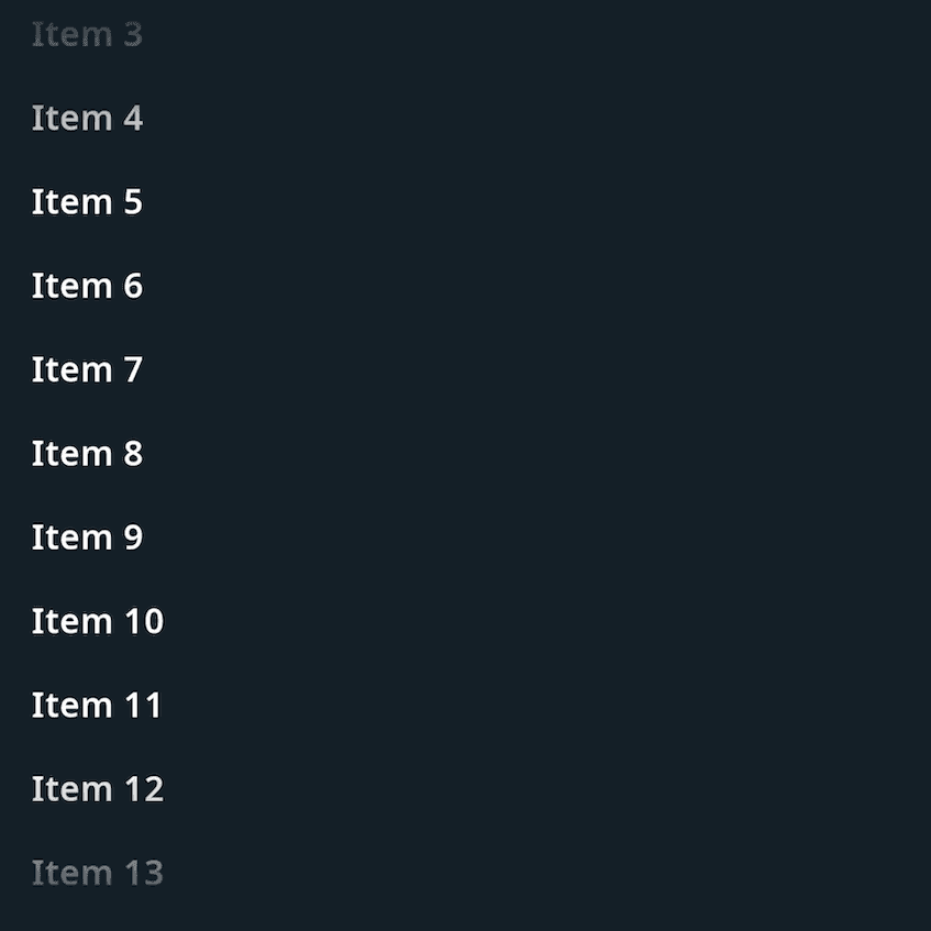
Here is an example demonstrating a combined usage of TtScrollBar and
TtListRecyclerView. From the image, you can see the star icon as the
up button on the top of the bar. Also, the scroll bar indicator shows D for the current scroll
position.
ScrollView
The TtScrollView class provides the Android
ScrollView
functionalities, but can only scroll vertically. You can specify the position of a fading effect as
one of the following:
- Top edge only.
- Bottom edge only.
- Top and bottom edges.
Other controls
ProgressBar
The TtSmoothProgressBar class is used to indicate the progress of an
operation.
The TtSmoothProgressBar adds to the Android class
ProgressBar
the following features:
- The progress is updated smoothly by an
Animator.

InformationControl
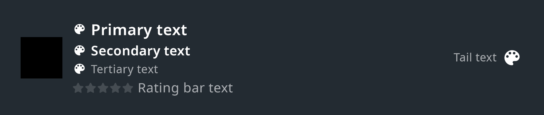
The TtInformationControl class is designed to present various types of
information in a view. It can be used in different places across the system, like lists,
notifications, process panels, etc.
The content within this control consists of three sections that can be configured individually:
- The optional head section is positioned on the left and holds an image.
- The main section is positioned in the center. It starts with three vertically aligned text areas, with an optional icon: primary, secondary and tertiary. At the bottom it shows a rating bar with a dedicated text label.
- The optional tail section is positioned on the right and holds a text and an image. The user can choose whether to show either the text or the icon, or both.
An action can be triggered when the user taps the head section or the main section. A separate action can be triggered when the user taps the tail section.
NavigationBar
The TtNavigationBar class is mainly used to navigate between different
screens within a domain or a panel.
It optionally shows a back button. Next to the back button is either a title or a number of breadcrumb items. The breadcrumbs reflect the current back stack and allow clicking on the items in order to navigate backwards through the stack.
The navigation bar can be configured to look as:

SearchView
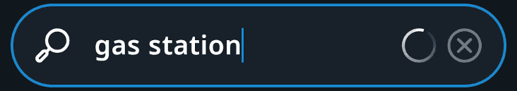
The TtSearchView class consists of an icon on the left, an input field
in the middle, a clear icon, and a searching indicator on the right.
The TtSearchView adds to the Android class
SearchView
the following features:
- The search indicator for the search progress visual indication.
- Locking the view for driving safety.
- Expanding and collapsing the view, to have more screen space when the view is not in use.
- The appearance customization, such as the visibility of the searching indicator, or the look of the locked view, is affected by the search status: focused, searching, locked, etc.
This is how the control looks while a search is in progress, with the clear icon visible and the searching indicator animating:
This is how the control looks like in a collapsed and locked state with the lock icon visible. The minimal-width collapsed search view example is on the left, and the larger variant of the collapsed search view is on the right.

SeekBar
The TtSmoothSeekBar class is used to indicate the progress of an
operation with a draggable thumb. The user can touch the thumb and drag left or right to set the
current progress.
The TtSmoothSeekBar adds to the Android class
AppCompatSeekBar
the following features:
- The progress is updated smoothly by an
Animator.

TabBar
The TtTabBar class contains tab components and a tab indicator. A tab
usually represents a group of content and the tab bar is used to organize and navigate between these
groups. The tabs within the tab bar can be visually represented by an icon, a text or both. The tabs
can have a fixed or a flexible width, depending on the configuration. When a tab is selected, it
will be highlighted and the tab indicator moves under the selected tab.
AppTileView
The TtiviAppTileView class is used to represent an application. It is used
generally in panels offering a selection between multiple applications. Each application is
represented by a tile containing a background, the icon and the name of the application.