UI controls
The Map Display module provides a set of built-in UI elements that can be used to control the map. The components can be accessed and customized by using the TomTomMap object. Each of these elements can be repositioned by changing its margin property (expressed in pixels).
The UI components can be modified not only in the Kotlin code, but also in the XML styles. To modify them in XML, use the appropriate style and parent names as described below. You can use this method to set Android properties as well as attributes defined in the Map Display module.
Compass
The compass graphic indicates which way is north. By default, it is placed in the upper right corner of the map and is only visible when the map is not oriented north-up. If the user clicks the compass, the camera rotates to the north up position. The icon changes to the northUpIcon then disappears with an animation. You can set your drawable as an icon that points north when the map is not north-up. When the map is north-up, the icon becomes the northUpIcon.
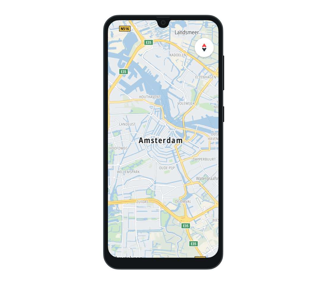
Use the visibilityPolicy of the CompassButton to change the default visibility policy.
mapFragment.compassButton.visibilityPolicy = VisibilityPolicy.Visible
To detect a click on the compass button, set the UiComponentClickListener.
val uiComponentClickListener = UiComponentClickListener { /* YOUR CODE GOES HERE */ }mapFragment.compassButton.addCompassButtonClickListener(uiComponentClickListener)
Once the click listener is no longer needed, it can be removed.
mapFragment.compassButton.removeCompassButtonClickListener(uiComponentClickListener)
To change the style of the CompassButton in XML, set the style name to CompassButton and its parent to BasicCompassButton.
1<style name="CompassButton" parent="BaseCompassButton">2 <item name="android:backgroundTint">@android:color/black</item>3 <item name="compassButton_visibilityPolicy">visible</item>4</style>
Zoom controls
When visible, the zoom control is in the middle of the right-hand side of the map. It is invisible by default, but you can change it using the isVisible flag on the ZoomControlsView.
mapFragment.zoomControlsView.isVisible = true
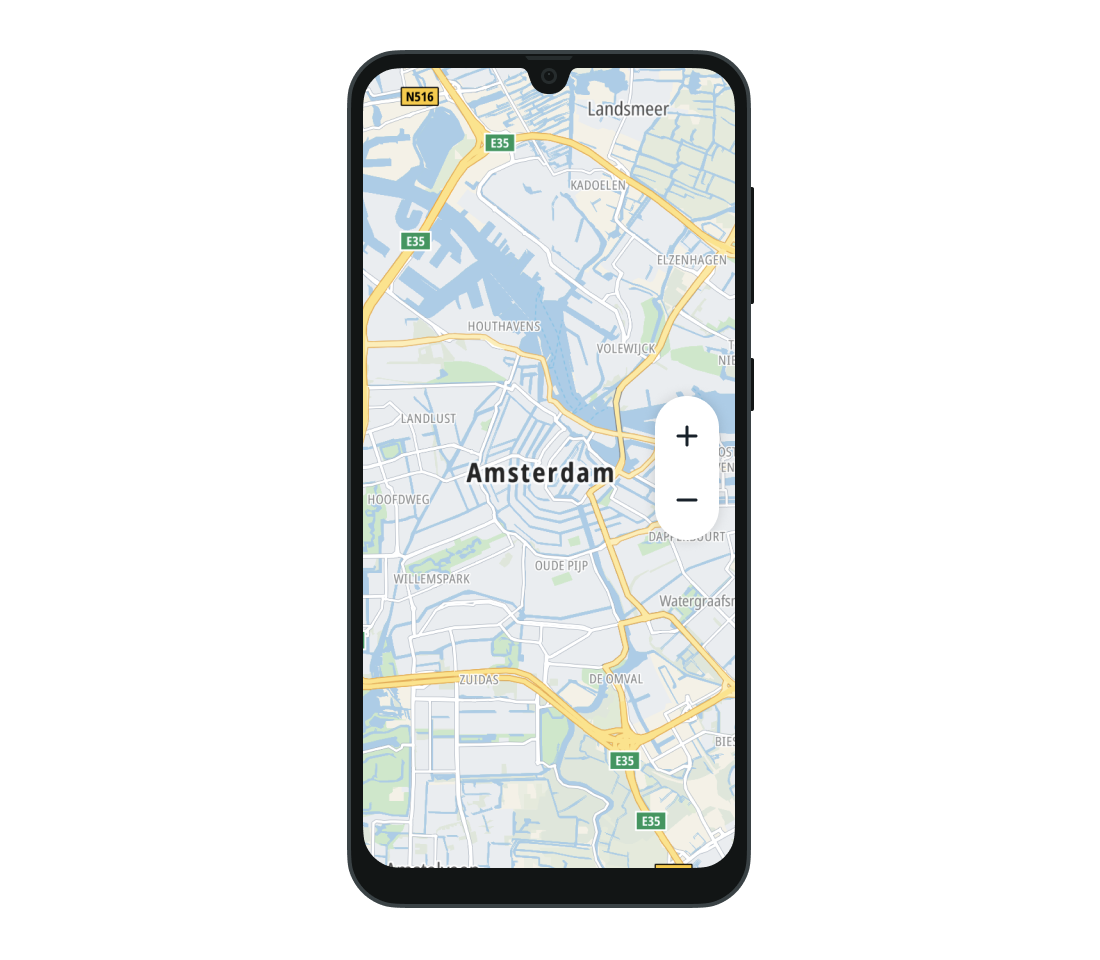
You can also set your custom drawable as the zoom in and zoom out icons.
mapFragment.zoomControlsView.zoomInIcon = R.drawable.ic_cafemapFragment.zoomControlsView.zoomOutIcon = com.tomtom.sdk.map.display.common.R.drawable.mapui_ic_scale
To modify the zoom components in XML, use ZoomControlsView as the style name and BasicZoomControlsView as its parent.
1<style name="ZoomControlsView" parent="BaseZoomControlsView">2 <item name="android:visibility">visible</item>3 <item name="zoom_controls_zoomInIcon">@drawable/ic_cafe</item>4 <item name="android:layout_gravity">start</item>5</style>
Current location button
Users can click the current location button to re-center the camera on the device location.
To work, the button needs access to that location. This is obtained by setting the
LocationProviderto the map using theTomTomMap.setLocationProvider(LocationProvider)method. See the Showing user location guide for more information.
By default, the button is in the bottom left corner of the map and is visible whenever the map is not centered on the device location.

To change the visibility of the button use the visibilityPolicy of the CurrentLocationButton.
mapFragment.currentLocationButton.visibilityPolicy = VisibilityPolicy.Invisible
You can also set a custom drawable as an icon at the current location.
mapFragment.currentLocationButton.icon = R.drawable.ic_cafe
As with the CompassButton, you can listen to click events performed on the CurrentLocationButton.
1val uiComponentClickListener = UiComponentClickListener { /* YOUR CODE GOES HERE */ }2mapFragment.currentLocationButton.addCurrentLocationButtonClickListener(3 uiComponentClickListener,4)
The UiComponentClickListener can be removed when listening to click events is no longer needed.
1mapFragment.currentLocationButton.removeCurrentLocationButtonClickListener(2 uiComponentClickListener,3)
Customizing CurrentLocationButton in the XML requires using CurrentLocationButton as the style name and BasicCurrentLocationButton as its parent.
1<style name="CurrentLocationButton" parent="BaseCurrentLocationButton">2 <item name="android:src">@drawable/ic_cafe</item>3 <item name="currentLocationButton_visibilityPolicy">visible</item>4</style>
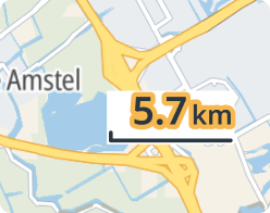
Scale view
The scale view is located in the lower right corner by default. It appears when zooming in or out, then disappears after 5 seconds without any map interaction. It also disappears when the map is tilted or when the scale is out of range.
The scale range is 10 m to 1000 km (metric) / 30 ft to 620 mi (imperial).
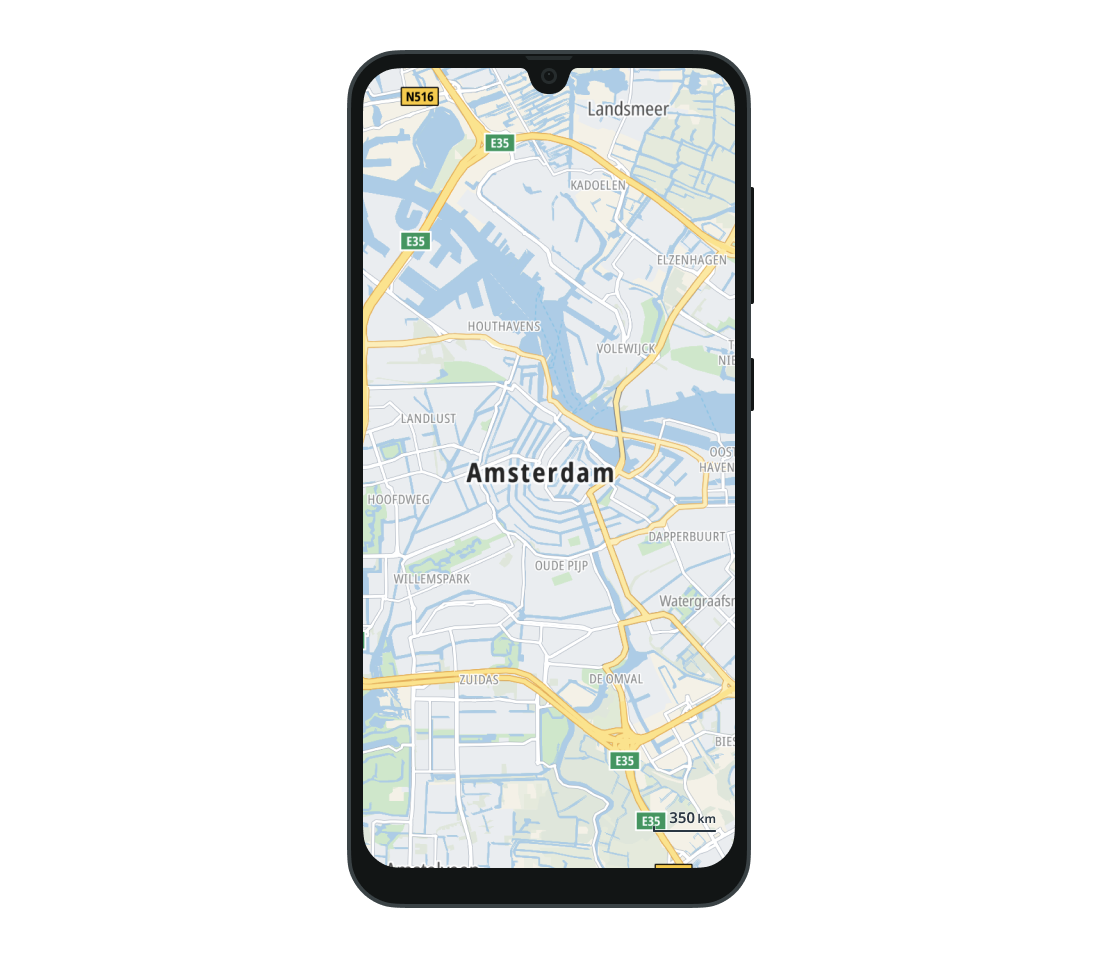
The units are set to metric or imperial based on system settings. You can change them by modifying the units property.
mapFragment.scaleView.units = UnitSystem.Metric
You can also remove it from the map by setting the isVisible flag to false.
mapFragment.scaleView.isVisible = false
The Scale view can be customized in the XML by setting the ScaleView style. The ScaleView style must have the BasicScaleView as a parent.
1<style name="ScaleView" parent="BaseScaleView">2 <item name="scale_view_units">Metric</item>3 <item name="android:background">#FFFFFF</item>4</style>
You can also style the text of the Scale view separately using the ScaleTextView style with a parent of BasicScaleTextView.
1<style name="ScaleTextView" parent="BaseScaleTextView">2 <item name="scale_text_stroke_color">#F7B84F</item>3 <item name="scale_text_stroke_width">4dp</item>4 <item name="scale_text_value_font_size">32sp</item>5 <item name="scale_text_unit_font_size">18sp</item>6 <item name="android:layout_width">wrap_content</item>7 <item name="android:layout_height">wrap_content</item>8</style>
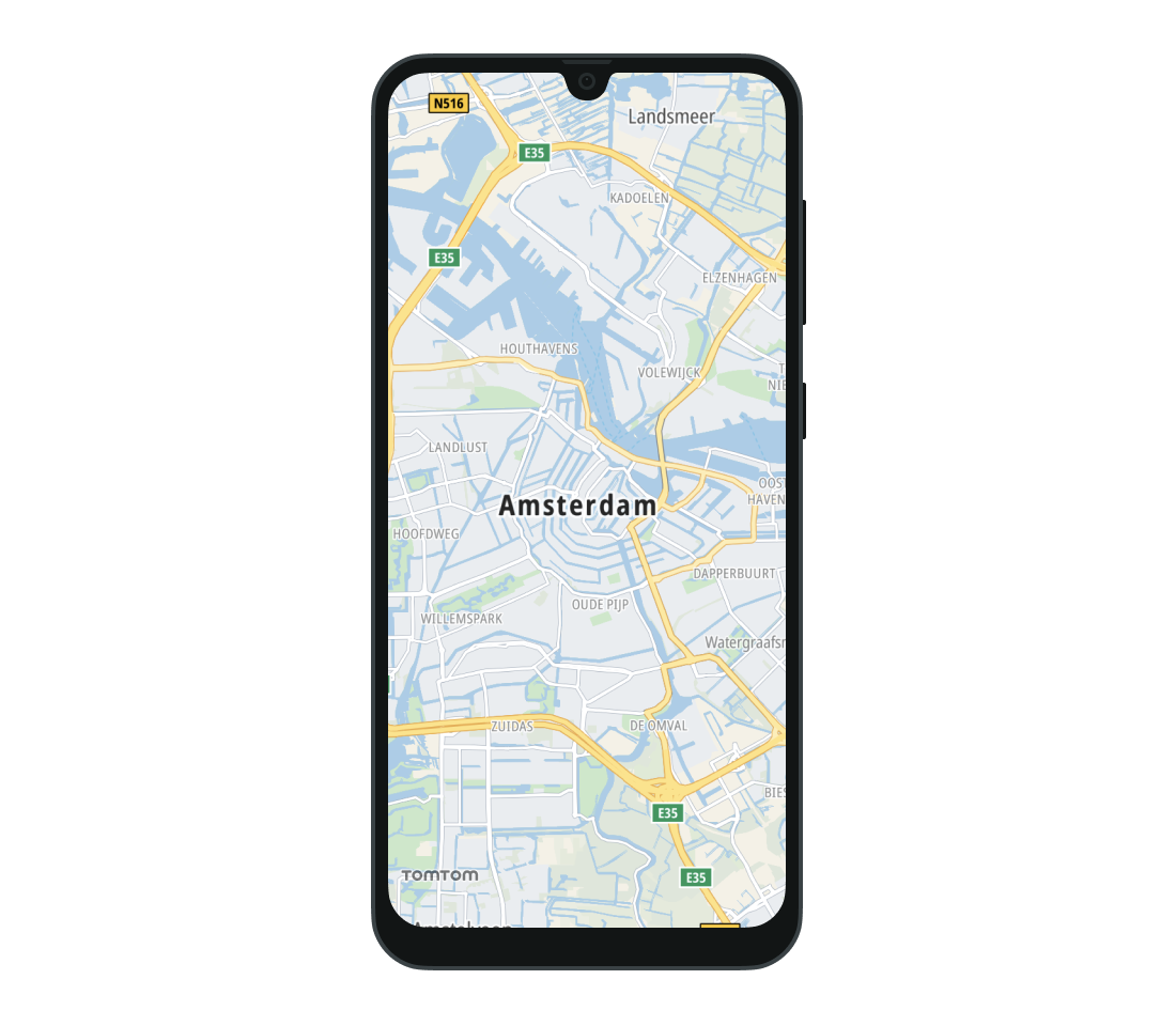
Logo view
The TomTom logo is displayed by default in the bottom left corner of the map.
You can change its visibility by changing its visibilityPolicy.
mapFragment.logoView.visibilityPolicy = VisibilityPolicy.Invisible
To check whether the logo is visible use the isVisible property.
val isLogoViewVisible = mapFragment.logoView.isVisible
Next steps
Since you have learned how to use the map UI elements, here are recommendations for the next steps: