Visualizing TomTom Traffic Index Data with Data Science Tools
)

TomTom Traffic Index 2021 contains a wealth of traffic data from around the world. We'll show you how to gain insights using data science tools such as NumPy and Seaborn for visualization. Learn how to apply your Python skills to mine traffic data for broad patterns and hidden gems.
Billions of cars travel through the streets, each generating a constant stream of data. Studying this information requires data science, which has become a crucial part of any automotive application. Whether building a mobile app or web application, developers need a solid understanding of data science tools to conceptualize, visualize, and maximize the potential of their data.
As TomTom provides all of the data your application requires, it enables you to step back and view the bigger picture. Suddenly, you can understand how this data connects globally, discover patterns affecting businesses and daily life, and discover how enormous segments of the public are adjusting to the post-pandemic “new normal.”
In this article, we’ll discuss some insights from the 2021 TomTom Traffic Index Report. Then, we’ll explore how to use data science tools to visualize the gathered data. While the report contains a wealth of information, we’ll focus primarily on day-to-day traffic variations, seeking the best day and time to travel from San Francisco.
To follow this tutorial, you should have some familiarity with Python. We’ll explain how to use data science tools like NumPy and Seaborn.
TomTom’s 2021 Traffic Index Report
TomTom’s yearly Traffic Index report highlights new trends in traffic globally and locally, serving as a powerful tool to analyze and understand its patterns.
As the pandemic has shifted, many have wondered whether the public has returned to some degree of normalcy. This year's report tries to answer this question by comparing roadway congestion levels from 2019, 2020, and 2021. Additionally, the 2021 report includes emissions data related to congestion.
In 2021, Istanbul was the world's most congested city, with a congestion level of 62 percent. Congestion had increased by 11 percent from the previous year.
The second most congested city was Moscow, at 61 percent. This is 7 percent higher than in 2020. Meanwhile, Mecca was the least traffic-congested city at maintaining its 7 percent rate from 2020.
This report enables you to search for traffic information in your city, including live traffic information, congestion levels, and congestion figures by time of day.

After looking at the Traffic Index report, you’re probably eager to do something similar in your own data science projects. First, it is crucial to visualize the data and identify any patterns before implementing an algorithm. So, let’s explore how to use TomTom’s traffic APIs and corresponding data science tools.
Using Traffic APIs
TomTom’s wide variety of APIs makes retrieving data straightforward. Whether you need to find traffic routing data or a specific location, you can find the necessary tools within the TomTom API documentation. If you don’t already have a TomTom account, register your Freemium account enabling thousands of free requests daily. Then pay as you grow.
The following code demonstrates how to use Traffic APIs to generate a simple diagram similar to that in the 2021 report. To follow this example, create a Jupyter notebook and add the following code.
Since we need to perform HTTP requests in Python to communicate with TomTom APIs, we need to first import Python’s requests library. Using your favorite editor, import these libraries with this command:
import requestsThe requests library enables sending HTTP requests. In our case, we just need to specify the API to request. API explorer helps with the parameters, as seen below:

Assemble the request parameters and call the requests.get(URL) to get a response from TomTom servers:
# Create request URL
API_params = (urlparse.quote(start) + ":" + urlparse.quote(end)
+ "/json?departAt=" + urlparse.quote(departure_time_2021))
request_url2021 = base_url + API_params + "&key=" + yourkey
# Get data
response2021 = requests.get(request_url2021)
Saving Data
After requesting data from TomTom, it’s good practice to save it in CSV format. This approach reduces the number of requests to the TomTom server.
Python provides the to_csv() method to save data frames in this format. To use this method, simply call it from the data frame you need to save:
# saving dataframe into CSV file
df2021_daily.to_csv('df2021_daily_hourly_6AM.csv')
Importing Data
If you need to load the data from the saved file in the next run, you can call the method read_csv(), which loads the CSV data into a data frame:
df2021 = pd.read_csv("df2021_daily_monthly_6AM.csv")
df2021_daily = pd.read_csv("df2021_daily_hourly_6AM.csv")
Visualizing Data
Data visualization converts the raw data into a visual representation to help us understand the nature of the data. You can use many visualization types including charts, tables, line graphs, and bar graphs. Furthermore, there are various visualization libraries and tools. We'll explore the most common Python libraries for data visualization: Matplotlib, Seaborn, and NumPy. We’ll also introduce heatmaps.
MadplotlibMatplotlib is a library for two-dimensional illustrations in Python. It supports many visualization types, including basic bar, line, and scatter plots. It also supports statistical plots and unstructured coordinates. Import Matplotlib using this command:
import matplotlib.pyplot as pltThe Seaborn library is based on Matplotlib and offers attractive statistical visualizations. Import Seaborn using this command:
import seaborn as snsIf you want to work with arrays in Python, use the NumPy library. It’s equipped with linear algebra, matrices, and Fourier transform (FT). Import NumPy as follows:
import numpy as npA heatmap is a colored representation of the data. When provided the data in a matrix format, the library converts it into attractive figures.
This article will use Seaborn heatmaps and Matplotlib to represent the traffic data.
Examining Daily Traffic Changes
As an example, we’ll use visualizations to display how traffic changes over the days of the week. We’ll request data for a single trip and compare the travel time at different start times each day of the week. Let's visualize how trip times change each day between 6:00 AM and 5:00 PM on a journey from San Francisco. This information helps determine the best time of day to travel.
We can get the data using the TomTom Routing API. The API enables you to specify the starting point, destination, and departure time and uses historical data to estimate the trip time.
The following code iteratively changes the day and hour to collect the data from TomTom Routing APIs over each day of the week:
date = datetime.datetime(2021, 5, 1)
departure_time_start_2021 = datetime.datetime(date.year, date.month , date.day, 6, 0, 0)
day_range = range(0,7)
hour_range = range (0,12)
for i in day_range:
for j in hour_range:
# Update the month
departure_time_2021 = departure_time_start_2021.replace(day=departure_time_start_2021.day + i, hour=departure_time_start_2021.hour +j)
# Format datetime string
departure_time_2021 = departure_time_2021.strftime('%Y-%m-%dT%H:%M:%S')
# Create request URL
request_params_2021 = (
urlparse.quote(start) + ":" + urlparse.quote(end)
+ "/json?departAt=" + urlparse.quote(departure_time_2021))
request_url_2021 = base_url + request_params_2021 + "&key=" + key
# Get data
response2021 = requests.get(request_url2021)
# Convert to JSON
json_result_2021 = response2021.json()
# Get summary
route_summary_2021 = json_result_2021['routes'][0]['summary']
# Convert to data frame and append
if((i == 0) and (j==0)):
df_2021_daily = pd.json_normalize(route_summary_2021)
else:
df_2021_daily = df2021_daily.append(pd.json_normalize(route_summary_2021), ignore_index=True)
print(f"Retrieving data: {i+1} / {len(day_range)}")
The code stores the data in a data frame called df2021_daily. This frame holds the data in a linear format, but we need to reformat the data into a matrix format for the heatmap visualization. We’ll use NumPy to convert the data into a matrix.
First, we filter the required column from the data frame using this code:
values = df2021_daily['travelTimeInSeconds']Next, we convert and copy the data into a NumPy array:
# Converting the dataframe into Numpy array
arr_daily = values.values.copy()
Then, we resize the array into a two-dimensional array (matrix) containing data shaped for seven 12-hour days:
# Reshaping the array into 2-dimension array features the days and month
arr_daily.resize(7, 12)
The data is now ready for the HeatMap function to convert into a colored representation. Note that the data is now in a matrix of size (7,12). We need to transpose it into a matrix with the shape (12,7). So, you’ll see that the code calls a transpose function while passing data to the heatmap:
# configuring the size of the plot
ax = plt.subplots(figsize=(11, 9))
As we generate the heatmap using the Seaborn heatmap function, we use the coolwarm colormap to represent low numbers in blue and increase the degree of red as the warm numbers increase:
# generating heatmap for the data
# we used transpose to define the display orientation
ax = sns.heatmap(np.transpose(arr_daily) , linewidth = 1, cmap = 'coolwarm' )
We now define the Y-axes' labels for better visualization:
# yticks defines the Y-axes' labels
yticks_labels = ['6AM', '7AM', '8AM', '9AM', '10AM', '11AM',
              '12PM', '1PM', '2PM', '3PM', '4PM', '5PM']

plt.yticks(np.arange(12) + .5, labels=yticks_labels)
Finally, we define the graph title:
# defining the title of the HeatMap
plt.title( "Traffic over the day")
plt.show()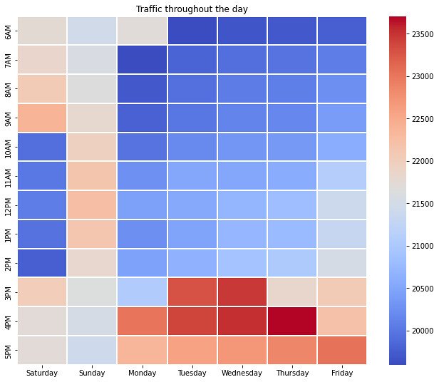
The resulting heatmap provides some interesting traffic insights. For example, the worst time to travel was on Thursday at 4 PM. The best time was between 6 AM and 2 PM every day, except Sunday. We can use this information to help our application users find the most convenient time to drive from San Francisco.
We can use the same steps to generate heatmaps for previous years and compare the results to identify long-term changes in traffic behavior. We only need to change the start date to the corresponding days in 2020 by modifying the following lines:
date = datetime.datetime(2020, 5, 2)The newly generated heatmap will appear similar to this:

When comparing the two heatmaps, we can observe mostly consistent traffic behavior between 2020 and 2021. In both years, the roads become busy after 3 PM on most days. However, the traffic density shifts somewhat between the two years. Additionally, the comparison shows that in 2020, there was more traffic on Friday mornings and throughout each Saturday.
We can repeat this process for any day in the year. TomTom also enables us to show predictions for the next year using TomTom Routing APIs with future days.
Next Steps
It’s easy to extract traffic information from TomTom APIs like the Traffic Index 2021. You just need to know how to use this data in your application. Data science tools like Matplotlib, NumPy, Seaborn, and heatmaps help delve into TomTom’s vast amounts of information to find helpful insights for theoretical study and practical planning.
Insights like this can help drivers plan a road trip and help companies transport goods between cities. Other insights might help realtors rate the least polluted city based on vehicle emissions or help car manufacturers target their next market.
Explore the TomTom Traffic Index to find data to help your own projects. Then follow this tutorial’s steps to visualize data and glean insights for your applications.