Creating a Map with the TomTom Map Styler: Step by Step
)
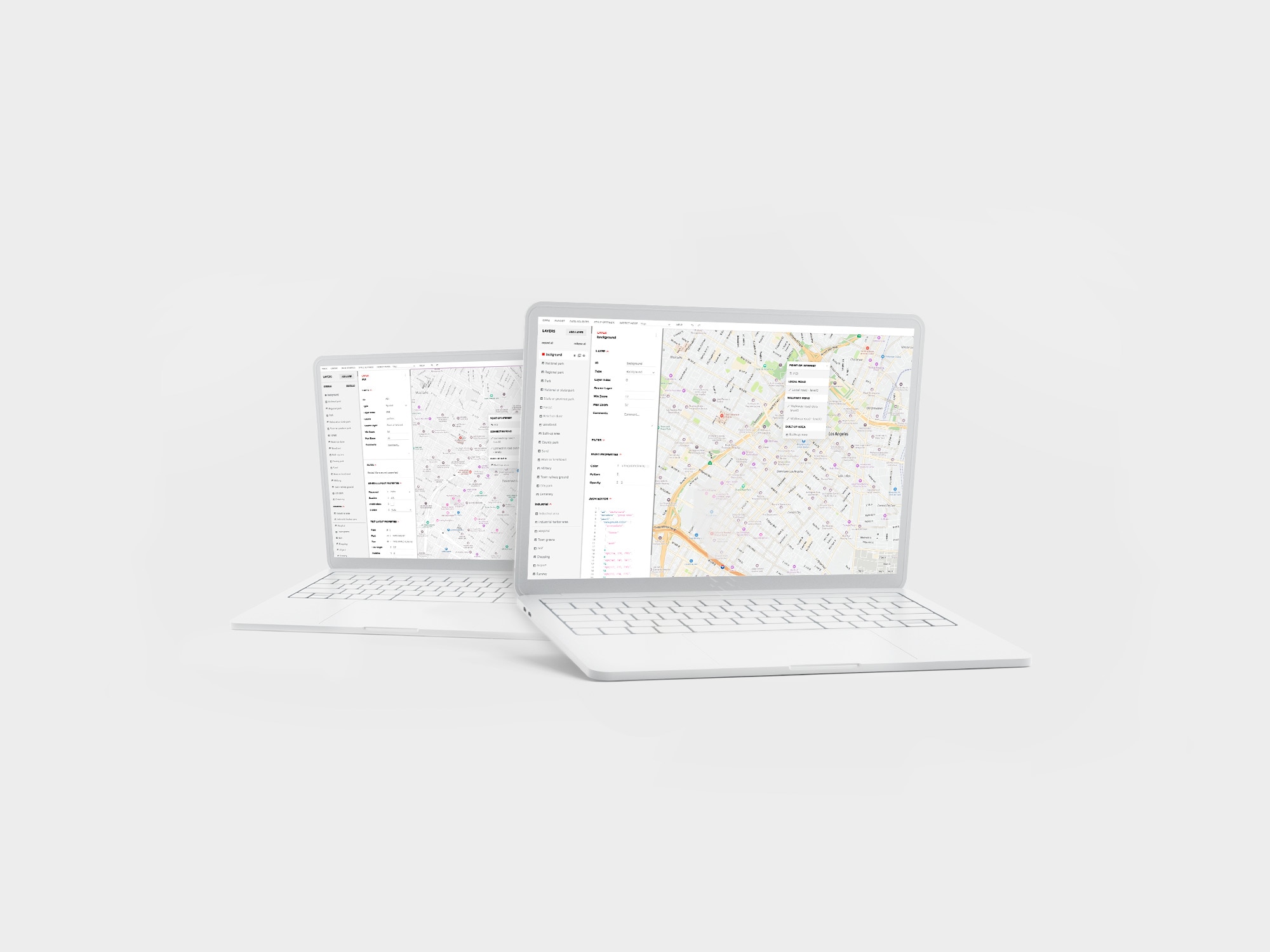
The TomTom Map Styler makes it easy to customize how many features are accessed and displayed on your map — from label text to roads and geography. We'll walk you through the basics of using the Map Styler.
When it comes to building maps for your application, TomTom has you covered. Digital maps serve a wide range of purposes and should be designed and developed with customer use case in mind. Perhaps you need to track a fleet of vehicles to find the most efficient routes. Or, maybe you want to highlight points of interest to help joggers map out scenic routes. Whether your app monitors traffic jams or guides tourists around unfamiliar cities, mindful map design is key.
Digital maps are not one-size-fits-all. In order to create an effective map, you must consider how your user will interact with your map and make design choices that best facilitate their experience. It’s also important to develop a map that fits aesthetically and functionally with the rest of your application, in order to maintain a strong visual brand and seamless user experience.
TomTom Maps SDK for Web and Map Styler offer a suite of tools that make it simple to build the map that best suits your application. TomTom provides API for traffic, points of interest, routing, search functionality, and more. Plus, Map Styler makes it easy to customize how all these features are accessed and displayed through your map.
Guiding Principles
Before we jump into the details of getting your map set up, it’s worth mentioning the following guiding principles to ensure you create the map to best fit your application and users.
Legibility
Legibility is fundamental to map design. A map can be innovative and attractive yet still fail to serve its purpose if it is not legible. Users should never struggle to read or interpret your map, as this leads to frustration and distrust in your brand. When choosing font styles for your map, ensure appropriate size, color, and weight. Avoid using color combinations with low contrast or layering too much information.
Ease of Understanding
Legibility is fundamental to map design. A map can be innovative and attractive yet still fail to serve its purpose if it is not legible. Users should never struggle to read or interpret your map, as this leads to frustration and distrust in your brand. When choosing font styles for your map, ensure appropriate size, color, and weight. Avoid using color combinations with low contrast or layering too much information.

To tailor your map to a local use case, set its default view to the user’s city. For example, if the user lives in Manhattan, New York, the following view would be a better fit. You can implement this view by adjusting your default zoom level in the map. You can also set which labels are displayed at different zoom levels, so that labels do not overlap or overwhelm your user. For example, you may choose to only display street names for major roads when a user is zoomed out and have smaller streets appear as a user narrows in on a particular area, preventing your map from becoming overcrowded with information.

Consistency with the Rest of your Application
Consistency is key. Once you decide on a particular map style or configuration, stick with it. All aspects of your application should have the same look and feel, including your map. Consistency makes your app feel more intuitive, strengthens your visual brand, and gives users a sense of familiarity.
TomTom makes it easy to apply your brand colors to your design or add a custom layer with your company logo. Your map is completely customizable so you can ensure it matches the rest of your application.
Start with a Plan
The best way to follow these guiding principles is to make a plan. Before you start building your map, consider the following:
What branding will apply to the map?
What design will fit the best with your application?
How will this map be used?
How to Build a Map
With these guidelines in mind, we will be going through the steps of creating your ideal map in Map Styler. Before you can use any of TomTom’s map services, you will need an API key. If you do not have one, register by following this tutorial.
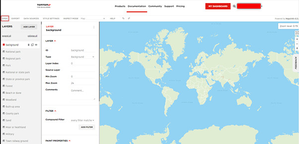
Select the Base Layer
First, choose the right style for your application. Each of the many styles in the gallery serves a specific purpose. The default is Basic Day, which is a vanilla style without any specific configurations enabled. To select a base layer that best suits your application, click Open then Gallery Styles.

The purpose of your application should dictate which base style you choose. For example, if your application will be used for navigation purposes, choose a style that displays Traffic Incidents. If it will be used to look up restaurants, then Points of Interest (POI) will better suit your needs.
Customize Labels and Fonts
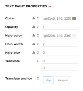
You can easily customize your labels to suit the style of your application. Simply select the label you wish to adjust and click on the popup dialog to open its properties.

Here, you can change the color, font, size, zoom level, and much more. If you scroll down, you will find the Text Layout Properties. With these settings, you can select the font and set the size of the label at various zoom levels. Further down, you will find the Text Paint Properties, where you can change the font color.

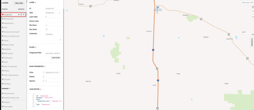
Choose how Roads are displayed
Similarly to labels, it is easy to select and customize roads. For example, you can choose which colors to use for each type of road. Depending on your use case, you may wish to simplify your map by hiding smaller roads that will not be relevant to your user.

Note that roads in the style usually come as both the outline and the line itself. So be prepared to update both layers if needed.
Customize Large Polygon Features
TomTom makes it easy to personalize large polygon features, such as water, land cover, or background land. Most polygons can be selected the same way as roads and labels. However, the settings for the background are instead found in the layer section, which is at the top of the properties sidebar. Like labels, polygons can be customized to vary by zoom level. TomTom also makes it easy to set different colors for different types of land. For example, national parks can be set to blend in with your map, or stand out with their own color scheme.
Choose Which Layers to Display
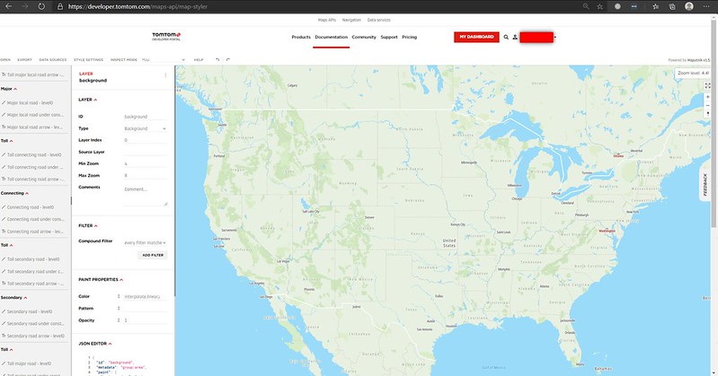
To make maps easy to configure, the Map Styler is organized in layers similar to that of an image editor. You can choose exactly what is visible to your users. As stated, too much information will confuse your users, so it is recommended that you only display the layers that are relevant to your application.
Choose which layers to show and which to hide by toggling the eye symbol in the layers section or by selecting the layer you wish to hide in the map and selecting hide in the ellipse menu in the top right corner.

Note that the layers can be also removed if you are sure not to use them, making the map visualization a bit faster — though that should only be a concern if running in a low-speed or very resource constrained browser.
Use Your Palette to Customize Colors
Be sure to utilize the same color palette that you use in your application to give your map the same look and feel. All colors can be adjusted via each layer’s properties.
Don't Get Lost in All the Choices
With all its possibilities, Map Styler can seem overwhelming. The key is to focus on your specific needs, use the principles outlined in this article to plan your requirements, then execute your plan. But don’t be afraid to experiment along the way — if you make a mistake, you can just hit the refresh button and try again.
To demonstrate a simple use case we can look at the following. Say I want to learn the location of all the fifty US states. I will open a Basic Day base style and zoom in until the entire US is in focus.
I don’t need national parks or big cities so I will hide the following layers:
Large city popRank234
Regional park
National park
Capital city node
State or province park
Country name
This will now only have the States in view which removed all the unnecessary details.

This is now a more focused view, but we need to make sure that the state names are clearly visible as well as the country borders to ensure that we do not accidentally confuse one of the other states with the states in question. For that we will modify the colors of the following layers:
Country border background
State border
State name
For the state name, we also increase the size on Zoom level 4 to 12 to 16 and change the font to Noto-Bold and change the Inspect Mode to Map(tritanopia) to give it a more lively look and below is the final result.

Start Building Your Map Today
The TomTom Map Styler provides a wide variety of choices for every aspect of your map. TomTom makes it easy to design an attractive, functional map that is tailored to your brand as well as to the use case and style of your application. To learn more about the Map Styler and discover how to create custom map styles, check out these helpful links:
- Map Styler Documentation
- Create Custom Map Styles with TomTom's Map Styler
- Halloween Fun with TomTom's Map Styler
- Manipulating and Styling Map Layers Beyond the Basics
To explore the Map Styler for yourself, register for the TomTom Developer Portal.
Lastly, here's a short video overview of the Map Styler:
Happy mapping!