Map Accessibility: How to Customize your map for Color Blindness
)
In honor of Color-Blind Awareness Day, learn how to make your maps more inclusive with color schemes for color blindness with the TomTom Map Styler.
Why write about making map colors accessible? In honor of Color-Blind Awareness Day, we at TomTom Developers felt it was important to note that while online maps are increasingly everywhere, accessibility considerations within maps unfortunately often aren’t – but it doesn’t have to be that way.
Map design often relies on color, because line widths, patterns and other visual textures often don’t tell the full story. Colors within colors can separate neighborhoods, states, highlight geofenced areas, and even delineate whole countries. Even maps focusing on natural areas usually take advantage of earth tones to signify rivers, lakes and parks.
When someone doesn’t see color in quite the same way, what might have been a well-intentioned color wheel can suddenly be incredibly hard to distinguish, or miss out on providing a useful experience altogether for many users. With as many as 300 million people affected by color vision deficiency, or nearly 1 in 12 men, this means that countless online map users can benefit from thoughtful color design to speak to their visual experience.
With TomTom’s Map Styler, users can customize mapping layers with color palettes created specifically for different color vision ranges, or even create a map with a color schema interpreted by all forms of color vision deficiency all at once.
With the help of Venngage’s color palettes, as well our developer advocate Jose Rojas, we’ve created a short video showing a map style created specifically for color blind mappers. Read on below to learn more about how modern design can clash with the best palettes for inclusive color styling, and how you can use adaptive colorways in your projects.
To learn more about color blindness in general, head to: https://www.coolwinks.com/color-blindness/
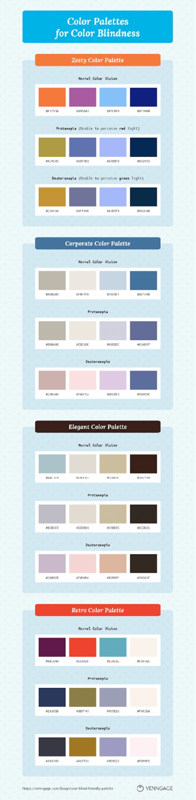
Adapting Color Palettes
Monochromatic color schemes are often pleasing complements to many design elements, but unfortunately can make important information less accessible for the most common forms of color blindness, especially when focused on the wrong shades.
Using high contrast colors in general opens up accessibility of many shades, as well as avoiding the following combinations:
Red & green
Green & brown
Green & blue
Blue & gray
Blue & purple
Green & gray
Green & black
Source: Venngage
This is because the most common forms of color blindness are red and green-related. The vast majority of those with color deficient vision have red-green colorblindness.
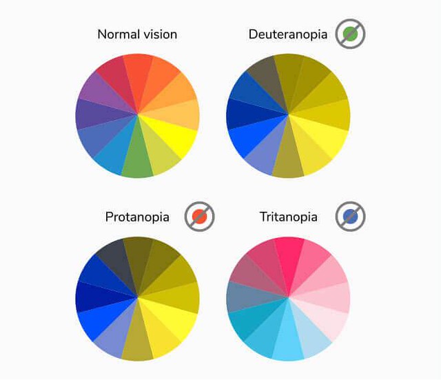
[Image from Venngage]
Those with Deuternopia perceive green light weekly, those with protanopia perceive red light weakly. This means that their perceived color spectrum shifts red and green hues to more yellowed shades, and eliminates red hues which can specify purple, leaving blue and purple potentially indistinguishable from each other. Lastly, those with Tritanopia have trouble with blue and yellow shades, which is why their color spectrum reflects pink in many instances.
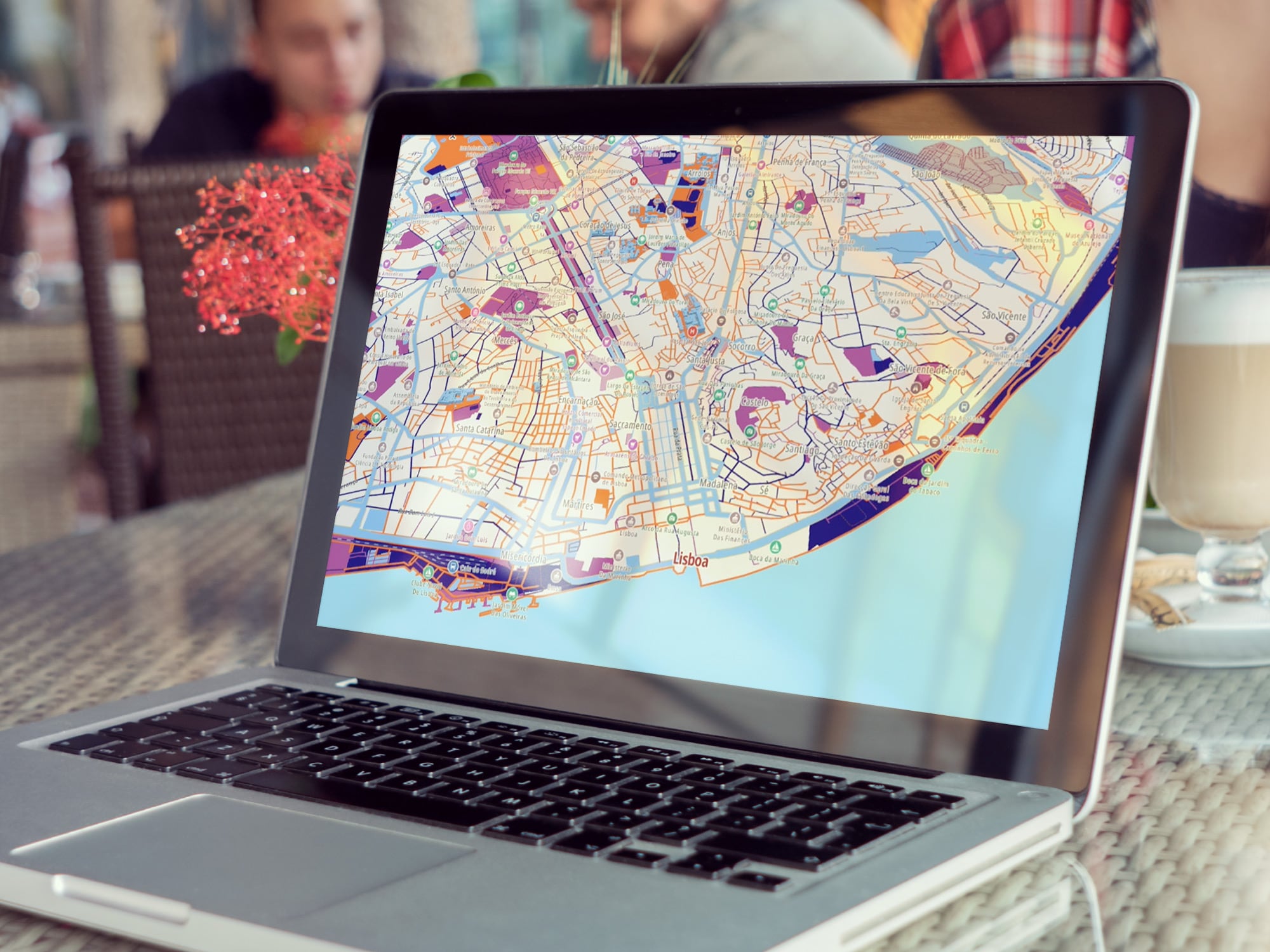
Created using guidelines from Venngage’s inclusive color palette below, our short clip shows how there are many potential color palettes to make mapping elements perceivable by color-deficient viewers. The retro color palette gives a great pop to streets and other road elements, and has a high contrast which makes smaller details even more visible than before.
YouTube video playerNext Steps
To learn more about how we made our color-accessible map, check out our GitHub repo with the specific styles! To help spread awareness of accessible design, or just to support our color-inclusive mapping here at the TomTom Developers, give us a share or a like on Twitter, or share your map on our subreddit r/TomTomDevs or in our Developer Forum!
Happy mapping!