#30DayMapChallenge 2022 Inspiration
)
This year's #30DayMapChallenge on Twitter starts on November 1st! Check out some of our own map creations along with some of our favorites from the mapping community for some inspiration for the challenge!
Finnish geographer and mapping enthusiast Topi Tjukanov started the #30DayMapChallenge in November 2019, and has since continued it every November. This challenge is open to anyone and everyone in the online geospatial community, encouraging participants to post one map that they’ve created per day on a different theme or topic on Twitter.
November’s 30-day map challenge is coming up soon, starting on November 1st, so we thought we would revisit some of our favorite maps from last year's challenge. We wanted to showcase not only our own maps on the hashtag, but some fantastic ones we found in the rest of the mapping community, too!
Read on for some map inspiration and get ready for this year's challenge!
Note: This year's themes are a bit different from last year's. You can check them out here.
2021 Challenge Highlights
Day 2: Lines
Day 2 was all about lines, and our dev advocate Jose Jose Rojas made a couple of different maps:
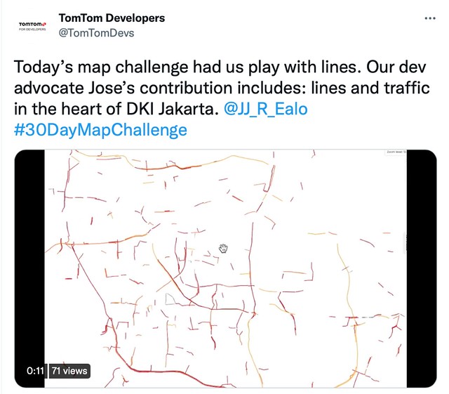

Can you guess what the city above is?
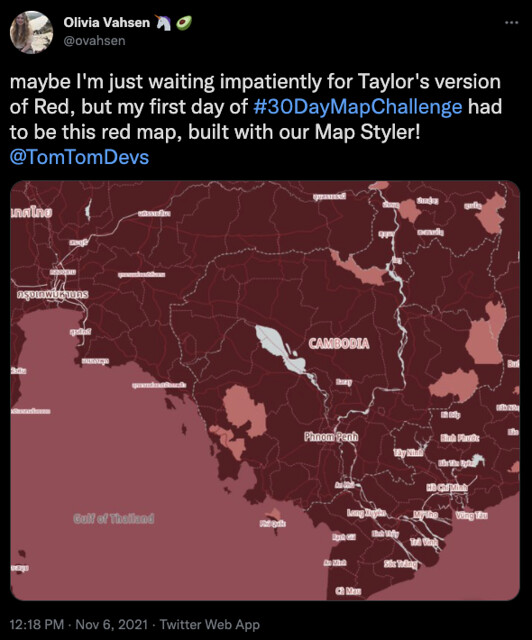
Day 6: Red Map
The first few days of the month were an assortment of color maps, which allowed us to show off all the fun capabilities of the Map Styler! To generate the color themes, I used coolors.co under a monochromatic setting, until I arrived at a color range which had contrast for multiple different areas and text.
I had to make a pun about eagerly anticipating Taylor Swift’s new version of her Red album, and I’ve since listened to it during countless working hours.
Days 7 & 8: Green and Blue Maps
It can be hard to use single color themes to bring out specific mapping factors unique to different locations. The contrasting light green shows state borders in Ireland quite clearly, and is a good example of how color themes can also be manipulated to showcase certain kinds of data. I could have chosen to focus on the freeway network with a different contrast arrangement, for example.
New Zealand presented different geographical characteristics which were more challenging to show in shades relating to a single color – but I still wanted to use blue, since any overhead capture of the country would showcase a large amount of ocean. New Zealand’s many local bodies of water and national and regional parks are showcased in several of the lighter blue areas.


Day 9: Monochrome
Using the same black and gray color scale as our very spooky Halloween map to show haunted places in North America, the monochrome palette gives this image of London some elegantly eerie vibes.

Day 13: Natural Earth
Things got a little more technical for our next two map challenge days! In order to show more natural elements over Europe, Adam Ratcliffe used the Natural Earth Shaded Relief raster dataset. This is a raster DEM dataset.
This was tiled as an XYZ layer in terrarium format. Using the SDK for Web, a "hillshade" layer was created with the natural earth tiles as a data source. This layer was interleaved between the layers in our "basic_main" map style so it sits above the earth cover layers and beneath the hydrology layers. It shows off the mountainous regions and topography of Europe, while also clearly marking political boundaries throughout the continent.

Day 21: Elevation

For the elevation map of Mt Shasta, picture above, Adam used the same Natural Earth dataset for the elevation data with satellite imagery from maptiler.
From the Map Community on Twitter
So many gifted designers, engineers, and other mapping enthusiasts submitted some astounding renditions last month, and so all of us at TomTomDevs wanted to share a few of our favorites:
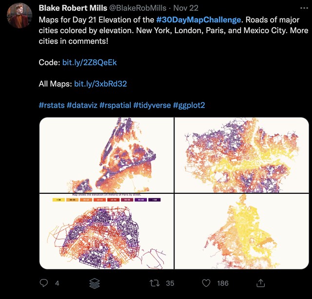
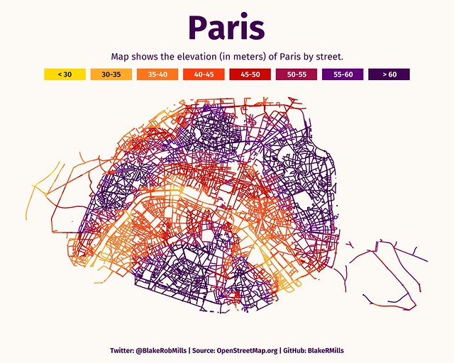
@BlakeRobMills created stunning cityscapes showing the elevations of the road networks in major cities. It was incredible to compare a couple of them – Mexico’s dense array of streets appears to at first glance much lower, but at second glance, much higher, than Paris’s streets.

Where Mexico’s lowest streets still appear to lay at a bit below 2250 meters, where Paris’ highest roads are above just 60 meters.
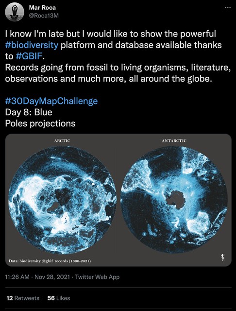
@Roca13M shared a pole projection map for Day 8: Blue, using data from GBIF, the Global Biodiversity Information Facility. This specifically blue projection shows both of the earth’s poles in what appears to be colored contrast to global city population density, and/or the travel frequency of historic routes which pass near the poles. The color palette here shows just how much information can be conveyed at once with smart use of negative space and high contrast data visualization.
Lastly, and perhaps a personal favorite, is this map, shared by @stevefaeembra on Day 29: Null, which shows where to live in Scotland if you don’t want neighbors. This map was indicated to show areas without standing building structures, essentially guaranteeing your intentional solitude in your area of residence within beautiful Scotland.
A map created just for introverts? Sign me up.

2022 Challenge: Go Map Your Favorite Topics!
The best part about the #30DayMapChallenge is that the wide variety of data represented with map visualizations is simply so vast, you can choose from countless datasets around the globe to build with. A quick scroll through the hashtag shows you oodles of sources you can use to speak to nearly any topic you find interesting, where reliable collected data exists.
We hope you enjoyed this roundup of maps from the 2021 #30DayMapChallenge. If you want to show us your contribution for 2022's challenge, tag us at @tomtomdevs!
Here's a snapshot of 2022's map themes:

Here are a few articles below to help you get started with the TomTom Maps APIs and SDKs. If you have any questions, feel free to ask them in our Developer Forum.
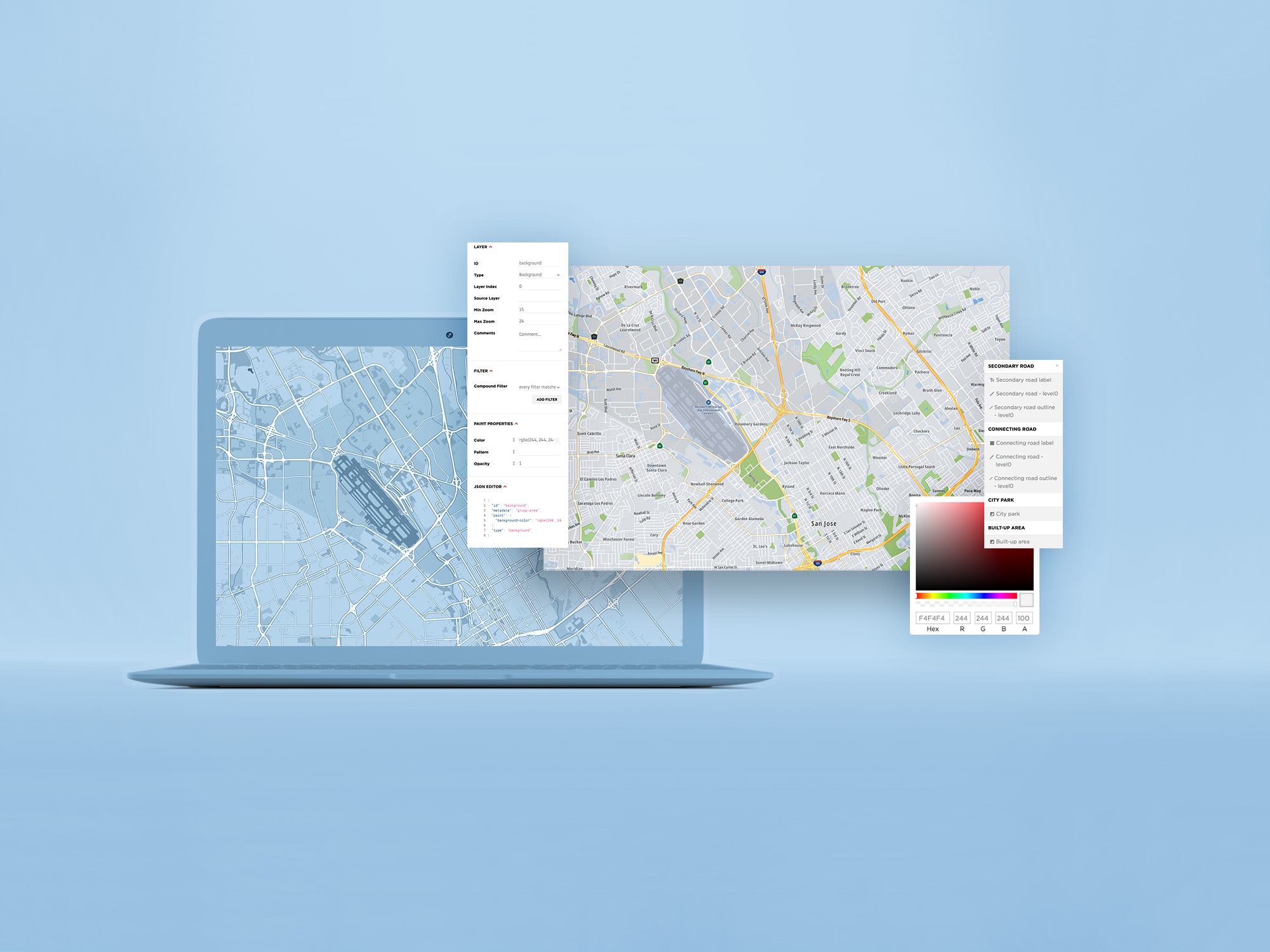
• Creating a Map with the TomTom Map Styler: Step by Step
• 5 Ways to Create a Unique Map Experience with TomTom Maps APIs
• Add TomTom Maps to a Website in 30 Seconds
Happy mapping!
*Editor's note: This article was originally published in December 2021 and has been updated and revamped for accuracy.