Using Data Science to Analyze and Visualize TomTom Notification Data
)

Data scientists can access a wealth of mapping data to enhance their business insights. Pull TomTom's information into your favorite data science tools using webhooks and APIs, then visualize and analyze away! It's easy with just a bit of Python — learn how.
Map information is invaluable to data scientists working in taxi, delivery, logistics, and other industries. TomTom makes it easy to download the information we need. When we import this data into our favorite analysis and visualization tools, we gain deep insights about more efficient routes and ways to make faster deliveries, or maybe even highlight an area your business can further develop.
TomTom’s flexible Notifications API service enables emails or webhooks to send Maps API data to an application. Webhooks are automated messages that send information when events happen. This allows us to start filling a database with valuable data, like whenever a delivery vehicle or taxi driver crosses a geofence, for example.
Let’s explore how to download TomTom mapping information to an Airtable database using Zapier and webhooks. We’ll then import that bountiful data into Anaconda’s data science tools package. Then, we’ll create some charts to visually inspect our data and gain helpful insights to improve driver efficiency.
We’ll begin by creating a Python application that looks something like this:

Building the Dataset
When we’re working on a data science project, we gather our information into a dataset. We then need to explore this intermediate data using analysis and visualization to understand it deeply and clearly. Although datasets come in various formats, such as a zip file or a folder containing multiple data tables, the simplest and most common dataset format is a CSV file. This is a single file organized as a table of rows and columns.
Getting Started
First, if you don’t already have a TomTom Developer account, register an account for free. You get thousands of free requests — even for commercial applications. And, if your project expands, you can always pay as you grow.
To start building our dataset, we first need a TomTom Maps API Key to work with the TomTom Notifications service. We get the key from our account dashboard.
After registering for an API Key, we should add a group with at least one way to send notifications. We do this using the group service called the create contact group endpoint. The request URL may look like the following:
https://api.tomtom.com/notifications/1/groups?key=Your_API_Key

The TomTom Notifications API provides 20 webhook addresses per contact group. Using these contact groups enables us to have single or multiple addresses. Whenever we use a contact group in multiple APIs, any change occurring inside this group's connectivity leads to a change in all APIs related to this group’s connections.
The following snippet represents a message a geofencing service sends to the TomTom Notifications API with this payload:
{
 "key": "2015-01-27 13:08:24.0000002",
 "pickup_datetime": "2015-01-27 13:08:24 UTC",
 "pickup_longitude": "-73.973320007324219",
 "pickup_latitude": "40.7638053894043",
 "dropoff_longitude": "-73.981430053710938",
 "dropoff_latitude": "40.74383544921875",
 "passenger_count": 1
}
This snippet uses the request data with HTTPS method (POST). The request body is serialized in JSON file format. Visit the notification format documentation for more information.
Setting Up Zapier and Webhooks
Webhooks are a simple way for online accounts to communicate and send automatic notifications when something new happens. In our case, we use webhooks to push data from our application to an Airtable database automatically.
To receive webhook calls from the TomTom Notifications API, we need to configure Zapier, an easy automation tool. We’ll do this to get notifications about new form submissions or notifications from a specified application. It will receive notification data using webhooks instantly.
To start using Zapier, we first sign up for a new account. Connecting to Zapier helps your app receive GET, POST, and PUT requests from any data source. This includes JSON, form data, or data in the query string. Zapier accesses raw data, parses the payload into fields to send to other applications, and makes API calls or forwards webhooks to another service.

To connect Zapier to our TomTom geofencing application, we first ensure we have a Zapier account and the key from our TomTom account. Then, we create a new application in the Zapier developer platform, giving it a title and description.
Next, we adjust Zapier’s authentication settings by providing a username and password.
We’ll need to fetch notification data from the TomTom API. To do that, we create a trigger. In our Zapier application, we click the Add Trigger button. We then complete the trigger connection settings by providing our TomTom API key and credentials. We also poll URLRoute to check periodically for new or updated data, and complete other required actions, such as defining sample data and output fields.
After that, we can use Zapier to accept data from our TomTom geofencing application and store it in spreadsheets or CSV files (we later manipulate these files in our tutorial’s data science phase).
Webhooks communicate with connected applications by instantly punting information over whenever it is available. We do not have to request this information. The application simply sends a POST request to a specified URL containing details of the event, so we need to specify a URL. Visit the Zapier website to learn more about how to set up webhooks.
Storing Data in Airtable
It’s time to connect our webhooks using Zapier and Airtable. First, we need to configure Zapier to store notification data in an Airtable database. See Airtable’s documentation on how to do that.

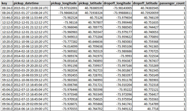
Later, we export the TomTom notification data that Zapier saved in the Airtable database. We export it to a CSV file. It may look like the file in the image below:
Analyzing Data
Data scientists focus on the unique characteristics of spatial data, moving beyond simply looking at where things happen to understand why they happen. Our application focuses on sample features such as pickup_datetime, pickup_longitude, pickup_latitude, dropoff_longitude, dropoff_latitude, and passenger_count.
To accomplish our data science mission, we implement our project in the Python programming language inside Jupyter Notebook (formerly IPython). We depend on the NumPy, Pandas, and scikit-Learn packages bundled together in the Anaconda platform.
Our application will monitor a taxi driver using the TomTom Notifications API. This API provides webhooks to our Airtable database to populate our dataset, which we can export as a CSV file.

(EDA). EDA is a critical data investigation mechanism to discover patterns, spot anomalies, and more.
To start, we import the functions we need in our implementation, such as Python libraries. We set up our environment, and load our dataset:
import numpy as np
import pandas as pd
import matplotlib.pyplot as plt
import seaborn as sns
Then we load our CSV file data into a Pandas DataFrame:
myfile='mydata.csv'
full_data=pd.read_csv(myfile, thousands=',',delimiter=';',na_values="n/a")
Now it’s time to analyze the dataset. This data exploration is necessary before implementing our model. We do this by showing a quick sample from the data, describing the type of data, learning its shape or dimensions, and, if needed, generate basic statistics and information about the loaded dataset.
Data exploration provides us with a deeper understanding of our dataset, including dataset schemas, value distributions, missing values, and categorical feature cardinality. To explore our dataset stored in the Pandas DataFrame, we first display the first few entries for examination using the .head() function.
display(full_data.head())When the Pandas DataFrame prints, its output looks like the figure below:

To display more information about the data’s structure, we use the following code snippet:
full_data.dtypesThis code provides the output:
We use the following code line to check if there are any null values present in the dataset:
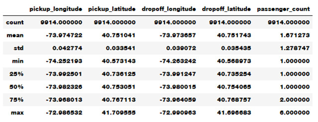
full_data.isnull().sum()We can use this code to display statistics about the underlying dataset:
full_data.describe()This code provides some vital statistics related to the dataset, like in the image below:
Visualizing Data
When we inspect our data, we can find abnormalities and peculiarities and better understand the relationships between its various components. In practice, inconsistencies in the data and unexpected measurements are typical.
One of the best ways to inspect data is to create visualizations. We can use Python’s Matplotlib library or seaborn library for plotting and visualizing the data using bar plot, box plot, scatter plot, and others.
For visualizing our data set, we use the following function that displays a bar graph for any single arbitrary data attribute:
def BarGraph(theData,target,attributeName):
    xValues = np.unique(target)    yValues=[]
    for label in xValues:
     yValues.append(theData.loc[target==label, attributeName].idxmax())     plt.bar(xValues,yValues)
 plt.xticks(xValues, target)
 plt.title(attributeName)
 plt.show()

Labels = full_data['key']
The code below tests the above function by displaying a bar graph illustration for the 'passenger_count' attribute:
BarGraph(full_data,Labels,'passenger_count')
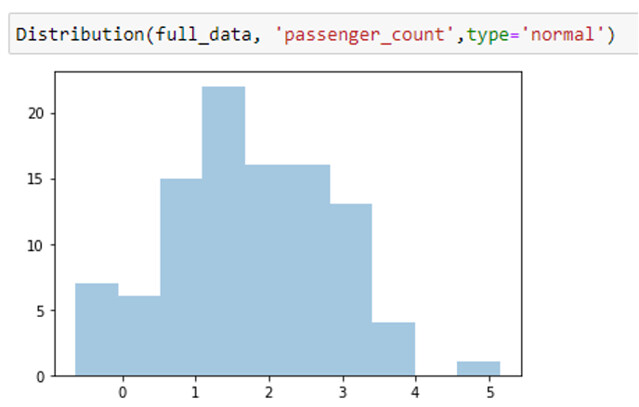
Visualizing value distribution across our dataset helps us understand attribute distributions inside the dataset. We can check if the distribution’s nature is normal or uniform distribution. To do this, we use the following code:
def Distribution(theData,datacolumn,type='value'):
   if type=='value':        print("Distribution for {}                ".format(datacolumn))        theData[datacolumn].value_counts().plot(kind='bar')
  elif type=='normal':
    attr_mean=theData[datacolumn].mean() # Mean of the attribute values
   attr_std_dev=full_data[datacolumn].std() # Standard Deviation of the attribute values
    ndist=np.random.normal(attr_mean, attr_std_dev, 100)
      norm_ax = sns.distplot(ndist, kde=False )
   plt.show()
  plt.close()
  elif type=='uniform':
    udist = np.random.uniform(-1,0,1000)
   uniform_ax = sns.distplot(udist, kde=False )
    plt.show()
  elif type=='hist':
     theData[datacolumn].hist()
To test visualizing value distribution for the 'passenger_count' attribute, we write:
Distribution(full_data, 'passenger_count')
To show the histograph diagram for a particular attribute, we use the following code:
sns.distplot(full_data['passenger_count'])
<AxesSubplot:xlabel='passenger_count',ylabel='Desnity'>
To explore how these features correlate to each other, we can use a heatmap in the seaborn library. After doing this, we see that some features slightly correlate with each other:
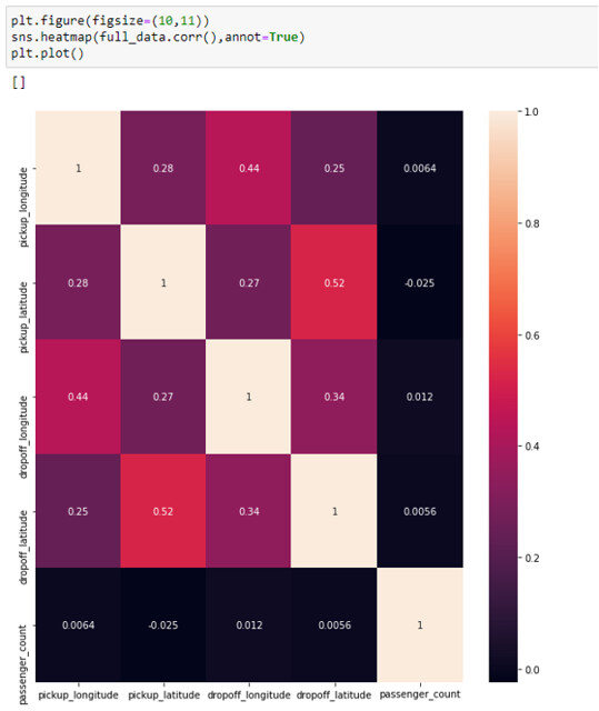
We can also use a scatter plot to observe relationships between features in our dataset. A scatter plot puts one feature along the x-axis and another along the y-axis and draws a dot for each data point. We use the code below to scatter plot how our data is distributed based on 'passenger_count' to investigate its relation to features like pickup time, drop-off time, and more.
sns.pairplot(mydata)
For instance, we may note in the above scatter plot that when drop-off latitude or longitude is near the starting point, passenger count increases. This information means drivers are carrying more passengers to nearby places. We can continue to examine TomTom data visualizations to gain more insights to help decision-making and improve customer service. A company may decide to invest in higher-capacity vehicles and assign them to geographical areas where there tend to be shorter trips, for example.
Next Steps
Now you know how to get information from TomTom’s Notification API using webhooks connected to Zapier. From there, you can push it to an Airtable database so you can easily generate CSVs for your data science tools. TomTom’s APIs and your favorite data science tools work together to provide insight into mapping data. You can expand these capabilities by cooking the data into a predictive model to generate predictions or integrate these insights and projections into real-time maps.
To benefit from TomTom’s wealth of mapping data, sign up and start using TomTom Maps today.